Building a Button Part 3: Keyboard Focus Behavior
By Devon GovettThis is the last post in our three part series on building a button component. In the first post, we covered how React Spectrum and React Aria implement adaptive press events across mouse, touch, keyboard, and screen readers. In the second post, we covered hover interactions. Today, we’ll cover keyboard focus behavior.
Keyboard navigation#
Keyboard navigation allows users who cannot physically use a mouse or touch screen, for example due to a motor disability, to navigate an application. As an additional benefit, it can also allow power users to navigate your application more quickly, without lifting their hands from the keyboard.
At a high level, keyboard navigation is broken into tab stops, which may be navigated by pressing the Tab key to move to the next tab stop, and Shift + Tab to move to the previous tab stop. A tab stop may be an atomic component like a text field or button, or a composite component like a listbox, radio group, grid, or toolbar. Composite components behave as a single tab stop. Elements within a composite component are typically navigated with the arrow keys, while the Tab key continues to navigate to the next/previous tab stop.
Keyboard navigation relies on the concept of focus. At any given time, a single element on screen is considered the active element, which is the element that will receive keyboard events. As the user navigates around, either with the keyboard or via a pointer or assistive technology, the active element updates and the focus and blur events are fired. The browser only handles the Tab key by default, so any time we need more advanced keyboard behavior, we need to implement it in JavaScript. This is commonly referred to as focus management.
There are many aspects of focus management, and perhaps we will cover more in future posts, but today we’ll discuss focus rings, and normalizing browser differences in focus behavior.
Focus rings#
An important feature for keyboard users is a focus ring. This is a visual affordance for the currently focused element, which allows a keyboard user to know which element they are currently on. It may only be visible when navigating with a keyboard, however, so as not to distract mouse and touchscreen users.
As you can see in the above video, the focus ring appears around each button when it receives keyboard focus, but when the user interacts with a mouse it does not appear. To implement this, we attach global event listeners for pointer, keyboard, and focus events at the document level and keep track of the most recent input modality that the user was interacting with. If the user most recently interacted with a keyboard or assistive technology, we show the focus ring, otherwise we do not show it.
There are many nuances to this, however. For example, when clicking a text input to focus it with the mouse, and then typing into it, we want to keep the mouse focus style and not switch to keyboard focus. In this case, we only show the keyboard focus ring if the user presses a navigation key such as Tab. Another case where a keyboard event occurs but we do not show the keyboard focus ring is for keyboard shortcuts with modifiers such as Ctrl, Cmd, or Alt. These keys are likely performing a command rather than navigating, so it makes sense to keep the current input modality the same.
Another challenge is that focus events may occur without any preceding user event. For example, when navigating through a form with the next and previous buttons on the software keyboard in iOS, only a focus event is fired, with no keyboard or pointer events before it. This can also occur when navigating with an assistive technology like a screen reader. In these cases, we don’t know how the navigation occurred, so we default to showing the focus ring to ensure the user knows where focus went.
However, we do not want programmatic focus() calls to affect the current input modality. The user may click on an element with the mouse, and in response focus is moved somewhere else programatically. For example, when clicking on a button to open a menu, focus is typically moved to the first menu item. However, because focus events are still fired when focusing an element programmatically, we need to ignore these events to ensure the focus ring does not appear or disappear based on programatic focus movement.
There are also various inconsistencies in the number and order of focus events across browsers. For example, Firefox fires two extra focus events when the user first clicks on any element in an iframe: first on the window, then on the document. Finally, it fires a focus event on the element itself. We need to ignore these extra focus events so they don’t unintentionally cause the focus ring to appear when using a mouse.
In the future, the :focus-visible pseudo class in CSS may be able to replace this code. However, since the spec does not say when it should apply, browsers will likely implement different heuristics, which will mean it will behave inconsistently. Until browser support improves, the useFocusVisible and useFocusRing hooks in React Aria can be used to implement focus rings that work consistently across browsers.
Ensuring consistent focus behavior#
In addition to focus rings, we also need to ensure buttons have consistent focus behavior. Believe it or not, browsers behave differently when it comes to the native <button> element, as well as other form controls such as checkboxes and radios. These components should receive focus when the user presses down with their mouse or finger, but browsers sometimes don’t do this.
Ensuring buttons are focused when interacting with a mouse or touch is very important for event ordering consistency that other parts of an application may rely on, and also for features like restoring focus from a dialog or other overlay. When opening an overlay, we typically record where focus was on the page before it opened so that we can restore focus back to it when the overlay closes. If the button used to open the overlay never received focus, we would not be able to handle this properly.
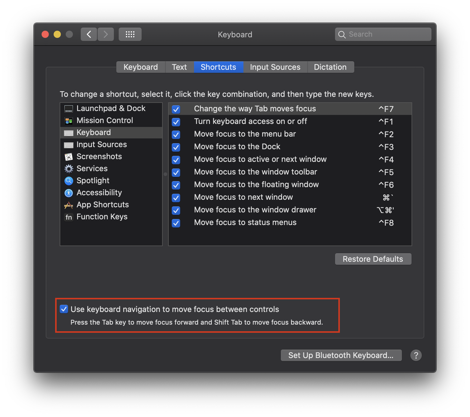
Unfortunately, Safari both on macOS and iOS reaaaally doesn’t want to do this. Native buttons on these platforms typically do not receive focus at all, unless you enable an accessibility setting (shown below). This means that tabbing through elements will only show text inputs, and not other elements like buttons, checkboxes, radios, etc. However, Safari is the only browser on macOS that respects this setting – both Chrome and Firefox always allow tabbing to all of these elements. We do not do anything to normalize this behavior for Safari because it’s likely that if you’re a keyboard user, you already have this setting enabled.
Even with this setting turned on, however, Safari still does not focus buttons and other native form elements on mouse down or touch start. A bug for this has been open against WebKit since 2008, and it seems unlikely to be fixed any time soon. In this case, we do need to normalize this to ensure browsers are consistent. We can handle focusing the element programmatically on mouse down ourselves.
However, it gets even more tricky on iOS. While on macOS, Safari will respect our programatic focus, on iOS the browser attempts to forcibly blur the element asynchronously sometime after the onClick event is fired. This means that even programmatically, focusing the button will not work. 🤯
The only solution is to call event.preventDefault() on all mouse and touch events on the element, and handle focusing ourselves. This ensures that the browser does not perform any of its default behavior, including this forced blur, but it means that we’ll have to handle all of the default browser behavior ourselves.
This focus normalization behavior is implemented by the usePress hook in React Aria, which is used by useButton, useCheckbox, useRadio, and many other hooks. If you’re implementing your own components, I’d highly recommend checking them out to ensure the focus behavior is consistent across browsers.
Conclusion#
In this series, you’ve seen how complicated even “simple” components like buttons can be when you consider all of the interactions they can support. React Aria aims to simplify this complexity and provide consistent behavior out of the box, while giving you complete rendering and styling control for your own components. This lets you focus on your unique design requirements, and build high quality components much faster. If you’re working on a design system, check it out!