March 5, 2025 Release
Buckle in because this is a big one! In this React Aria release, we’re excited to announce three new components: Toast, Tree, and Virtualizer. In addition, we have improved Autocomplete to enable UI patterns like Searchable Menus, Searchable Selects, and Command Palettes, added support for custom Menu, Popover, and Tooltip triggers, introduced colSpan support in Table, and upgraded to Tailwind CSS v4. Last but not least, we have a major refactor of usePress, which fixes many longstanding issues and improves compatibility with third party libraries.
For React Spectrum, we have GA versions of Toast and TreeView, support for tooltips in TagGroup and Tabs, and improved localization support in our DatePicker components.
This release would not be possible without the fantastic contributions we received from the community. A special shoutout to @oyvinmar and @nwidynski for contributing features like colSpan and nested collection support. Huge thanks to everyone else who contributed as well. ❤️
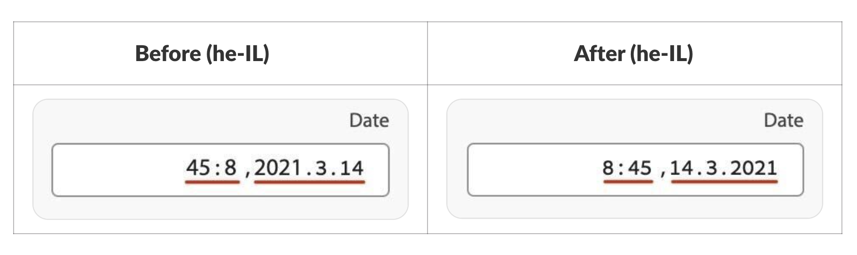
Date and Time Formatting in RTL Languages#
In this release, we’ve improved support for right-to-left languages in our date picker components to correct the order of the segments. To account for this, you must update your styles for DateInput to use normal CSS flow layout, e.g. display: block instead of display: flex. If you are using the useDateSegment hook, ensure that you render spans instead of divs. These changes allow the browser to correctly order the segments according to the Unicode Bidirectional Algorithm. If you choose to not make these style changes, your component will look the same as before, but will not format correctly in RTL languages.
usePress update#
usePress was heavily refactored to improve focus management and compatibility with third party libraries. Prior to this refactor, we used preventDefault and manually managed focus due to differences in focus behavior between Safari and other browsers. Unfortunately, this resulted in many unintended side effects, such as canceling compatibility mouse events, breaking the :active and :focus-visible pseudo classes, causing issues with the mobile virtual keyboard, etc.
Thanks to an update in Safari 17, all elements with an explicit tabIndex can now receive focus like in other browsers. This allows us to remove our reliance on preventDefault, and change the timing of when onPress is fired. As a result, browser events that used to be prevented when interacting with our components now fire as expected, greatly improving compatibility with third party libraries that rely on these events, and resolving over 15 open issues.
Note that this refactor changes the order that focus occurs. Previously, focus always occurred before onPressStart. Now focus occurs after onPressStart on mouse and keyboard interactions, and after onPressEnd on touch screens, matching native browser behavior. Additionally, unit tests may need to simulate different events than before. We recommend the user-event library to simulate events matching browser behavior.
TreeView changes#
With the GA release of TreeView, be sure to update any usages of TreeViewItem so that its contents are wrapped in the new TreeViewItemContent.
Enhancements#
- Button
- Collections
- Add
autoFocusprop to GridList - @snowystinger - PR - Add
colSpan propto Table - @oyvinmar - PR, @snowystinger - PR, @devongovett - PR - Support Tooltips on Tags and Tabs - @devongovett - PR
- Support nested collections - @nwidynski - PR
- Add WaterfallLayout for Virtualizer and update GridLayout - @devongovett - PR
- Add
- LabeledValue
- Allow
ReactElementin LabeledValue value - @sana-malik - PR
- Allow
- Popover
- Automatically render Popovers as Dialogs - @devongovett - PR
- Toast
- Add
placementprop to Spectrum ToastContainer - @reidbarber - PR, PR - Use View Transition API for Toast animations - @reidbarber - PR, PR
- Add
- usePress
- No longer
preventDefaultinusePressand allow browser to manage focus - @devongovett - PR, PR, PR, @yihuiliao - PR, PR
- No longer
- Miscellaneous
- Update to Tailwind v4 - @devongovett - PR
- Focus Management within ShadowDOM - @MahmoudElsayad - PR
- Implemented
actionprop to the getItems function in the useClipboard hook - @Nevnet99 - PR, PR - Add
has-child-itemsto Tailwind plugin - @reidbarber - PR
Fixes#
- Collections
- Prevent mutating non-empty selection upon focus - @alirezamirian - PR
- Update Table/Collection array types - @lukeapage - PR
- ComboBox
- Fix SSR Combobox inner ref from getting lost - @snowystinger - PR
- Date and Time
- Ensure
dayPeriodno longer resets when hour is deleted - @charlotte-whiting - PR - Correctly format date/time in RTL - @yihuiliao - PR, PR, PR, PR
- Remove
OverlayTriggerPropsfrom DateField props - @nwidynski - PR
- Ensure
- NumberField
- Add
isRequiredto NumberField RenderProps - @snowystinger - PR
- Add
- Select
- Tabs
- Fix TabList auto selection - @snowystinger - PR
- Tree
- Update Spectrum TreeView API - @snowystinger - PR
- Add label to the expand/collapse button in
useTreeItem- @LFDanLu - PR
- Toast
- Remove Toast priority queue - @snowystinger - PR
- Resume timers if pointer left region due to region shrinking - @reidbarber - PR
- Fix Toast hover and focus behavior - @devongovett - PR
- Make Toasts announce when rendered in NVDA - @LFDanLu - PR
- Miscellaneous
- Expose missing
renderPropstypes in RAC - @agscala - PR - Do not build list of available slots when there is no error - @jorrit - PR
- Ensure React
inertprop compatibility - @chirokas - PR - Fix infinite re-render on reoccuring ids - @nwidynski - PR
- Save render through optimized
useSlot()- @nwidynski - PR - Fix memory leak in
useIdwhen used with React Suspense - @snowystinger - PR
- Expose missing
Docs#
- Update test util doc examples so they don't error out - @LFDanLu - PR
- Fix typo in Slider - @artola - PR
- Fix typo in Drag and Drop docs - @nwidynski - PR
- Fix RadioGroup controlled example - @snowystinger - PR
- Add Virtualizer docs - @devongovett - PR
- Add
colSpanexamples to docs - @snowystinger - PR - RAC Tree docs - @snowystinger - PR
- Add docs for custom overlay trigger elements - @devongovett - PR
Under Construction#
RAC Toast
- Add Toast to React Aria Components - @devongovett - PR
Autocomplete
- Fix broken link in
Autocompletedocs - @amitdahan - PR - RAC Autocomplete docs - @reidbarber - PR, PR, @devongovett - PR, PR
- Add initial Autocomplete hook docs - @reidbarber - PR
- Add Subdialog support to Menu and Autocomplete - @LFDanLu - PR, @devongovett - PR
- Add
disableAutoFocusFirstprop to opt out of autofocus on first ListBoxItem in Autocomplete - @romansndlr - PR - Fix Autocomplete
tabkey forwarding - @snowystinger - PR - Add
isFocusVisibletouseMenuItemand fix focusRing when typing in Autocomplete SearchField - @LFDanLu - PR - Rename filterFn in useAutocomplete to filter - @LFDanLu - PR
Released packages#
 - @adobe/react-spectrum@3.40.0
 - @react-aria/actiongroup@3.7.13
 - @react-aria/autocomplete@3.0.0-beta.0
 - @react-aria/breadcrumbs@3.5.21
 - @react-aria/button@3.12.0
 - @react-aria/calendar@3.7.1
 - @react-aria/checkbox@3.15.2
 - @react-aria/collections@3.0.0-beta.0
 - @react-aria/color@3.0.4
 - @react-aria/combobox@3.12.0
 - @react-aria/datepicker@3.14.0
 - @react-aria/dialog@3.5.22
 - @react-aria/disclosure@3.0.2
 - @react-aria/dnd@3.9.0
 - @react-aria/focus@3.20.0
 - @react-aria/form@3.0.13
 - @react-aria/grid@3.12.0
 - @react-aria/gridlist@3.11.0
 - @react-aria/i18n@3.12.6
 - @react-aria/interactions@3.24.0
 - @react-aria/label@3.7.15
 - @react-aria/landmark@3.0.0
 - @react-aria/link@3.7.9
 - @react-aria/listbox@3.14.1
 - @react-aria/menu@3.18.0
 - @react-aria/meter@3.4.20
 - @react-aria/numberfield@3.11.11
 - @react-aria/overlays@3.26.0
 - @react-aria/progress@3.4.20
 - @react-aria/radio@3.11.0
 - @react-aria/searchfield@3.8.1
 - @react-aria/select@3.15.2
 - @react-aria/selection@3.23.0
 - @react-aria/separator@3.4.6
 - @react-aria/slider@3.7.16
 - @react-aria/spinbutton@3.6.12
 - @react-aria/steplist@3.0.0-alpha.14
 - @react-aria/switch@3.7.0
 - @react-aria/table@3.17.0
 - @react-aria/tabs@3.10.0
 - @react-aria/tag@3.5.0
 - @react-aria/test-utils@1.0.0-alpha.5
 - @react-aria/textfield@3.17.0
 - @react-aria/toast@3.0.0
 - @react-aria/toggle@3.11.0
 - @react-aria/toolbar@3.0.0-beta.13
 - @react-aria/tooltip@3.8.0
 - @react-aria/tree@3.0.0
 - @react-aria/utils@3.28.0
 - @react-aria/virtualizer@4.1.2
 - @react-aria/visually-hidden@3.8.20
 - @react-spectrum/accordion@3.0.3
 - @react-spectrum/actionbar@3.6.4
 - @react-spectrum/actiongroup@3.10.12
 - @react-spectrum/autocomplete@3.0.0-alpha.40
 - @react-spectrum/avatar@3.0.19
 - @react-spectrum/badge@3.1.20
 - @react-spectrum/breadcrumbs@3.9.14
 - @react-spectrum/button@3.16.11
 - @react-spectrum/buttongroup@3.6.19
 - @react-spectrum/calendar@3.6.1
 - @react-spectrum/card@3.0.0-alpha.40
 - @react-spectrum/checkbox@3.9.13
 - @react-spectrum/color@3.0.4
 - @react-spectrum/combobox@3.15.0
 - @react-spectrum/contextualhelp@3.6.18
 - @react-spectrum/datepicker@3.13.0
 - @react-spectrum/dialog@3.8.18
 - @react-spectrum/divider@3.5.20
 - @react-spectrum/dnd@3.5.2
 - @react-spectrum/dropzone@3.0.8
 - @react-spectrum/filetrigger@3.0.8
 - @react-spectrum/form@3.7.12
 - @react-spectrum/icon@3.8.2
 - @react-spectrum/illustratedmessage@3.5.7
 - @react-spectrum/image@3.5.8
 - @react-spectrum/inlinealert@3.2.12
 - @react-spectrum/label@3.16.12
 - @react-spectrum/labeledvalue@3.2.0
 - @react-spectrum/layout@3.6.12
 - @react-spectrum/link@3.6.14
 - @react-spectrum/list@3.9.2
 - @react-spectrum/listbox@3.14.2
 - @react-spectrum/menu@3.21.2
 - @react-spectrum/meter@3.5.7
 - @react-spectrum/numberfield@3.9.10
 - @react-spectrum/overlays@5.7.2
 - @react-spectrum/picker@3.15.6
 - @react-spectrum/progress@3.7.13
 - @react-spectrum/provider@3.10.2
 - @react-spectrum/radio@3.7.13
 - @react-spectrum/s2@0.7.0
 - @react-spectrum/searchfield@3.8.13
 - @react-spectrum/slider@3.7.2
 - @react-spectrum/statuslight@3.5.19
 - @react-spectrum/steplist@3.0.0-alpha.12
 - @react-spectrum/style-macro-s1@3.0.0-alpha.3
 - @react-spectrum/switch@3.5.12
 - @react-spectrum/table@3.16.0
 - @react-spectrum/tabs@3.8.17
 - @react-spectrum/tag@3.2.13
 - @react-spectrum/test-utils@1.0.0-alpha.5
 - @react-spectrum/text@3.5.12
 - @react-spectrum/textfield@3.13.0
 - @react-spectrum/theme-dark@3.5.16
 - @react-spectrum/theme-default@3.5.16
 - @react-spectrum/theme-express@3.0.0-alpha.18
 - @react-spectrum/theme-light@3.4.16
 - @react-spectrum/toast@3.0.0
 - @react-spectrum/tooltip@3.7.2
 - @react-spectrum/tree@3.0.0
 - @react-spectrum/utils@3.12.2
 - @react-spectrum/view@3.6.16
 - @react-spectrum/well@3.4.20
 - @react-stately/autocomplete@3.0.0-beta.0
 - @react-stately/calendar@3.7.1
 - @react-stately/checkbox@3.6.12
 - @react-stately/collections@3.12.2
 - @react-stately/color@3.8.3
 - @react-stately/combobox@3.10.3
 - @react-stately/data@3.12.2
 - @react-stately/datepicker@3.13.0
 - @react-stately/disclosure@3.0.2
 - @react-stately/dnd@3.5.2
 - @react-stately/flags@3.1.0
 - @react-stately/form@3.1.2
 - @react-stately/grid@3.11.0
 - @react-stately/layout@4.2.0
 - @react-stately/list@3.12.0
 - @react-stately/menu@3.9.2
 - @react-stately/numberfield@3.9.10
 - @react-stately/overlays@3.6.14
 - @react-stately/radio@3.10.11
 - @react-stately/searchfield@3.5.10
 - @react-stately/select@3.6.11
 - @react-stately/selection@3.20.0
 - @react-stately/slider@3.6.2
 - @react-stately/steplist@3.0.0-alpha.12
 - @react-stately/table@3.14.0
 - @react-stately/tabs@3.8.0
 - @react-stately/toast@3.0.0
 - @react-stately/toggle@3.8.2
 - @react-stately/tooltip@3.5.2
 - @react-stately/tree@3.8.8
 - @react-stately/virtualizer@4.3.0
 - @react-types/actionbar@3.1.13
 - @react-types/actiongroup@3.4.15
 - @react-types/autocomplete@3.0.0-alpha.29
 - @react-types/avatar@3.0.13
 - @react-types/badge@3.1.15
 - @react-types/breadcrumbs@3.7.11
 - @react-types/button@3.11.0
 - @react-types/buttongroup@3.3.15
 - @react-types/calendar@3.6.1
 - @react-types/card@3.0.0-alpha.33
 - @react-types/checkbox@3.9.2
 - @react-types/color@3.0.3
 - @react-types/combobox@3.13.3
 - @react-types/contextualhelp@3.2.16
 - @react-types/datepicker@3.11.0
 - @react-types/dialog@3.5.16
 - @react-types/divider@3.3.15
 - @react-types/form@3.7.10
 - @react-types/grid@3.3.0
 - @react-types/illustratedmessage@3.3.15
 - @react-types/image@3.4.7
 - @react-types/label@3.9.9
 - @react-types/layout@3.3.21
 - @react-types/link@3.5.11
 - @react-types/list@3.2.24
 - @react-types/listbox@3.5.5
 - @react-types/menu@3.9.15
 - @react-types/meter@3.4.7
 - @react-types/numberfield@3.8.9
 - @react-types/overlays@3.8.13
 - @react-types/progress@3.5.10
 - @react-types/provider@3.8.7
 - @react-types/radio@3.8.7
 - @react-types/searchfield@3.6.0
 - @react-types/select@3.9.10
 - @react-types/shared@3.28.0
 - @react-types/slider@3.7.9
 - @react-types/statuslight@3.3.15
 - @react-types/switch@3.5.9
 - @react-types/table@3.11.0
 - @react-types/tabs@3.3.13
 - @react-types/text@3.3.15
 - @react-types/textfield@3.12.0
 - @react-types/tooltip@3.4.15
 - @react-types/view@3.4.15
 - @react-types/well@3.3.15
 - @spectrum-icons/color@3.5.19
 - @spectrum-icons/express@3.0.0-alpha.23
 - @spectrum-icons/illustrations@3.6.19
 - @spectrum-icons/ui@3.6.13
 - @spectrum-icons/workflow@4.2.18
 - @react-spectrum/codemods@0.5.0
 - @react-spectrum/parcel-transformer-s2-icon@0.2.1
 - @react-spectrum/s2-icon-builder@0.2.2
 - react-aria@3.38.0
 - react-aria-components@1.7.0
 - react-stately@3.36.0
 - tailwindcss-react-aria-components@2.0.0