Menu
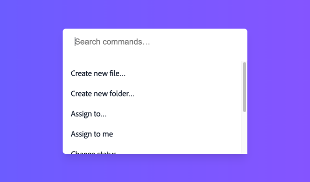
A menu displays a list of actions or options that a user can choose.
| install | yarn add react-aria-components |
|---|---|
| version | 1.13.0 |
| usage | import {MenuTrigger, Menu, SubmenuTrigger} from 'react-aria-components' |
Example#
import {Button, Menu, MenuItem, MenuTrigger, Popover} from 'react-aria-components';
import {Menu as MenuIcon} from 'lucide-react';

<MenuTrigger>
  <Button aria-label="Menu">
    <MenuIcon size={18} />
  </Button>
  <Popover>
    <Menu>
      <MenuItem onAction={() => alert('open')}>Open</MenuItem>
      <MenuItem onAction={() => alert('rename')}>Rename…</MenuItem>
      <MenuItem onAction={() => alert('duplicate')}>Duplicate</MenuItem>
      <MenuItem onAction={() => alert('share')}>Share…</MenuItem>
      <MenuItem onAction={() => alert('delete')}>Delete…</MenuItem>
    </Menu>
  </Popover>
</MenuTrigger>
import {
Button,
Menu,
MenuItem,
MenuTrigger,
Popover
} from 'react-aria-components';
import {Menu as MenuIcon} from 'lucide-react';
<MenuTrigger>
<Button aria-label="Menu">
<MenuIcon size={18} />
</Button>
<Popover>
<Menu>
<MenuItem onAction={() => alert('open')}>
Open
</MenuItem>
<MenuItem onAction={() => alert('rename')}>
Rename…
</MenuItem>
<MenuItem onAction={() => alert('duplicate')}>
Duplicate
</MenuItem>
<MenuItem onAction={() => alert('share')}>
Share…
</MenuItem>
<MenuItem onAction={() => alert('delete')}>
Delete…
</MenuItem>
</Menu>
</Popover>
</MenuTrigger>import {
Button,
Menu,
MenuItem,
MenuTrigger,
Popover
} from 'react-aria-components';
import {Menu as MenuIcon} from 'lucide-react';
<MenuTrigger>
<Button aria-label="Menu">
<MenuIcon
size={18}
/>
</Button>
<Popover>
<Menu>
<MenuItem
onAction={() =>
alert(
'open'
)}
>
Open
</MenuItem>
<MenuItem
onAction={() =>
alert(
'rename'
)}
>
Rename…
</MenuItem>
<MenuItem
onAction={() =>
alert(
'duplicate'
)}
>
Duplicate
</MenuItem>
<MenuItem
onAction={() =>
alert(
'share'
)}
>
Share…
</MenuItem>
<MenuItem
onAction={() =>
alert(
'delete'
)}
>
Delete…
</MenuItem>
</Menu>
</Popover>
</MenuTrigger>Show CSS
@import "@react-aria/example-theme";

.react-aria-Menu {
  max-height: inherit;
  box-sizing: border-box;
  overflow: auto;
  padding: 2px;
  min-width: 150px;
  box-sizing: border-box;
  outline: none;
}

.react-aria-MenuItem {
  margin: 2px;
  padding: 0.286rem 0.571rem;
  border-radius: 6px;
  outline: none;
  cursor: default;
  color: var(--text-color);
  font-size: 1.072rem;
  position: relative;
  display: grid;
  grid-template-areas: "label kbd"
                      "desc  kbd";
  align-items: center;
  column-gap: 20px;
  forced-color-adjust: none;

  &[data-focused] {
    background: var(--highlight-background);
    color: var(--highlight-foreground);
  }
}
@import "@react-aria/example-theme";
.react-aria-Menu {
max-height: inherit;
box-sizing: border-box;
overflow: auto;
padding: 2px;
min-width: 150px;
box-sizing: border-box;
outline: none;
}
.react-aria-MenuItem {
margin: 2px;
padding: 0.286rem 0.571rem;
border-radius: 6px;
outline: none;
cursor: default;
color: var(--text-color);
font-size: 1.072rem;
position: relative;
display: grid;
grid-template-areas: "label kbd"
"desc kbd";
align-items: center;
column-gap: 20px;
forced-color-adjust: none;
&[data-focused] {
background: var(--highlight-background);
color: var(--highlight-foreground);
}
}@import "@react-aria/example-theme";
.react-aria-Menu {
max-height: inherit;
box-sizing: border-box;
overflow: auto;
padding: 2px;
min-width: 150px;
box-sizing: border-box;
outline: none;
}
.react-aria-MenuItem {
margin: 2px;
padding: 0.286rem 0.571rem;
border-radius: 6px;
outline: none;
cursor: default;
color: var(--text-color);
font-size: 1.072rem;
position: relative;
display: grid;
grid-template-areas: "label kbd"
"desc kbd";
align-items: center;
column-gap: 20px;
forced-color-adjust: none;
&[data-focused] {
background: var(--highlight-background);
color: var(--highlight-foreground);
}
}Features#
There is no native element to implement a menu in HTML that is widely supported. MenuTrigger and Menu
help achieve accessible menu components that can be styled as needed.
- Keyboard navigation – Menu items can be navigated using the arrow keys, along with page up/down, home/end, etc. Typeahead, auto scrolling, and disabled items are supported as well.
- Item selection – Single or multiple selection can be optionally enabled.
- Trigger interactions – Menus can be triggered by pressing with a mouse or touch, or optionally, with a long press interaction. The arrow keys also open the menu with a keyboard, automatically focusing the first or last item accordingly.
- Accessible – Follows the ARIA menu pattern, with support for items and sections, and slots for label, description, and keyboard shortcut elements within each item for improved screen reader announcement.
Anatomy#
A menu trigger consists of a button or other trigger element combined with a menu displayed in a popover, with a list of menu items or sections inside. Users can click, touch, or use the keyboard on the button to open the menu.
import {Button, Header, Keyboard, Menu, MenuItem, MenuSection, MenuTrigger, Popover, SelectionIndicator, Separator, Text} from 'react-aria-components';

<MenuTrigger>
  <Button />
  <Popover>
    <Menu>
      <MenuItem>
        <Text slot="label" />
        <Text slot="description" />
        <Keyboard />
        <SelectionIndicator />
      </MenuItem>
      <Separator />
      <MenuSection>
        <Header />
        <MenuItem />
      </MenuSection>
    </Menu>
  </Popover>
</MenuTrigger>
import {
Button,
Header,
Keyboard,
Menu,
MenuItem,
MenuSection,
MenuTrigger,
Popover,
SelectionIndicator,
Separator,
Text
} from 'react-aria-components';
<MenuTrigger>
<Button />
<Popover>
<Menu>
<MenuItem>
<Text slot="label" />
<Text slot="description" />
<Keyboard />
<SelectionIndicator />
</MenuItem>
<Separator />
<MenuSection>
<Header />
<MenuItem />
</MenuSection>
</Menu>
</Popover>
</MenuTrigger>import {
Button,
Header,
Keyboard,
Menu,
MenuItem,
MenuSection,
MenuTrigger,
Popover,
SelectionIndicator,
Separator,
Text
} from 'react-aria-components';
<MenuTrigger>
<Button />
<Popover>
<Menu>
<MenuItem>
<Text slot="label" />
<Text slot="description" />
<Keyboard />
<SelectionIndicator />
</MenuItem>
<Separator />
<MenuSection>
<Header />
<MenuItem />
</MenuSection>
</Menu>
</Popover>
</MenuTrigger>Concepts#
Menu makes use of the following concepts:
Composed components#
A Menu uses the following components, which may also be used standalone or reused in other components.
Examples#


Starter kits#
To help kick-start your project, we offer starter kits that include example implementations of all React Aria components with various styling solutions. All components are fully styled, including support for dark mode, high contrast mode, and all UI states. Each starter comes with a pre-configured Storybook that you can experiment with, or use as a starting point for your own component library.
Reusable wrappers#
If you will use a Menu in multiple places in your app, you can wrap all of the pieces into a reusable component. This way, the DOM structure, styling code, and other logic are defined in a single place and reused everywhere to ensure consistency.
This example wraps MenuTrigger and all of its children together into a single component which accepts a label prop and children, which are passed through to the right places. The MenuItem component is also wrapped to apply class names based on the current state, as described in the styling section.
import type {MenuItemProps, MenuProps, MenuTriggerProps} from 'react-aria-components';
import {ChevronRight} from 'lucide-react';
interface MyMenuButtonProps<T>
extends MenuProps<T>, Omit<MenuTriggerProps, 'children'> {
label?: string;
}
function MyMenuButton<T extends object>(
{ label, children, ...props }: MyMenuButtonProps<T>
) {
return (
<MenuTrigger {...props}>
<Button>{label}</Button>
<Popover>
<Menu {...props}>
{children}
</Menu>
</Popover>
</MenuTrigger>
);
}
export function MyItem(
props: Omit<MenuItemProps, 'children'> & { children?: React.ReactNode }
) {
let textValue = props.textValue ||
(typeof props.children === 'string' ? props.children : undefined);
return (
<MenuItem
{...props}
textValue={textValue}
className={({ isFocused, isSelected, isOpen }) =>
`my-item `}
>
{({ hasSubmenu }) => (
<>
{props.children}
{hasSubmenu && <ChevronRight size={18} className="chevron" />}
</>
)}
</MenuItem>
);
}
<MyMenuButton label="Edit">
<MyItem>Cut</MyItem>
<MyItem>Copy</MyItem>
<MyItem>Paste</MyItem>
</MyMenuButton>import type {
MenuItemProps,
MenuProps,
MenuTriggerProps
} from 'react-aria-components';
import {ChevronRight} from 'lucide-react';
interface MyMenuButtonProps<T>
extends MenuProps<T>, Omit<MenuTriggerProps, 'children'> {
label?: string;
}
function MyMenuButton<T extends object>(
{ label, children, ...props }: MyMenuButtonProps<T>
) {
return (
<MenuTrigger {...props}>
<Button>{label}</Button>
<Popover>
<Menu {...props}>
{children}
</Menu>
</Popover>
</MenuTrigger>
);
}
export function MyItem(
props: Omit<MenuItemProps, 'children'> & {
children?: React.ReactNode;
}
) {
let textValue = props.textValue ||
(typeof props.children === 'string'
? props.children
: undefined);
return (
<MenuItem
{...props}
textValue={textValue}
className={({ isFocused, isSelected, isOpen }) =>
`my-item `}
>
{({ hasSubmenu }) => (
<>
{props.children}
{hasSubmenu && (
<ChevronRight size={18} className="chevron" />
)}
</>
)}
</MenuItem>
);
}
<MyMenuButton label="Edit">
<MyItem>Cut</MyItem>
<MyItem>Copy</MyItem>
<MyItem>Paste</MyItem>
</MyMenuButton>import type {
MenuItemProps,
MenuProps,
MenuTriggerProps
} from 'react-aria-components';
import {ChevronRight} from 'lucide-react';
interface MyMenuButtonProps<
T
> extends
MenuProps<T>,
Omit<
MenuTriggerProps,
'children'
> {
label?: string;
}
function MyMenuButton<
T extends object
>(
{
label,
children,
...props
}: MyMenuButtonProps<T>
) {
return (
<MenuTrigger
{...props}
>
<Button>
{label}
</Button>
<Popover>
<Menu {...props}>
{children}
</Menu>
</Popover>
</MenuTrigger>
);
}
export function MyItem(
props:
& Omit<
MenuItemProps,
'children'
>
& {
children?:
React.ReactNode;
}
) {
let textValue =
props.textValue ||
(typeof props
.children ===
'string'
? props.children
: undefined);
return (
<MenuItem
{...props}
textValue={textValue}
className={(
{
isFocused,
isSelected,
isOpen
}
) =>
`my-item `}
>
{(
{ hasSubmenu }
) => (
<>
{props
.children}
{hasSubmenu &&
(
<ChevronRight
size={18}
className="chevron"
/>
)}
</>
)}
</MenuItem>
);
}
<MyMenuButton label="Edit">
<MyItem>Cut</MyItem>
<MyItem>Copy</MyItem>
<MyItem>
Paste
</MyItem>
</MyMenuButton>Show CSS
.my-item {
  margin: 2px;
  padding: 0.286rem 0.571rem;
  border-radius: 6px;
  outline: none;
  cursor: default;
  color: var(--text-color);
  font-size: 1.072rem;
  position: relative;

  &.focused {
    background: #e70073;
    color: white;
  }
  &.open:not(.focused) {
    background: rgba(192, 192, 192, 0.3);
    color: var(--text-color);
  }
  .chevron {
    fill: none;
    stroke: currentColor;
    stroke-linecap: round;
    stroke-linejoin: round;
    stroke-width: 2;
    position: absolute;
    right: 0;
    top: 0;
    height: 100%;
  }
}

@media (forced-colors: active) {
  .my-item.focused {
    forced-color-adjust: none;
    background: Highlight;
    color: HighlightText;
  }
}.my-item {
margin: 2px;
padding: 0.286rem 0.571rem;
border-radius: 6px;
outline: none;
cursor: default;
color: var(--text-color);
font-size: 1.072rem;
position: relative;
&.focused {
background: #e70073;
color: white;
}
&.open:not(.focused) {
background: rgba(192, 192, 192, 0.3);
color: var(--text-color);
}
.chevron {
fill: none;
stroke: currentColor;
stroke-linecap: round;
stroke-linejoin: round;
stroke-width: 2;
position: absolute;
right: 0;
top: 0;
height: 100%;
}
}
@media (forced-colors: active) {
.my-item.focused {
forced-color-adjust: none;
background: Highlight;
color: HighlightText;
}
}Content#
Menu follows the Collection Components API, accepting both static and dynamic collections.
The examples above show static collections, which can be used when the full list of options is known ahead of time. Dynamic collections,
as shown below, can be used when the options come from an external data source such as an API call, or update over time.
As seen below, an iterable list of options is passed to the Menu using the items prop. Each item accepts an id prop, which
is passed to the onAction prop on the Menu to identify the selected item. Alternatively, if the item objects contain an id property,
as shown in the example below, then this is used automatically and an id prop is not required.
function Example() {
  let items = [
    {id: 1, name: 'New'},
    {id: 2, name: 'Open'},
    {id: 3, name: 'Close'},
    {id: 4, name: 'Save'},
    {id: 5, name: 'Duplicate'},
    {id: 6, name: 'Rename'},
    {id: 7, name: 'Move'}
  ];

  return (
    <MyMenuButton label="Actions" items={items} onAction={id => alert(id)}>
      {(item) => <MenuItem>{item.name}</MenuItem>}
    </MyMenuButton>
  );
}
function Example() {
let items = [
{ id: 1, name: 'New' },
{ id: 2, name: 'Open' },
{ id: 3, name: 'Close' },
{ id: 4, name: 'Save' },
{ id: 5, name: 'Duplicate' },
{ id: 6, name: 'Rename' },
{ id: 7, name: 'Move' }
];
return (
<MyMenuButton
label="Actions"
items={items}
onAction={(id) => alert(id)}
>
{(item) => <MenuItem>{item.name}</MenuItem>}
</MyMenuButton>
);
}
function Example() {
  let items = [
    {
      id: 1,
      name: 'New'
    },
    {
      id: 2,
      name: 'Open'
    },
    {
      id: 3,
      name: 'Close'
    },
    {
      id: 4,
      name: 'Save'
    },
    {
      id: 5,
      name: 'Duplicate'
    },
    {
      id: 6,
      name: 'Rename'
    },
    {
      id: 7,
      name: 'Move'
    }
  ];

  return (
    <MyMenuButton
      label="Actions"
      items={items}
      onAction={(id) =>
        alert(id)}
    >
      {(item) => (
        <MenuItem>
          {item.name}
        </MenuItem>
      )}
    </MyMenuButton>
  );
}
Selection#
Menu supports multiple selection modes. By default, selection is disabled, however this can be changed using the selectionMode prop.
Use defaultSelectedKeys to provide a default set of selected items (uncontrolled) and selectedKeys to set the selected items (controlled). The value of the selected keys must match the id prop of the items.
Single#
import type {Selection} from 'react-aria-components';

function Example() {
  let [selected, setSelected] = React.useState<Selection>(new Set(['center']));

  return (
    <>
      <MyMenuButton
        label="Align"
        selectionMode="single"
        selectedKeys={selected}
        onSelectionChange={setSelected}
      >
        <MenuItem id="left">Left</MenuItem>
        <MenuItem id="center">Center</MenuItem>
        <MenuItem id="right">Right</MenuItem>
      </MyMenuButton>
      <p>Current selection (controlled): {[...selected].join(', ')}</p>
    </>
  );
}
import type {Selection} from 'react-aria-components';

function Example() {
  let [selected, setSelected] = React.useState<Selection>(
    new Set(['center'])
  );

  return (
    <>
      <MyMenuButton
        label="Align"
        selectionMode="single"
        selectedKeys={selected}
        onSelectionChange={setSelected}
      >
        <MenuItem id="left">Left</MenuItem>
        <MenuItem id="center">Center</MenuItem>
        <MenuItem id="right">Right</MenuItem>
      </MyMenuButton>
      <p>
        Current selection (controlled):{' '}
        {[...selected].join(', ')}
      </p>
    </>
  );
}
import type {Selection} from 'react-aria-components';

function Example() {
  let [
    selected,
    setSelected
  ] = React.useState<
    Selection
  >(new Set(['center']));

  return (
    <>
      <MyMenuButton
        label="Align"
        selectionMode="single"
        selectedKeys={selected}
        onSelectionChange={setSelected}
      >
        <MenuItem id="left">
          Left
        </MenuItem>
        <MenuItem id="center">
          Center
        </MenuItem>
        <MenuItem id="right">
          Right
        </MenuItem>
      </MyMenuButton>
      <p>
        Current selection
        (controlled):
        {' '}
        {[...selected]
          .join(', ')}
      </p>
    </>
  );
}
Show CSS
.react-aria-MenuItem {
  &[data-selection-mode] {
    padding-left: 24px;

    &::before {
      position: absolute;
      left: 4px;
      font-weight: 600;
    }

    &[data-selection-mode=multiple][data-selected]::before {
      content: '✓';
      content: '✓' / '';
      alt: ' ';
      position: absolute;
      left: 4px;
      font-weight: 600;
    }

    &[data-selection-mode=single][data-selected]::before {
      content: '●';
      content: '●' / '';
      transform: scale(0.7)
    }
  }
}.react-aria-MenuItem {
&[data-selection-mode] {
padding-left: 24px;
&::before {
position: absolute;
left: 4px;
font-weight: 600;
}
&[data-selection-mode=multiple][data-selected]::before {
content: '✓';
content: '✓' / '';
alt: ' ';
position: absolute;
left: 4px;
font-weight: 600;
}
&[data-selection-mode=single][data-selected]::before {
content: '●';
content: '●' / '';
transform: scale(0.7)
}
}
}Multiple#
import type {Selection} from 'react-aria-components';

function Example() {
  let [selected, setSelected] = React.useState<Selection>(
    new Set(['sidebar', 'console'])
  );

  return (
    <>
      <MyMenuButton
        label="View"
        selectionMode="multiple"
        selectedKeys={selected}
        onSelectionChange={setSelected}
      >
        <MenuItem id="sidebar">Sidebar</MenuItem>
        <MenuItem id="searchbar">Searchbar</MenuItem>
        <MenuItem id="tools">Tools</MenuItem>
        <MenuItem id="console">Console</MenuItem>
      </MyMenuButton>
      <p>
        Current selection (controlled):{' '}
        {selected === 'all' ? 'all' : [...selected].join(', ')}
      </p>
    </>
  );
}
import type {Selection} from 'react-aria-components';

function Example() {
  let [selected, setSelected] = React.useState<Selection>(
    new Set(['sidebar', 'console'])
  );

  return (
    <>
      <MyMenuButton
        label="View"
        selectionMode="multiple"
        selectedKeys={selected}
        onSelectionChange={setSelected}
      >
        <MenuItem id="sidebar">Sidebar</MenuItem>
        <MenuItem id="searchbar">Searchbar</MenuItem>
        <MenuItem id="tools">Tools</MenuItem>
        <MenuItem id="console">Console</MenuItem>
      </MyMenuButton>
      <p>
        Current selection (controlled): {selected === 'all'
          ? 'all'
          : [...selected].join(', ')}
      </p>
    </>
  );
}
import type {Selection} from 'react-aria-components';

function Example() {
  let [
    selected,
    setSelected
  ] = React.useState<
    Selection
  >(
    new Set([
      'sidebar',
      'console'
    ])
  );

  return (
    <>
      <MyMenuButton
        label="View"
        selectionMode="multiple"
        selectedKeys={selected}
        onSelectionChange={setSelected}
      >
        <MenuItem id="sidebar">
          Sidebar
        </MenuItem>
        <MenuItem id="searchbar">
          Searchbar
        </MenuItem>
        <MenuItem id="tools">
          Tools
        </MenuItem>
        <MenuItem id="console">
          Console
        </MenuItem>
      </MyMenuButton>
      <p>
        Current selection
        (controlled):
        {' '}
        {selected ===
            'all'
          ? 'all'
          : [...selected]
            .join(', ')}
      </p>
    </>
  );
}
Links#
By default, interacting with an item in a Menu triggers onAction and optionally onSelectionChange depending on the selectionMode. Alternatively, items may be links to another page or website. This can be achieved by passing the href prop to the <MenuItem> component. Link items in a menu are not selectable.
<MyMenuButton label="Links">
  <MenuItem href="https://adobe.com/" target="_blank">Adobe</MenuItem>
  <MenuItem href="https://apple.com/" target="_blank">Apple</MenuItem>
  <MenuItem href="https://google.com/" target="_blank">Google</MenuItem>
  <MenuItem href="https://microsoft.com/" target="_blank">Microsoft</MenuItem>
</MyMenuButton><MyMenuButton label="Links">
<MenuItem href="https://adobe.com/" target="_blank">
Adobe
</MenuItem>
<MenuItem href="https://apple.com/" target="_blank">
Apple
</MenuItem>
<MenuItem href="https://google.com/" target="_blank">
Google
</MenuItem>
<MenuItem href="https://microsoft.com/" target="_blank">
Microsoft
</MenuItem>
</MyMenuButton><MyMenuButton label="Links">
<MenuItem
href="https://adobe.com/"
target="_blank"
>
Adobe
</MenuItem>
<MenuItem
href="https://apple.com/"
target="_blank"
>
Apple
</MenuItem>
<MenuItem
href="https://google.com/"
target="_blank"
>
Google
</MenuItem>
<MenuItem
href="https://microsoft.com/"
target="_blank"
>
Microsoft
</MenuItem>
</MyMenuButton>Client side routing#
The <MenuItem> component works with frameworks and client side routers like Next.js and React Router. As with other React Aria components that support links, this works via the RouterProvider component at the root of your app. See the client side routing guide to learn how to set this up.
Sections#
Menu supports sections with headings in order to group items. Sections can be used by wrapping groups of MenuItems in a MenuSection component. A <Header> element may also be included to label the section.
Static items#
import {MenuSection, Header} from 'react-aria-components';

<MyMenuButton label="Actions">
  <MenuSection>
    <Header>Styles</Header>
    <MenuItem>Bold</MenuItem>
    <MenuItem>Underline</MenuItem>
  </MenuSection>
  <MenuSection>
    <Header>Align</Header>
    <MenuItem>Left</MenuItem>
    <MenuItem>Middle</MenuItem>
    <MenuItem>Right</MenuItem>
  </MenuSection>
</MyMenuButton>
import {MenuSection, Header} from 'react-aria-components';
<MyMenuButton label="Actions">
<MenuSection>
<Header>Styles</Header>
<MenuItem>Bold</MenuItem>
<MenuItem>Underline</MenuItem>
</MenuSection>
<MenuSection>
<Header>Align</Header>
<MenuItem>Left</MenuItem>
<MenuItem>Middle</MenuItem>
<MenuItem>Right</MenuItem>
</MenuSection>
</MyMenuButton>import {
Header,
MenuSection
} from 'react-aria-components';
<MyMenuButton label="Actions">
<MenuSection>
<Header>
Styles
</Header>
<MenuItem>
Bold
</MenuItem>
<MenuItem>
Underline
</MenuItem>
</MenuSection>
<MenuSection>
<Header>
Align
</Header>
<MenuItem>
Left
</MenuItem>
<MenuItem>
Middle
</MenuItem>
<MenuItem>
Right
</MenuItem>
</MenuSection>
</MyMenuButton>Show CSS
.react-aria-Menu {
  .react-aria-MenuSection:not(:first-child) {
    margin-top: 12px;
  }

  .react-aria-Header {
    font-size: 1.143rem;
    font-weight: bold;
    padding: 0 0.714rem;
  }
}.react-aria-Menu {
.react-aria-MenuSection:not(:first-child) {
margin-top: 12px;
}
.react-aria-Header {
font-size: 1.143rem;
font-weight: bold;
padding: 0 0.714rem;
}
}.react-aria-Menu {
.react-aria-MenuSection:not(:first-child) {
margin-top: 12px;
}
.react-aria-Header {
font-size: 1.143rem;
font-weight: bold;
padding: 0 0.714rem;
}
}Dynamic items#
The above example shows sections with static items. Sections can also be populated from a hierarchical data structure.
Similarly to the props on Menu, <MenuSection> takes an array of data using the items prop. If the section also has a header,
the Collection component can be used to render the child items.
import type {Selection} from 'react-aria-components';
import {Collection} from 'react-aria-components';

function Example() {
  let [selected, setSelected] = React.useState<Selection>(new Set([1,3]));
  let openWindows = [
    {
      name: 'Left Panel',
      id: 'left',
      children: [
        {id: 1, name: 'Final Copy (1)'}
      ]
    },
    {
      name: 'Right Panel',
      id: 'right',
      children: [
        {id: 2, name: 'index.ts'},
        {id: 3, name: 'package.json'},
        {id: 4, name: 'license.txt'}
      ]
    }
  ];

  return (
    <MyMenuButton
      label="Window"
      items={openWindows}
      selectionMode="multiple"
      selectedKeys={selected}
      onSelectionChange={setSelected}>
      {section => (
        <MenuSection>
          <Header>{section.name}</Header>
          <Collection items={section.children}>
            {item => <MenuItem>{item.name}</MenuItem>}
          </Collection>
        </MenuSection>
      )}
    </MyMenuButton>
  );
}
import type {Selection} from 'react-aria-components';
import {Collection} from 'react-aria-components';
function Example() {
let [selected, setSelected] = React.useState<Selection>(
new Set([1, 3])
);
let openWindows = [
{
name: 'Left Panel',
id: 'left',
children: [
{ id: 1, name: 'Final Copy (1)' }
]
},
{
name: 'Right Panel',
id: 'right',
children: [
{ id: 2, name: 'index.ts' },
{ id: 3, name: 'package.json' },
{ id: 4, name: 'license.txt' }
]
}
];
return (
<MyMenuButton
label="Window"
items={openWindows}
selectionMode="multiple"
selectedKeys={selected}
onSelectionChange={setSelected}
>
{(section) => (
<MenuSection>
<Header>{section.name}</Header>
<Collection items={section.children}>
{(item) => <MenuItem>{item.name}</MenuItem>}
</Collection>
</MenuSection>
)}
</MyMenuButton>
);
}
import type {Selection} from 'react-aria-components';
import {Collection} from 'react-aria-components';

function Example() {
  let [
    selected,
    setSelected
  ] = React.useState<
    Selection
  >(new Set([1, 3]));
  let openWindows = [
    {
      name: 'Left Panel',
      id: 'left',
      children: [
        {
          id: 1,
          name:
            'Final Copy (1)'
        }
      ]
    },
    {
      name:
        'Right Panel',
      id: 'right',
      children: [
        {
          id: 2,
          name:
            'index.ts'
        },
        {
          id: 3,
          name:
            'package.json'
        },
        {
          id: 4,
          name:
            'license.txt'
        }
      ]
    }
  ];

  return (
    <MyMenuButton
      label="Window"
      items={openWindows}
      selectionMode="multiple"
      selectedKeys={selected}
      onSelectionChange={setSelected}
    >
      {(section) => (
        <MenuSection>
          <Header>
            {section
              .name}
          </Header>
          <Collection
            items={section
              .children}
          >
            {(item) => (
              <MenuItem>
                {item
                  .name}
              </MenuItem>
            )}
          </Collection>
        </MenuSection>
      )}
    </MyMenuButton>
  );
}
Separators#
Separators may be added between menu items or sections in order to create non-labeled groupings.
import {Separator} from 'react-aria-components';

<MyMenuButton label="Actions">
  <MenuItem>New…</MenuItem>
  <MenuItem>Open…</MenuItem>
  <Separator />
  <MenuItem>Save</MenuItem>
  <MenuItem>Save as…</MenuItem>
  <MenuItem>Rename…</MenuItem>
  <Separator />
  <MenuItem>Page setup…</MenuItem>
  <MenuItem>Print…</MenuItem>
</MyMenuButton>
import {Separator} from 'react-aria-components';
<MyMenuButton label="Actions">
<MenuItem>New…</MenuItem>
<MenuItem>Open…</MenuItem>
<Separator />
<MenuItem>Save</MenuItem>
<MenuItem>Save as…</MenuItem>
<MenuItem>Rename…</MenuItem>
<Separator />
<MenuItem>Page setup…</MenuItem>
<MenuItem>Print…</MenuItem>
</MyMenuButton>import {Separator} from 'react-aria-components';
<MyMenuButton label="Actions">
<MenuItem>
New…
</MenuItem>
<MenuItem>
Open…
</MenuItem>
<Separator />
<MenuItem>
Save
</MenuItem>
<MenuItem>
Save as…
</MenuItem>
<MenuItem>
Rename…
</MenuItem>
<Separator />
<MenuItem>
Page setup…
</MenuItem>
<MenuItem>
Print…
</MenuItem>
</MyMenuButton>Show CSS
.react-aria-Menu {
  .react-aria-Separator {
    height: 1px;
    background: var(--border-color);
    margin: 2px 4px;
  }
}.react-aria-Menu {
.react-aria-Separator {
height: 1px;
background: var(--border-color);
margin: 2px 4px;
}
}.react-aria-Menu {
.react-aria-Separator {
height: 1px;
background: var(--border-color);
margin: 2px 4px;
}
}Section-level selection#
Each section in a menu may have independent selection states. This works the same way as described above for the entire menu, but operates at the section level instead.
function Example() {
  let [style, setStyle] = React.useState<Selection>(new Set(['bold']));
  let [align, setAlign] = React.useState<Selection>(new Set(['left']));
  return (
    <MyMenuButton label="Edit">
      <MenuSection>
        <Header>Actions</Header>
        <MenuItem>Cut</MenuItem>
        <MenuItem>Copy</MenuItem>
        <MenuItem>Paste</MenuItem>
      </MenuSection>
      <MenuSection
        selectionMode="multiple"
        selectedKeys={style}
        onSelectionChange={setStyle}
      >
        <Header>Text style</Header>
        <MenuItem id="bold">Bold</MenuItem>
        <MenuItem id="italic">Italic</MenuItem>
        <MenuItem id="underline">Underline</MenuItem>
      </MenuSection>
      <MenuSection
        selectionMode="single"
        selectedKeys={align}
        onSelectionChange={setAlign}
      >
        <Header>Text alignment</Header>
        <MenuItem id="left">Left</MenuItem>
        <MenuItem id="center">Center</MenuItem>
        <MenuItem id="right">Right</MenuItem>
      </MenuSection>
    </MyMenuButton>
  );
}
function Example() {
  let [style, setStyle] = React.useState<Selection>(
    new Set(['bold'])
  );
  let [align, setAlign] = React.useState<Selection>(
    new Set(['left'])
  );
  return (
    <MyMenuButton label="Edit">
      <MenuSection>
        <Header>Actions</Header>
        <MenuItem>Cut</MenuItem>
        <MenuItem>Copy</MenuItem>
        <MenuItem>Paste</MenuItem>
      </MenuSection>
      <MenuSection
        selectionMode="multiple"
        selectedKeys={style}
        onSelectionChange={setStyle}
      >
        <Header>Text style</Header>
        <MenuItem id="bold">Bold</MenuItem>
        <MenuItem id="italic">Italic</MenuItem>
        <MenuItem id="underline">Underline</MenuItem>
      </MenuSection>
      <MenuSection
        selectionMode="single"
        selectedKeys={align}
        onSelectionChange={setAlign}
      >
        <Header>Text alignment</Header>
        <MenuItem id="left">Left</MenuItem>
        <MenuItem id="center">Center</MenuItem>
        <MenuItem id="right">Right</MenuItem>
      </MenuSection>
    </MyMenuButton>
  );
}
function Example() {
  let [style, setStyle] =
    React.useState<
      Selection
    >(new Set(['bold']));
  let [align, setAlign] =
    React.useState<
      Selection
    >(new Set(['left']));
  return (
    <MyMenuButton label="Edit">
      <MenuSection>
        <Header>
          Actions
        </Header>
        <MenuItem>
          Cut
        </MenuItem>
        <MenuItem>
          Copy
        </MenuItem>
        <MenuItem>
          Paste
        </MenuItem>
      </MenuSection>
      <MenuSection
        selectionMode="multiple"
        selectedKeys={style}
        onSelectionChange={setStyle}
      >
        <Header>
          Text style
        </Header>
        <MenuItem id="bold">
          Bold
        </MenuItem>
        <MenuItem id="italic">
          Italic
        </MenuItem>
        <MenuItem id="underline">
          Underline
        </MenuItem>
      </MenuSection>
      <MenuSection
        selectionMode="single"
        selectedKeys={align}
        onSelectionChange={setAlign}
      >
        <Header>
          Text alignment
        </Header>
        <MenuItem id="left">
          Left
        </MenuItem>
        <MenuItem id="center">
          Center
        </MenuItem>
        <MenuItem id="right">
          Right
        </MenuItem>
      </MenuSection>
    </MyMenuButton>
  );
}
Accessibility#
Sections without a <Header> must provide an aria-label for accessibility.
Text slots#
By default, items in a ListBox are labeled by their text contents for accessibility. MenuItems also support the "label" and "description" slots to separate primary and secondary content, which improves screen reader announcements and can also be used for styling purposes. The <Keyboard> component can also be used to display a keyboard shortcut.
import {Text, Keyboard} from 'react-aria-components';

<MyMenuButton label="Actions">
  <MenuItem textValue="Copy">
    <Text slot="label">Copy</Text>
    <Text slot="description">Copy the selected text</Text>
    <Keyboard>⌘C</Keyboard>
  </MenuItem>
  <MenuItem textValue="Cut">
    <Text slot="label">Cut</Text>
    <Text slot="description">Cut the selected text</Text>
    <Keyboard>⌘X</Keyboard>
  </MenuItem>
  <MenuItem textValue="Paste">
    <Text slot="label">Paste</Text>
    <Text slot="description">Paste the copied text</Text>
    <Keyboard>⌘V</Keyboard>
  </MenuItem>
</MyMenuButton>
import {Text, Keyboard} from 'react-aria-components';
<MyMenuButton label="Actions">
<MenuItem textValue="Copy">
<Text slot="label">Copy</Text>
<Text slot="description">Copy the selected text</Text>
<Keyboard>⌘C</Keyboard>
</MenuItem>
<MenuItem textValue="Cut">
<Text slot="label">Cut</Text>
<Text slot="description">Cut the selected text</Text>
<Keyboard>⌘X</Keyboard>
</MenuItem>
<MenuItem textValue="Paste">
<Text slot="label">Paste</Text>
<Text slot="description">Paste the copied text</Text>
<Keyboard>⌘V</Keyboard>
</MenuItem>
</MyMenuButton>import {
Keyboard,
Text
} from 'react-aria-components';
<MyMenuButton label="Actions">
<MenuItem textValue="Copy">
<Text slot="label">
Copy
</Text>
<Text slot="description">
Copy the selected
text
</Text>
<Keyboard>
⌘C
</Keyboard>
</MenuItem>
<MenuItem textValue="Cut">
<Text slot="label">
Cut
</Text>
<Text slot="description">
Cut the selected
text
</Text>
<Keyboard>
⌘X
</Keyboard>
</MenuItem>
<MenuItem textValue="Paste">
<Text slot="label">
Paste
</Text>
<Text slot="description">
Paste the copied
text
</Text>
<Keyboard>
⌘V
</Keyboard>
</MenuItem>
</MyMenuButton>Show CSS
.react-aria-MenuItem {
  [slot=label] {
    font-weight: bold;
    grid-area: label;
  }

  [slot=description] {
    font-size: small;
    grid-area: desc;
  }

  kbd {
    grid-area: kbd;
    font-family: monospace;
    text-align: end;
  }
}.react-aria-MenuItem {
[slot=label] {
font-weight: bold;
grid-area: label;
}
[slot=description] {
font-size: small;
grid-area: desc;
}
kbd {
grid-area: kbd;
font-family: monospace;
text-align: end;
}
}.react-aria-MenuItem {
[slot=label] {
font-weight: bold;
grid-area: label;
}
[slot=description] {
font-size: small;
grid-area: desc;
}
kbd {
grid-area: kbd;
font-family: monospace;
text-align: end;
}
}Long press#
By default, MenuTrigger opens by pressing the trigger element or activating it via the Space or Enter keys. However, there may be cases in which your trigger element should perform a separate default action on press, and should only display the Menu when long pressed. This behavior can be changed by providing "longPress" to the trigger prop. With this prop, the Menu will only be opened upon pressing and holding the trigger element or by using the Option (Alt on Windows) + Down Arrow/Up Arrow keys while focusing the trigger element.
<MenuTrigger trigger="longPress">
  <Button onPress={() => alert('crop')}>Crop</Button>
  <Popover>
    <Menu>
      <MenuItem>Rotate</MenuItem>
      <MenuItem>Slice</MenuItem>
      <MenuItem>Clone stamp</MenuItem>
    </Menu>
  </Popover>
</MenuTrigger><MenuTrigger trigger="longPress">
<Button onPress={() => alert('crop')}>Crop</Button>
<Popover>
<Menu>
<MenuItem>Rotate</MenuItem>
<MenuItem>Slice</MenuItem>
<MenuItem>Clone stamp</MenuItem>
</Menu>
</Popover>
</MenuTrigger><MenuTrigger trigger="longPress">
<Button
onPress={() =>
alert('crop')}
>
Crop
</Button>
<Popover>
<Menu>
<MenuItem>
Rotate
</MenuItem>
<MenuItem>
Slice
</MenuItem>
<MenuItem>
Clone stamp
</MenuItem>
</Menu>
</Popover>
</MenuTrigger>Disabled items#
A MenuItem can be disabled with the isDisabled prop. Disabled items are not focusable or keyboard navigable, and do not trigger onAction or onSelectionChange.
<MyMenuButton label="Actions">
  <MenuItem>Copy</MenuItem>
  <MenuItem>Cut</MenuItem>
<MenuItem isDisabled>Paste</MenuItem></MyMenuButton><MyMenuButton label="Actions">
<MenuItem>Copy</MenuItem>
<MenuItem>Cut</MenuItem>
<MenuItem isDisabled>Paste</MenuItem></MyMenuButton><MyMenuButton label="Actions">
<MenuItem>
Copy
</MenuItem>
<MenuItem>
Cut
</MenuItem>
<MenuItem isDisabled>
Paste
</MenuItem></MyMenuButton>Show CSS
.react-aria-MenuItem {
  &[data-disabled] {
    color: var(--text-color-disabled);
  }
}.react-aria-MenuItem {
&[data-disabled] {
color: var(--text-color-disabled);
}
}.react-aria-MenuItem {
&[data-disabled] {
color: var(--text-color-disabled);
}
}In dynamic collections, it may be more convenient to use the disabledKeys prop at the Menu level instead of isDisabled on individual items. Each key in this list
corresponds with the id prop passed to the MenuItem component, or automatically derived from the values passed
to the items prop (see the Collections for more details). An item is considered disabled if its id exists in disabledKeys or if it has isDisabled.
function Example() {
  let items = [
    {id: 1, name: 'New'},
    {id: 2, name: 'Open'},
    {id: 3, name: 'Close'},
    {id: 4, name: 'Save'},
    {id: 5, name: 'Duplicate'},
    {id: 6, name: 'Rename'},
    {id: 7, name: 'Move'}
  ];

  return (
    <MyMenuButton
      label="Actions"
      items={items}
      disabledKeys={[4, 6]}    >
      {(item) => <MenuItem>{item.name}</MenuItem>}
    </MyMenuButton>
  );
}
function Example() {
let items = [
{id: 1, name: 'New'},
{id: 2, name: 'Open'},
{id: 3, name: 'Close'},
{id: 4, name: 'Save'},
{id: 5, name: 'Duplicate'},
{id: 6, name: 'Rename'},
{id: 7, name: 'Move'}
];
return (
<MyMenuButton
label="Actions"
items={items}
disabledKeys={[4, 6]} >
{(item) => <MenuItem>{item.name}</MenuItem>}
</MyMenuButton>
);
}function Example() {
let items = [
{
id: 1,
name: 'New'
},
{
id: 2,
name: 'Open'
},
{
id: 3,
name: 'Close'
},
{
id: 4,
name: 'Save'
},
{
id: 5,
name: 'Duplicate'
},
{
id: 6,
name: 'Rename'
},
{
id: 7,
name: 'Move'
}
];
return (
<MyMenuButton
label="Actions"
items={items}
disabledKeys={[
4,
6
]} >
{(item) => (
<MenuItem>
{item.name}
</MenuItem>
)}
</MyMenuButton>
);
}
Controlled open state#
The open state of the menu can be controlled via the defaultOpen and isOpen props.
function Example() {
  let [open, setOpen] = React.useState(false);

  return (
    <>
      <p>Menu is {open ? 'open' : 'closed'}</p>
      <MyMenuButton
        label="View"
        isOpen={open}
        onOpenChange={setOpen}>
        <MenuItem id="side">Side bar</MenuItem>
        <MenuItem id="options">Page options</MenuItem>
        <MenuItem id="edit">Edit Panel</MenuItem>
      </MyMenuButton>
    </>
  );
}
function Example() {
let [open, setOpen] = React.useState(false);
return (
<>
<p>Menu is {open ? 'open' : 'closed'}</p>
<MyMenuButton
label="View"
isOpen={open}
onOpenChange={setOpen}>
<MenuItem id="side">Side bar</MenuItem>
<MenuItem id="options">Page options</MenuItem>
<MenuItem id="edit">Edit Panel</MenuItem>
</MyMenuButton>
</>
);
}function Example() {
let [open, setOpen] =
React.useState(
false
);
return (
<>
<p>
Menu is {open
? 'open'
: 'closed'}
</p>
<MyMenuButton
label="View"
isOpen={open}
onOpenChange={setOpen}
>
<MenuItem id="side">
Side bar
</MenuItem>
<MenuItem id="options">
Page options
</MenuItem>
<MenuItem id="edit">
Edit Panel
</MenuItem>
</MyMenuButton>
</>
);
}
Submenus#
Submenus can be created by wrapping an item and a submenu in a SubmenuTrigger. The SubmenuTrigger accepts exactly two children: the first child should be the MenuItem which triggers opening of the submenu, and second child should be the Popover containing the submenu.
Static#
import {Menu, Popover, SubmenuTrigger} from 'react-aria-components';

<MyMenuButton label="Actions">
  <MyItem>Cut</MyItem>
  <MyItem>Copy</MyItem>
  <MyItem>Delete</MyItem>
  <SubmenuTrigger>
    <MyItem>Share</MyItem>
    <Popover>
      <Menu>
        <MyItem>SMS</MyItem>
        <MyItem>X</MyItem>
        <SubmenuTrigger>
          <MyItem>Email</MyItem>
          <Popover>
            <Menu>
              <MyItem>Work</MyItem>
              <MyItem>Personal</MyItem>
            </Menu>
          </Popover>
        </SubmenuTrigger>
      </Menu>
    </Popover>
  </SubmenuTrigger>
</MyMenuButton>
import {
Menu,
Popover,
SubmenuTrigger
} from 'react-aria-components';
<MyMenuButton label="Actions">
<MyItem>Cut</MyItem>
<MyItem>Copy</MyItem>
<MyItem>Delete</MyItem>
<SubmenuTrigger>
<MyItem>Share</MyItem>
<Popover>
<Menu>
<MyItem>SMS</MyItem>
<MyItem>X</MyItem>
<SubmenuTrigger>
<MyItem>Email</MyItem>
<Popover>
<Menu>
<MyItem>Work</MyItem>
<MyItem>Personal</MyItem>
</Menu>
</Popover>
</SubmenuTrigger>
</Menu>
</Popover>
</SubmenuTrigger>
</MyMenuButton>import {
Menu,
Popover,
SubmenuTrigger
} from 'react-aria-components';
<MyMenuButton label="Actions">
<MyItem>Cut</MyItem>
<MyItem>Copy</MyItem>
<MyItem>
Delete
</MyItem>
<SubmenuTrigger>
<MyItem>
Share
</MyItem>
<Popover>
<Menu>
<MyItem>
SMS
</MyItem>
<MyItem>
X
</MyItem>
<SubmenuTrigger>
<MyItem>
Email
</MyItem>
<Popover>
<Menu>
<MyItem>
Work
</MyItem>
<MyItem>
Personal
</MyItem>
</Menu>
</Popover>
</SubmenuTrigger>
</Menu>
</Popover>
</SubmenuTrigger>
</MyMenuButton>Dynamic#
You can define a recursive function to render the nested menu items dynamically.
import {Menu, Popover, SubmenuTrigger} from 'react-aria-components';

let items = [
  {id: 'cut', name: 'Cut'},
  {id: 'copy', name: 'Copy'},
  {id: 'delete', name: 'Delete'},
  {id: 'share', name: 'Share', children: [
    {id: 'sms', name: 'SMS'},
    {id: 'x', name: 'X'},
    {id: 'email', name: 'Email', children: [
      {id: 'work', name: 'Work'},
      {id: 'personal', name: 'Personal'},
    ]}
  ]}
];

<MyMenuButton label="Actions" items={items}>
  {function renderSubmenu(item) {
    if (item.children) {
      return (
        <SubmenuTrigger>
          <MyItem key={item.name}>{item.name}</MyItem>
          <Popover>
            <Menu items={item.children}>
              {(item) => renderSubmenu(item)}
            </Menu>
          </Popover>
        </SubmenuTrigger>
      );
    } else {
      return <MyItem key={item.name}>{item.name}</MyItem>;
    }
  }}
</MyMenuButton>
import {
Menu,
Popover,
SubmenuTrigger
} from 'react-aria-components';
let items = [
{ id: 'cut', name: 'Cut' },
{ id: 'copy', name: 'Copy' },
{ id: 'delete', name: 'Delete' },
{
id: 'share',
name: 'Share',
children: [
{ id: 'sms', name: 'SMS' },
{ id: 'x', name: 'X' },
{
id: 'email',
name: 'Email',
children: [
{ id: 'work', name: 'Work' },
{ id: 'personal', name: 'Personal' }
]
}
]
}
];
<MyMenuButton label="Actions" items={items}>
{function renderSubmenu(item) {
if (item.children) {
return (
<SubmenuTrigger>
<MyItem key={item.name}>{item.name}</MyItem>
<Popover>
<Menu items={item.children}>
{(item) => renderSubmenu(item)}
</Menu>
</Popover>
</SubmenuTrigger>
);
} else {
return <MyItem key={item.name}>{item.name}</MyItem>;
}
}}
</MyMenuButton>import {
Menu,
Popover,
SubmenuTrigger
} from 'react-aria-components';
let items = [
{
id: 'cut',
name: 'Cut'
},
{
id: 'copy',
name: 'Copy'
},
{
id: 'delete',
name: 'Delete'
},
{
id: 'share',
name: 'Share',
children: [
{
id: 'sms',
name: 'SMS'
},
{
id: 'x',
name: 'X'
},
{
id: 'email',
name: 'Email',
children: [
{
id: 'work',
name: 'Work'
},
{
id:
'personal',
name:
'Personal'
}
]
}
]
}
];
<MyMenuButton
label="Actions"
items={items}
>
{function renderSubmenu(
item
) {
if (
item.children
) {
return (
<SubmenuTrigger>
<MyItem
key={item
.name}
>
{item.name}
</MyItem>
<Popover>
<Menu
items={item
.children}
>
{(
item
) =>
renderSubmenu(
item
)}
</Menu>
</Popover>
</SubmenuTrigger>
);
} else {
return (
<MyItem
key={item
.name}
>
{item.name}
</MyItem>
);
}
}}
</MyMenuButton>Show CSS
.react-aria-Popover[data-trigger=SubmenuTrigger][data-placement="right"] {
  margin-left: -5px;
}

.react-aria-Popover[data-trigger=SubmenuTrigger][data-placement="left"] {
  margin-right: -5px;
}.react-aria-Popover[data-trigger=SubmenuTrigger][data-placement="right"] {
margin-left: -5px;
}
.react-aria-Popover[data-trigger=SubmenuTrigger][data-placement="left"] {
margin-right: -5px;
}.react-aria-Popover[data-trigger=SubmenuTrigger][data-placement="right"] {
margin-left: -5px;
}
.react-aria-Popover[data-trigger=SubmenuTrigger][data-placement="left"] {
margin-right: -5px;
}Complex content#
Submenu popovers can also include components other than menus. This example uses an Autocomplete to make the submenu searchable.
import {Autocomplete, Menu, Popover, SubmenuTrigger, useFilter} from 'react-aria-components';
import {MySearchField} from './SearchField';

function Example() {
  let { contains } = useFilter({ sensitivity: 'base' });

  return (
    <MyMenuButton label="Actions">
      <MyItem>Cut</MyItem>
      <MyItem>Copy</MyItem>
      <MyItem>Delete</MyItem>
      <SubmenuTrigger>
        <MyItem>Add tag...</MyItem>
        <Popover>
          <Autocomplete filter={contains}>
            <MySearchField label="Search tags" autoFocus />
            <Menu>
              <MyItem>News</MyItem>
              <MyItem>Travel</MyItem>
              <MyItem>Shopping</MyItem>
              <MyItem>Business</MyItem>
              <MyItem>Entertainment</MyItem>
              <MyItem>Food</MyItem>
              <MyItem>Technology</MyItem>
              <MyItem>Health</MyItem>
              <MyItem>Science</MyItem>
            </Menu>
          </Autocomplete>
        </Popover>
      </SubmenuTrigger>
    </MyMenuButton>
  );
}
import {
  Autocomplete,
  Menu,
  Popover,
  SubmenuTrigger,
  useFilter
} from 'react-aria-components';
import {MySearchField} from './SearchField';

function Example() {
  let { contains } =
    useFilter({
      sensitivity: 'base'
    });

  return (
    <MyMenuButton label="Actions">
      <MyItem>
        Cut
      </MyItem>
      <MyItem>
        Copy
      </MyItem>
      <MyItem>
        Delete
      </MyItem>
      <SubmenuTrigger>
        <MyItem>
          Add tag...
        </MyItem>
        <Popover>
          <Autocomplete
            filter={contains}
          >
            <MySearchField
              label="Search tags"
              autoFocus
            />
            <Menu>
              <MyItem>
                News
              </MyItem>
              <MyItem>
                Travel
              </MyItem>
              <MyItem>
                Shopping
              </MyItem>
              <MyItem>
                Business
              </MyItem>
              <MyItem>
                Entertainment
              </MyItem>
              <MyItem>
                Food
              </MyItem>
              <MyItem>
                Technology
              </MyItem>
              <MyItem>
                Health
              </MyItem>
              <MyItem>
                Science
              </MyItem>
            </Menu>
          </Autocomplete>
        </Popover>
      </SubmenuTrigger>
    </MyMenuButton>
  );
}
Custom trigger#
MenuTrigger works out of the box with any pressable React Aria component (e.g. Button, Link, etc.). Custom trigger elements such as third party components and other DOM elements are also supported by wrapping them with the <Pressable> component, or using the usePress hook.
import {Pressable} from 'react-aria-components';

<MenuTrigger>
  <Pressable>
    <span role="button">Custom trigger</span>
  </Pressable>  <Popover>
    <Menu>
      <MenuItem>Open</MenuItem>
      <MenuItem>Rename…</MenuItem>
      <MenuItem>Duplicate</MenuItem>
      <MenuItem>Delete…</MenuItem>
    </Menu>
  </Popover>
</MenuTrigger>
import {Pressable} from 'react-aria-components';
<MenuTrigger>
<Pressable>
<span role="button">Custom trigger</span>
</Pressable> <Popover>
<Menu>
<MenuItem>Open</MenuItem>
<MenuItem>Rename…</MenuItem>
<MenuItem>Duplicate</MenuItem>
<MenuItem>Delete…</MenuItem>
</Menu>
</Popover>
</MenuTrigger>import {Pressable} from 'react-aria-components';
<MenuTrigger>
<Pressable>
<span role="button">
Custom trigger
</span>
</Pressable> <Popover>
<Menu>
<MenuItem>
Open
</MenuItem>
<MenuItem>
Rename…
</MenuItem>
<MenuItem>
Duplicate
</MenuItem>
<MenuItem>
Delete…
</MenuItem>
</Menu>
</Popover>
</MenuTrigger>Note that any <Pressable> child must have an interactive ARIA role or use an appropriate semantic HTML element so that screen readers can announce the trigger. Trigger components must forward their ref and spread all props to a DOM element.
const CustomTrigger = React.forwardRef((props, ref) => (
  <button {...props} ref={ref} />
));
const CustomTrigger = React.forwardRef((props, ref) => (
<button {...props} ref={ref} />
));const CustomTrigger =
React.forwardRef((
props,
ref
) => (
<button
{...props}
ref={ref}
/>
));
Props#
MenuTrigger#
| Name | Type | Default | Description |
children | ReactNode | — | |
trigger | MenuTriggerType | 'press' | How the menu is triggered. |
isOpen | boolean | — | Whether the overlay is open by default (controlled). |
defaultOpen | boolean | — | Whether the overlay is open by default (uncontrolled). |
Events
| Name | Type | Description |
onOpenChange | (
(isOpen: boolean
)) => void | Handler that is called when the overlay's open state changes. |
SubmenuTrigger#
| Name | Type | Default | Description |
children | ReactElement[] | — | The contents of the SubmenuTrigger. The first child should be an Item (the trigger) and the second child should be the Popover (for the submenu). |
delay | number | 200 | The delay time in milliseconds for the submenu to appear after hovering over the trigger. |
Button#
A <Button> accepts its contents as children. Other props such as onPress and isDisabled will be set by the MenuTrigger.
Show props
| Name | Type | Default | Description |
isPending | boolean | — | Whether the button is in a pending state. This disables press and hover events while retaining focusability, and announces the pending state to screen readers. |
isDisabled | boolean | — | Whether the button is disabled. |
autoFocus | boolean | — | Whether the element should receive focus on render. |
type | 'button'
| 'submit'
| 'reset' | 'button' | The behavior of the button when used in an HTML form. |
form | string | — | The |
formAction | string | — | The URL that processes the information submitted by the button. Overrides the action attribute of the button's form owner. |
formEncType | string | — | Indicates how to encode the form data that is submitted. |
formMethod | string | — | Indicates the HTTP method used to submit the form. |
formNoValidate | boolean | — | Indicates that the form is not to be validated when it is submitted. |
formTarget | string | — | Overrides the target attribute of the button's form owner. |
name | string | — | Submitted as a pair with the button's value as part of the form data. |
value | string | — | The value associated with the button's name when it's submitted with the form data. |
children | ChildrenOrFunction<ButtonRenderProps> | — | The children of the component. A function may be provided to alter the children based on component state. |
className | ClassNameOrFunction<ButtonRenderProps> | — | The CSS className for the element. A function may be provided to compute the class based on component state. |
style | StyleOrFunction<ButtonRenderProps> | — | The inline style for the element. A function may be provided to compute the style based on component state. |
Events
| Name | Type | Description |
onPress | (
(e: PressEvent
)) => void | Handler that is called when the press is released over the target. |
onPressStart | (
(e: PressEvent
)) => void | Handler that is called when a press interaction starts. |
onPressEnd | (
(e: PressEvent
)) => void | Handler that is called when a press interaction ends, either over the target or when the pointer leaves the target. |
onPressChange | (
(isPressed: boolean
)) => void | Handler that is called when the press state changes. |
onPressUp | (
(e: PressEvent
)) => void | Handler that is called when a press is released over the target, regardless of whether it started on the target or not. |
onClick | (
(e: MouseEvent<FocusableElement>
)) => void | Not recommended – use |
onFocus | (
(e: FocusEvent<Target>
)) => void | Handler that is called when the element receives focus. |
onBlur | (
(e: FocusEvent<Target>
)) => void | Handler that is called when the element loses focus. |
onFocusChange | (
(isFocused: boolean
)) => void | Handler that is called when the element's focus status changes. |
onKeyDown | (
(e: KeyboardEvent
)) => void | Handler that is called when a key is pressed. |
onKeyUp | (
(e: KeyboardEvent
)) => void | Handler that is called when a key is released. |
onHoverStart | (
(e: HoverEvent
)) => void | Handler that is called when a hover interaction starts. |
onHoverEnd | (
(e: HoverEvent
)) => void | Handler that is called when a hover interaction ends. |
onHoverChange | (
(isHovering: boolean
)) => void | Handler that is called when the hover state changes. |
Layout
| Name | Type | Description |
slot | string | null | A slot name for the component. Slots allow the component to receive props from a parent component.
An explicit |
Positioning
Accessibility
| Name | Type | Description |
id | string | The element's unique identifier. See MDN. |
excludeFromTabOrder | boolean | Whether to exclude the element from the sequential tab order. If true, the element will not be focusable via the keyboard by tabbing. This should be avoided except in rare scenarios where an alternative means of accessing the element or its functionality via the keyboard is available. |
preventFocusOnPress | boolean | Whether to prevent focus from moving to the button when pressing it. Caution, this can make the button inaccessible and should only be used when alternative keyboard interaction is provided, such as ComboBox's MenuTrigger or a NumberField's increment/decrement control. |
aria-disabled | boolean
| 'true'
| 'false' | Indicates whether the element is disabled to users of assistive technology. |
aria-expanded | boolean
| 'true'
| 'false' | Indicates whether the element, or another grouping element it controls, is currently expanded or collapsed. |
aria-haspopup | boolean
| 'menu'
| 'listbox'
| 'tree'
| 'grid'
| 'dialog'
| 'true'
| 'false' | Indicates the availability and type of interactive popup element, such as menu or dialog, that can be triggered by an element. |
aria-controls | string | Identifies the element (or elements) whose contents or presence are controlled by the current element. |
aria-pressed | boolean
| 'true'
| 'false'
| 'mixed' | Indicates the current "pressed" state of toggle buttons. |
aria-current | boolean
| 'true'
| 'false'
| 'page'
| 'step'
| 'location'
| 'date'
| 'time' | Indicates whether this element represents the current item within a container or set of related elements. |
aria-label | string | Defines a string value that labels the current element. |
aria-labelledby | string | Identifies the element (or elements) that labels the current element. |
aria-describedby | string | Identifies the element (or elements) that describes the object. |
aria-details | string | Identifies the element (or elements) that provide a detailed, extended description for the object. |
Popover#
A <Popover> is a container to hold the <Menu>. By default, it has a placement of bottom start within a <MenuTrigger>, but this and other positioning properties may be customized.
Show props
| Name | Type | Default | Description |
trigger | string | — | The name of the component that triggered the popover. This is reflected on the element
as the |
triggerRef | RefObject<Element | null> | — | The ref for the element which the popover positions itself with respect to. When used within a trigger component such as DialogTrigger, MenuTrigger, Select, etc., this is set automatically. It is only required when used standalone. |
isEntering | boolean | — | Whether the popover is currently performing an entry animation. |
isExiting | boolean | — | Whether the popover is currently performing an exit animation. |
offset | number | 8 | The additional offset applied along the main axis between the element and its anchor element. |
placement | Placement | 'bottom' | The placement of the element with respect to its anchor element. |
containerPadding | number | 12 | The placement padding that should be applied between the element and its surrounding container. |
crossOffset | number | 0 | The additional offset applied along the cross axis between the element and its anchor element. |
shouldFlip | boolean | true | Whether the element should flip its orientation (e.g. top to bottom or left to right) when there is insufficient room for it to render completely. |
arrowRef | RefObject<Element | null> | — | A ref for the popover arrow element. |
isNonModal | boolean | — | Whether the popover is non-modal, i.e. elements outside the popover may be interacted with by assistive technologies. Most popovers should not use this option as it may negatively impact the screen reader experience. Only use with components such as combobox, which are designed to handle this situation carefully. |
isKeyboardDismissDisabled | boolean | false | Whether pressing the escape key to close the popover should be disabled. Most popovers should not use this option. When set to true, an alternative way to close the popover with a keyboard must be provided. |
shouldCloseOnInteractOutside | (
(element: Element
)) => boolean | — | When user interacts with the argument element outside of the popover ref, return true if onClose should be called. This gives you a chance to filter out interaction with elements that should not dismiss the popover. By default, onClose will always be called on interaction outside the popover ref. |
boundaryElement | Element | document.body | Element that that serves as the positioning boundary. |
scrollRef | RefObject<Element | null> | overlayRef | A ref for the scrollable region within the overlay. |
shouldUpdatePosition | boolean | true | Whether the overlay should update its position automatically. |
arrowBoundaryOffset | number | 0 | The minimum distance the arrow's edge should be from the edge of the overlay element. |
isOpen | boolean | — | Whether the overlay is open by default (controlled). |
defaultOpen | boolean | — | Whether the overlay is open by default (uncontrolled). |
children | ChildrenOrFunction<PopoverRenderProps> | — | The children of the component. A function may be provided to alter the children based on component state. |
className | ClassNameOrFunction<PopoverRenderProps> | — | The CSS className for the element. A function may be provided to compute the class based on component state. |
style | StyleOrFunction<PopoverRenderProps> | — | The inline style for the element. A function may be provided to compute the style based on component state. |
Events
| Name | Type | Description |
onOpenChange | (
(isOpen: boolean
)) => void | Handler that is called when the overlay's open state changes. |
Layout
| Name | Type | Description |
slot | string | null | A slot name for the component. Slots allow the component to receive props from a parent component.
An explicit |
Sizing
| Name | Type | Description |
maxHeight | number | The maxHeight specified for the overlay element. By default, it will take all space up to the current viewport height. |
Positioning
Accessibility
| Name | Type | Description |
aria-label | string | Defines a string value that labels the current element. |
aria-labelledby | string | Identifies the element (or elements) that labels the current element. |
aria-describedby | string | Identifies the element (or elements) that describes the object. |
aria-details | string | Identifies the element (or elements) that provide a detailed, extended description for the object. |
Menu#
| Name | Type | Default | Description |
renderEmptyState | () => ReactNode | — | Provides content to display when there are no items in the list. |
escapeKeyBehavior | 'clearSelection' | 'none' | 'clearSelection' | Whether pressing the escape key should clear selection in the menu or not. Most experiences should not modify this option as it eliminates a keyboard user's ability to easily clear selection. Only use if the escape key is being handled externally or should not trigger selection clearing contextually. |
autoFocus | boolean | FocusStrategy | — | Where the focus should be set. |
shouldFocusWrap | boolean | — | Whether keyboard navigation is circular. |
items | Iterable<T> | — | Item objects in the collection. |
disabledKeys | Iterable<Key> | — | The item keys that are disabled. These items cannot be selected, focused, or otherwise interacted with. |
selectionMode | SelectionMode | — | The type of selection that is allowed in the collection. |
disallowEmptySelection | boolean | — | Whether the collection allows empty selection. |
selectedKeys | 'all' | Iterable<Key> | — | The currently selected keys in the collection (controlled). |
defaultSelectedKeys | 'all' | Iterable<Key> | — | The initial selected keys in the collection (uncontrolled). |
children | ReactNode | (
(item: object
)) => ReactNode | — | The contents of the collection. |
dependencies | ReadonlyArray<any> | — | Values that should invalidate the item cache when using dynamic collections. |
className | ClassNameOrFunction<MenuRenderProps> | — | The CSS className for the element. A function may be provided to compute the class based on component state. |
style | StyleOrFunction<MenuRenderProps> | — | The inline style for the element. A function may be provided to compute the style based on component state. |
Events
| Name | Type | Description |
onAction | (
(key: Key
)) => void | Handler that is called when an item is selected. |
onClose | () => void | Handler that is called when the menu should close after selecting an item. |
onSelectionChange | (
(keys: Selection
)) => void | Handler that is called when the selection changes. |
Layout
| Name | Type | Description |
slot | string | null | A slot name for the component. Slots allow the component to receive props from a parent component.
An explicit |
Positioning
Accessibility
| Name | Type | Description |
id | string | The element's unique identifier. See MDN. |
aria-label | string | Defines a string value that labels the current element. |
aria-labelledby | string | Identifies the element (or elements) that labels the current element. |
aria-describedby | string | Identifies the element (or elements) that describes the object. |
aria-details | string | Identifies the element (or elements) that provide a detailed, extended description for the object. |
MenuSection#
A <MenuSection> defines the child items for a section within a <Menu>. It may also contain an optional <Header> element. If there is no header, then an aria-label must be provided to identify the section to assistive technologies.
Show props
| Name | Type | Description |
id | Key | The unique id of the section. |
value | object | The object value that this section represents. When using dynamic collections, this is set automatically. |
children | ReactNode | (
(item: object
)) => ReactElement | Static child items or a function to render children. |
dependencies | ReadonlyArray<any> | Values that should invalidate the item cache when using dynamic collections. |
items | Iterable<object> | Item objects in the section. |
className | string | The CSS className for the element. |
style | CSSProperties | The inline style for the element. |
selectionMode | SelectionMode | The type of selection that is allowed in the collection. |
disallowEmptySelection | boolean | Whether the collection allows empty selection. |
selectedKeys | 'all' | Iterable<Key> | The currently selected keys in the collection (controlled). |
defaultSelectedKeys | 'all' | Iterable<Key> | The initial selected keys in the collection (uncontrolled). |
disabledKeys | Iterable<Key> | The currently disabled keys in the collection (controlled). |
Events
| Name | Type | Description |
onSelectionChange | (
(keys: Selection
)) => void | Handler that is called when the selection changes. |
Positioning
Accessibility
| Name | Type | Description |
aria-label | string | An accessibility label for the section. |
Header#
A <Header> defines the title for a <MenuSection>. It accepts all DOM attributes.
MenuItem#
A <MenuItem> defines a single item within a <Menu>. If the children are not plain text, then the textValue prop must also be set to a plain text representation, which will be used for autocomplete in the Menu.
Show props
| Name | Type | Description |
id | Key | The unique id of the item. |
value | object | The object value that this item represents. When using dynamic collections, this is set automatically. |
textValue | string | A string representation of the item's contents, used for features like typeahead. |
isDisabled | boolean | Whether the item is disabled. |
children | ChildrenOrFunction<MenuItemRenderProps> | The children of the component. A function may be provided to alter the children based on component state. |
className | ClassNameOrFunction<MenuItemRenderProps> | The CSS className for the element. A function may be provided to compute the class based on component state. |
style | StyleOrFunction<MenuItemRenderProps> | The inline style for the element. A function may be provided to compute the style based on component state. |
href | Href | A URL to link to. See MDN. |
hrefLang | string | Hints at the human language of the linked URL. SeeMDN. |
target | HTMLAttributeAnchorTarget | The target window for the link. See MDN. |
rel | string | The relationship between the linked resource and the current page. See MDN. |
download | boolean | string | Causes the browser to download the linked URL. A string may be provided to suggest a file name. See MDN. |
ping | string | A space-separated list of URLs to ping when the link is followed. See MDN. |
referrerPolicy | HTMLAttributeReferrerPolicy | How much of the referrer to send when following the link. See MDN. |
routerOptions | RouterOptions | Options for the configured client side router. |
Events
| Name | Type | Description |
onAction | () => void | Handler that is called when the item is selected. |
onHoverStart | (
(e: HoverEvent
)) => void | Handler that is called when a hover interaction starts. |
onHoverEnd | (
(e: HoverEvent
)) => void | Handler that is called when a hover interaction ends. |
onHoverChange | (
(isHovering: boolean
)) => void | Handler that is called when the hover state changes. |
onPress | (
(e: PressEvent
)) => void | Handler that is called when the press is released over the target. |
onPressStart | (
(e: PressEvent
)) => void | Handler that is called when a press interaction starts. |
onPressEnd | (
(e: PressEvent
)) => void | Handler that is called when a press interaction ends, either over the target or when the pointer leaves the target. |
onPressChange | (
(isPressed: boolean
)) => void | Handler that is called when the press state changes. |
onPressUp | (
(e: PressEvent
)) => void | Handler that is called when a press is released over the target, regardless of whether it started on the target or not. |
onClick | (
(e: MouseEvent<FocusableElement>
)) => void | Not recommended – use |
Positioning
Accessibility
| Name | Type | Description |
aria-label | string | An accessibility label for this item. |
Separator#
A <Separator> can be placed between menu items.
Show props
| Name | Type | Default | Description |
orientation | Orientation | 'horizontal' | The orientation of the separator. |
elementType | string | — | The HTML element type that will be used to render the separator. |
className | string | — | The CSS className for the element. |
style | CSSProperties | — | The inline style for the element. |
Events
Layout
| Name | Type | Description |
slot | string | null | A slot name for the component. Slots allow the component to receive props from a parent component.
An explicit |
Positioning
Accessibility
| Name | Type | Description |
id | string | The element's unique identifier. See MDN. |
aria-label | string | Defines a string value that labels the current element. |
aria-labelledby | string | Identifies the element (or elements) that labels the current element. |
aria-describedby | string | Identifies the element (or elements) that describes the object. |
aria-details | string | Identifies the element (or elements) that provide a detailed, extended description for the object. |
Styling#
React Aria components can be styled in many ways, including using CSS classes, inline styles, utility classes (e.g. Tailwind), CSS-in-JS (e.g. Styled Components), etc. By default, all components include a builtin className attribute which can be targeted using CSS selectors. These follow the react-aria-ComponentName naming convention.
.react-aria-Menu {
  /* ... */
}.react-aria-Menu {
/* ... */
}.react-aria-Menu {
/* ... */
}A custom className can also be specified on any component. This overrides the default className provided by React Aria with your own.
<Menu className="my-menu">
  {/* ... */}
</Menu><Menu className="my-menu">
{/* ... */}
</Menu><Menu className="my-menu">
{/* ... */}
</Menu>In addition, some components support multiple UI states (e.g. pressed, hovered, etc.). React Aria components expose states using data attributes, which you can target in CSS selectors. For example:
.react-aria-MenuItem[data-selected] {
  /* ... */
}

.react-aria-MenuItem[data-focused] {
  /* ... */
}.react-aria-MenuItem[data-selected] {
/* ... */
}
.react-aria-MenuItem[data-focused] {
/* ... */
}.react-aria-MenuItem[data-selected] {
/* ... */
}
.react-aria-MenuItem[data-focused] {
/* ... */
}The className and style props also accept functions which receive states for styling. This lets you dynamically determine the classes or styles to apply, which is useful when using utility CSS libraries like Tailwind.
<MenuItem
  className={({ isSelected }) => isSelected ? 'bg-blue-400' : 'bg-gray-100'}
>
  Item
</MenuItem><MenuItem
className={({ isSelected }) =>
isSelected ? 'bg-blue-400' : 'bg-gray-100'}
>
Item
</MenuItem><MenuItem
className={(
{ isSelected }
) =>
isSelected
? 'bg-blue-400'
: 'bg-gray-100'}
>
Item
</MenuItem>Render props may also be used as children to alter what elements are rendered based on the current state. For example, you could render a checkmark icon when an item is selected.
<MenuItem>
  {({isSelected}) => (
    <>
      {isSelected && <CheckmarkIcon />}
      Item
    </>
  )}
</MenuItem><MenuItem>
{({isSelected}) => (
<>
{isSelected && <CheckmarkIcon />}
Item
</>
)}
</MenuItem><MenuItem>
{(
{ isSelected }
) => (
<>
{isSelected && (
<CheckmarkIcon />
)}
Item
</>
)}
</MenuItem>The states and selectors for each component used in a Menu are documented below.
MenuTrigger#
The MenuTrigger component does not render any DOM elements (it only passes through its children) so it does not support styling. If you need a wrapper element, add one yourself inside the <MenuTrigger>.
<MenuTrigger>
  <div className="my-menu-trigger">
    {/* ... */}
  </div>
</MenuTrigger><MenuTrigger>
<div className="my-menu-trigger">
{/* ... */}
</div>
</MenuTrigger><MenuTrigger>
<div className="my-menu-trigger">
{/* ... */}
</div>
</MenuTrigger>Button#
A Button can be targeted with the .react-aria-Button CSS selector, or by overriding with a custom className. It supports the following states:
| Name | CSS Selector | Description |
isHovered | [data-hovered] | Whether the button is currently hovered with a mouse. |
isPressed | [data-pressed] | Whether the button is currently in a pressed state. |
isFocused | [data-focused] | Whether the button is focused, either via a mouse or keyboard. |
isFocusVisible | [data-focus-visible] | Whether the button is keyboard focused. |
isDisabled | [data-disabled] | Whether the button is disabled. |
isPending | [data-pending] | Whether the button is currently in a pending state. |
Popover#
The Popover component can be targeted with the .react-aria-Popover CSS selector, or by overriding with a custom className. Note that it renders in a React Portal, so it will not appear as a descendant of the MenuTrigger in the DOM. It supports the following states and render props:
| Name | CSS Selector | Description |
trigger | [data-trigger="..."] | The name of the component that triggered the popover, e.g. "DialogTrigger" or "ComboBox". |
placement | [data-placement="left | right | top | bottom"] | The placement of the popover relative to the trigger. |
isEntering | [data-entering] | Whether the popover is currently entering. Use this to apply animations. |
isExiting | [data-exiting] | Whether the popover is currently exiting. Use this to apply animations. |
Within a MenuTrigger, the popover will have the data-trigger="MenuTrigger" attribute, which can be used to define menu-specific styles. In addition, the --trigger-width CSS custom property will be set on the popover, which you can use to make the popover match the width of the menu button.
.react-aria-Popover[data-trigger=MenuTrigger] {
  width: var(--trigger-width);
}.react-aria-Popover[data-trigger=MenuTrigger] {
width: var(--trigger-width);
}.react-aria-Popover[data-trigger=MenuTrigger] {
width: var(--trigger-width);
}Within a SubmenuTrigger, the popover will have the data-trigger="SubmenuTrigger" attribute, which can be used to define submenu-specific styles.
.react-aria-Popover[data-trigger=SubmenuTrigger][data-placement="right"] {
  transform: translateX(-5px);
}

.react-aria-Popover[data-trigger=SubmenuTrigger][data-placement="left"] {
  transform: translateX(5px);
}.react-aria-Popover[data-trigger=SubmenuTrigger][data-placement="right"] {
transform: translateX(-5px);
}
.react-aria-Popover[data-trigger=SubmenuTrigger][data-placement="left"] {
transform: translateX(5px);
}.react-aria-Popover[data-trigger=SubmenuTrigger][data-placement="right"] {
transform: translateX(-5px);
}
.react-aria-Popover[data-trigger=SubmenuTrigger][data-placement="left"] {
transform: translateX(5px);
}Menu#
A Menu can be targeted with the .react-aria-Menu CSS selector, or by overriding with a custom className.
MenuSection#
A MenuSection can be targeted with the .react-aria-MenuSection CSS selector, or by overriding with a custom className. See sections for examples.
Header#
A Header within a MenuSection can be targeted with the .react-aria-Header CSS selector, or by overriding with a custom className. See sections for examples.
MenuItem#
A MenuItem can be targeted with the .react-aria-MenuItem CSS selector, or by overriding with a custom className. It supports the following states and render props:
| Name | CSS Selector | Description |
hasSubmenu | [data-has-submenu] | Whether the item has a submenu. |
isOpen | [data-open] | Whether the item's submenu is open. |
isHovered | [data-hovered] | Whether the item is currently hovered with a mouse. |
isPressed | [data-pressed] | Whether the item is currently in a pressed state. |
isSelected | [data-selected] | Whether the item is currently selected. |
isFocused | [data-focused] | Whether the item is currently focused. |
isFocusVisible | [data-focus-visible] | Whether the item is currently keyboard focused. |
isDisabled | [data-disabled] | Whether the item is non-interactive, i.e. both selection and actions are disabled and the item may
not be focused. Dependent on |
selectionMode | [data-selection-mode="single | multiple"] | The type of selection that is allowed in the collection. |
selectionBehavior | — | The selection behavior for the collection. |
MenuItems also support two slots: a label, and a description. When provided using the <Text> element, the item will have aria-labelledby and aria-describedby attributes pointing to these slots, improving screen reader announcement. See text slots for an example.
Note that items may not contain interactive children such as buttons, as screen readers will not be able to access them.
Separator#
A Separator can be targeted with the .react-aria-Separator CSS selector, or by overriding with a custom className.
Advanced customization#
Composition#
If you need to customize one of the components within a MenuTrigger, such as Button or Menu, in many cases you can create a wrapper component. This lets you customize the props passed to the component.
function MyMenu(props) {
  return <Menu {...props} className="my-menu" />
}
function MyMenu(props) {
return <Menu {...props} className="my-menu" />
}function MyMenu(props) {
return (
<Menu
{...props}
className="my-menu"
/>
);
}
Custom children#
MenuTrigger passes props to its child components, such as the button and popover, via their associated contexts. These contexts are exported so you can also consume them in your own custom components. This enables you to reuse existing components from your app or component library together with React Aria Components.
| Component | Context | Props | Ref |
Button | ButtonContext | ButtonProps | HTMLButtonElement |
Popover | PopoverContext | PopoverProps | HTMLElement |
Menu | MenuContext | MenuProps | HTMLDivElement |
Separator | SeparatorContext | SeparatorProps | HTMLElement |
Text | TextContext | TextProps | HTMLElement |
Keyboard | KeyboardContext | HTMLAttributes | HTMLElement |
This example consumes from KeyboardContext in an existing styled keyboard shortcut component to make it compatible with React Aria Components. The useContextProps hook merges the local props and ref with the ones provided via context by Menu.
import {KeyboardContext, useContextProps} from 'react-aria-components';

const MyKeyboard = React.forwardRef(
  (
    props: React.HTMLAttributes<HTMLElement>,
    ref: React.ForwardedRef<HTMLElement>
  ) => {
    // Merge the local props and ref with the ones provided via context.
    [props, ref] = useContextProps(props, ref, KeyboardContext);
    // ... your existing Keyboard component
    return <kbd {...props} ref={ref} />;
  }
);
import {
  KeyboardContext,
  useContextProps
} from 'react-aria-components';

const MyKeyboard = React.forwardRef(
  (
    props: React.HTMLAttributes<HTMLElement>,
    ref: React.ForwardedRef<HTMLElement>
  ) => {
    // Merge the local props and ref with the ones provided via context.
    [props, ref] = useContextProps(
      props,
      ref,
      KeyboardContext
    );
    // ... your existing Keyboard component
    return <kbd {...props} ref={ref} />;
  }
);
import {
  KeyboardContext,
  useContextProps
} from 'react-aria-components';

const MyKeyboard = React
  .forwardRef(
    (
      props:
        React.HTMLAttributes<
          HTMLElement
        >,
      ref:
        React.ForwardedRef<
          HTMLElement
        >
    ) => {
      // Merge the local props and ref with the ones provided via context.
      [props, ref] =
        useContextProps(
          props,
          ref,
          KeyboardContext
        );
      // ... your existing Keyboard component
      return (
        <kbd
          {...props}
          ref={ref}
        />
      );
    }
  );
Now you can use MyKeyboard within a Menu, in place of the builtin React Aria Components Keyboard.
<Menu>
  <MenuItem textValue="Paste">
    <Text slot="label">Paste</Text>
    <MyKeyboard>⌘V</MyKeyboard>  </MenuItem>
  {/* ... */}
</Menu><Menu>
<MenuItem textValue="Paste">
<Text slot="label">Paste</Text>
<MyKeyboard>⌘V</MyKeyboard> </MenuItem>
{/* ... */}
</Menu><Menu>
<MenuItem textValue="Paste">
<Text slot="label">
Paste
</Text>
<MyKeyboard>
⌘V
</MyKeyboard> </MenuItem>
{/* ... */}
</Menu>Hooks#
If you need to customize things further, such as intercepting events or customizing DOM structure, you can drop down to the lower level Hook-based API. React Aria Hooks and Components can be mixed and matched by providing or consuming from the corresponding contexts that are exported for each component. See useMenu for details.
This example implements a custom OptionMenuTrigger component that intercepts the keyboard and press events returned by useMenuTrigger so that the menu only opens if the user holds the Alt key. This allows a button to have a default action, with additional options for power users.
import {ButtonContext, MenuContext, OverlayTriggerStateContext, PopoverContext, Provider} from 'react-aria-components';
import {useMenuTriggerState} from 'react-stately';
import {useMenuTrigger} from 'react-aria';

function OptionMenuTrigger(props: MenuTriggerProps) {
  let state = useMenuTriggerState(props);
  let ref = React.useRef(null);
  let { menuTriggerProps, menuProps } = useMenuTrigger(props, state, ref);

  return (
    // Provider is a utility that renders multiple context providers without nesting.
    <Provider
      values={[
        [ButtonContext, {
          ...menuTriggerProps,
          // Intercept events and only forward to useMenuTrigger if alt key is held.
          onPressStart: (e) => e.altKey && menuTriggerProps.onPressStart(e),
          onPress: (e) =>
            (e.pointerType !== 'mouse' || e.altKey) &&
            menuTriggerProps.onPress(e),
          onKeyDown: (e) => e.altKey && menuTriggerProps.onKeyDown(e),
          ref,
          isPressed: state.isOpen
        }],
        [OverlayTriggerStateContext, state],
        [PopoverContext, { triggerRef: ref, placement: 'bottom start' }],
        [MenuContext, menuProps]
      ]}
    >
      {props.children}
    </Provider>
  );
}
import {
  ButtonContext,
  MenuContext,
  OverlayTriggerStateContext,
  PopoverContext,
  Provider
} from 'react-aria-components';
import {useMenuTriggerState} from 'react-stately';
import {useMenuTrigger} from 'react-aria';

function OptionMenuTrigger(props: MenuTriggerProps) {
  let state = useMenuTriggerState(props);
  let ref = React.useRef(null);
  let { menuTriggerProps, menuProps } = useMenuTrigger(
    props,
    state,
    ref
  );

  return (
    // Provider is a utility that renders multiple context providers without nesting.
    <Provider
      values={[
        [ButtonContext, {
          ...menuTriggerProps,
          // Intercept events and only forward to useMenuTrigger if alt key is held.
          onPressStart: (e) =>
            e.altKey && menuTriggerProps.onPressStart(e),
          onPress: (e) =>
            (e.pointerType !== 'mouse' || e.altKey) &&
            menuTriggerProps.onPress(e),
          onKeyDown: (e) =>
            e.altKey && menuTriggerProps.onKeyDown(e),
          ref,
          isPressed: state.isOpen
        }],
        [OverlayTriggerStateContext, state],
        [PopoverContext, {
          triggerRef: ref,
          placement: 'bottom start'
        }],
        [MenuContext, menuProps]
      ]}
    >
      {props.children}
    </Provider>
  );
}
import {
  ButtonContext,
  MenuContext,
  OverlayTriggerStateContext,
  PopoverContext,
  Provider
} from 'react-aria-components';
import {useMenuTriggerState} from 'react-stately';
import {useMenuTrigger} from 'react-aria';

function OptionMenuTrigger(
  props: MenuTriggerProps
) {
  let state =
    useMenuTriggerState(
      props
    );
  let ref = React.useRef(
    null
  );
  let {
    menuTriggerProps,
    menuProps
  } = useMenuTrigger(
    props,
    state,
    ref
  );

  return (
    // Provider is a utility that renders multiple context providers without nesting.
    <Provider
      values={[
        [ButtonContext, {
          ...menuTriggerProps,
          // Intercept events and only forward to useMenuTrigger if alt key is held.
          onPressStart:
            (e) =>
              e.altKey &&
              menuTriggerProps
                .onPressStart(
                  e
                ),
          onPress: (e) =>
            (e.pointerType !==
                'mouse' ||
              e.altKey) &&
            menuTriggerProps
              .onPress(
                e
              ),
          onKeyDown:
            (e) =>
              e.altKey &&
              menuTriggerProps
                .onKeyDown(
                  e
                ),
          ref,
          isPressed:
            state.isOpen
        }],
        [
          OverlayTriggerStateContext,
          state
        ],
        [
          PopoverContext,
          {
            triggerRef:
              ref,
            placement:
              'bottom start'
          }
        ],
        [
          MenuContext,
          menuProps
        ]
      ]}
    >
      {props.children}
    </Provider>
  );
}
By providing the above contexts, the existing Button, Popover, and Menu components from React Aria Components can be used with this custom trigger built with the hooks.
<OptionMenuTrigger>
  <Button>Save</Button>
  <Popover>
    <Menu>
      <MenuItem>Save</MenuItem>
      <MenuItem>Save as…</MenuItem>
      <MenuItem>Rename…</MenuItem>
      <MenuItem>Delete…</MenuItem>
    </Menu>
  </Popover>
</OptionMenuTrigger><OptionMenuTrigger>
<Button>Save</Button>
<Popover>
<Menu>
<MenuItem>Save</MenuItem>
<MenuItem>Save as…</MenuItem>
<MenuItem>Rename…</MenuItem>
<MenuItem>Delete…</MenuItem>
</Menu>
</Popover>
</OptionMenuTrigger><OptionMenuTrigger>
<Button>Save</Button>
<Popover>
<Menu>
<MenuItem>
Save
</MenuItem>
<MenuItem>
Save as…
</MenuItem>
<MenuItem>
Rename…
</MenuItem>
<MenuItem>
Delete…
</MenuItem>
</Menu>
</Popover>
</OptionMenuTrigger>Testing#
Test utils beta#
@react-aria/test-utils offers common menu interaction utilities which you may find helpful when writing tests. See here for more information on how to setup these utilities
in your tests. Below is the full definition of the menu tester and a sample of how you could use it in your test suite.
// Menu.test.ts
import {render} from '@testing-library/react';
import {User} from '@react-aria/test-utils';

let testUtilUser = new User({ interactionType: 'mouse' });
// ...

it('Menu can open its submenu via keyboard', async function () {
  // Render your test component/app and initialize the menu tester
  let { getByTestId } = render(
    <MenuTrigger>
      <Button data-testid="test-menutrigger">Menu trigger</Button>
      ...
    </MenuTrigger>
  );
  let menuTester = testUtilUser.createTester('Menu', {
    root: getByTestId('test-menutrigger'),
    interactionType: 'keyboard'
  });

  await menuTester.open();
  expect(menuTester.menu).toBeInTheDocument();
  let submenuTriggers = menuTester.submenuTriggers;
  expect(submenuTriggers).toHaveLength(1);

  let submenuTester = await menuTester.openSubmenu({
    submenuTrigger: 'Share…'
  });
  expect(submenuTester.menu).toBeInTheDocument();

  await submenuTester.selectOption({ option: submenuTester.options()[0] });
  expect(submenuTester.menu).not.toBeInTheDocument();
  expect(menuTester.menu).not.toBeInTheDocument();
});
// Menu.test.ts
import {render} from '@testing-library/react';
import {User} from '@react-aria/test-utils';

let testUtilUser = new User({ interactionType: 'mouse' });
// ...

it('Menu can open its submenu via keyboard', async function () {
  // Render your test component/app and initialize the menu tester
  let { getByTestId } = render(
    <MenuTrigger>
      <Button data-testid="test-menutrigger">
        Menu trigger
      </Button>
      ...
    </MenuTrigger>
  );
  let menuTester = testUtilUser.createTester('Menu', {
    root: getByTestId('test-menutrigger'),
    interactionType: 'keyboard'
  });

  await menuTester.open();
  expect(menuTester.menu).toBeInTheDocument();
  let submenuTriggers = menuTester.submenuTriggers;
  expect(submenuTriggers).toHaveLength(1);

  let submenuTester = await menuTester.openSubmenu({
    submenuTrigger: 'Share…'
  });
  expect(submenuTester.menu).toBeInTheDocument();

  await submenuTester.selectOption({
    option: submenuTester.options()[0]
  });
  expect(submenuTester.menu).not.toBeInTheDocument();
  expect(menuTester.menu).not.toBeInTheDocument();
});
// Menu.test.ts
import {render} from '@testing-library/react';
import {User} from '@react-aria/test-utils';

let testUtilUser =
  new User({
    interactionType:
      'mouse'
  });
// ...

it('Menu can open its submenu via keyboard', async function () {
  // Render your test component/app and initialize the menu tester
  let { getByTestId } =
    render(
      <MenuTrigger>
        <Button data-testid="test-menutrigger">
          Menu trigger
        </Button>
        ...
      </MenuTrigger>
    );
  let menuTester =
    testUtilUser
      .createTester(
        'Menu',
        {
          root:
            getByTestId(
              'test-menutrigger'
            ),
          interactionType:
            'keyboard'
        }
      );

  await menuTester
    .open();
  expect(menuTester.menu)
    .toBeInTheDocument();
  let submenuTriggers =
    menuTester
      .submenuTriggers;
  expect(submenuTriggers)
    .toHaveLength(1);

  let submenuTester =
    await menuTester
      .openSubmenu({
        submenuTrigger:
          'Share…'
      });
  expect(
    submenuTester.menu
  ).toBeInTheDocument();

  await submenuTester
    .selectOption({
      option:
        submenuTester
          .options()[0]
    });
  expect(
    submenuTester.menu
  ).not
    .toBeInTheDocument();
  expect(menuTester.menu)
    .not
    .toBeInTheDocument();
});
Properties
| Name | Type | Description |
trigger | HTMLElement | Returns the menu's trigger. |
menu | HTMLElement | null | Returns the menu if present. |
sections | HTMLElement[] | Returns the menu's sections if any. |
submenuTriggers | HTMLElement[] | Returns the menu's submenu triggers if any. |
Methods
| Method | Description |
constructor(
  (opts: MenuTesterOpts
)): void | |
setInteractionType(
  (type: UserOpts['interactionType']
)): void | Set the interaction type used by the menu tester. |
open(
  (opts: MenuOpenOpts
)): Promise<void> | Opens the menu. Defaults to using the interaction type set on the menu tester. |
findOption(
(opts: {}
)): HTMLElement | Returns a option matching the specified index or text content. |
selectOption(
  (opts: MenuSelectOpts
)): Promise<void> | Selects the desired menu option. Defaults to using the interaction type set on the menu tester. If necessary, will open the menu dropdown beforehand. The desired option can be targeted via the option's node, the option's text, or the option's index. |
openSubmenu(
  (opts: MenuOpenSubmenuOpts
)): Promise<MenuTester | null> | Opens the submenu. Defaults to using the interaction type set on the menu tester. The submenu trigger can be targeted via the trigger's node or the trigger's text. |
close(): Promise<void> | Closes the menu. |
options(
(opts: {}
)): HTMLElement[] | Returns the menu's options if present. Can be filtered to a subsection of the menu if provided via element. |