useMenuTrigger
Provides the behavior and accessibility implementation for a menu trigger.
| install | yarn add react-aria |
|---|---|
| version | 3.18.0 |
| usage | import {useMenuTrigger} from 'react-aria' |
API#
useMenuTrigger<T>(
  props: AriaMenuTriggerProps,
  state: MenuTriggerState,
  ref: RefObject<Element>
): MenuTriggerAria<T>
Features#
There is no native element to implement a menu in HTML that is widely supported. useMenuTrigger
combined with useMenu helps achieve accessible menu components that can be styled as needed.
- Exposed to assistive technology as a button with a
menupopup using ARIA (combined with useMenu) - Support for mouse, touch, and keyboard interactions
- Keyboard support for opening the menu using the arrow keys, including automatically focusing the first or last item accordingly
Anatomy#
A menu trigger consists of a button or other trigger element combined with a popup menu. It should be combined with useButton and useMenu, which handle the implementation of the button and popup menu respectively.
useMenuTrigger returns props that you should spread onto the appropriate element:
| Name | Type | Description |
menuTriggerProps | AriaButtonProps | Props for the menu trigger element. |
menuProps | AriaMenuOptions<T> | Props for the menu. |
State is managed by the useMenuTriggerState
hook from @react-stately/menu. The state object should be passed as an option to useMenuTrigger.
Example#
This example shows how to build a menu button
using useMenuTrigger, useButton,
and useMenu.
The menu popup uses useMenu
and useMenuItem to render the menu and
its items. In addition, a <FocusScope>
is used to automatically restore focus to the trigger when the menu closes. A
hidden <DismissButton>
is added at the start and end of the menu to allow screen reader users to dismiss it easily.
This example does not do any advanced popover positioning or portaling to escape its visual container.
See useOverlayTrigger for an example of how to implement this
using useOverlayPosition.
In addition, see useMenu for examples of menu item groups, and more complex item content.
import {
DismissButton,
FocusScope,
mergeProps,
useButton,
useFocus,
useMenu,
useMenuItem,
useMenuTrigger,
useOverlay
} from 'react-aria';
import {Item, useMenuTriggerState, useTreeState} from 'react-stately';
function MenuButton(props) {
// Create state based on the incoming props
let state = useMenuTriggerState(props);
// Get props for the menu trigger and menu elements
let ref = React.useRef();
let { menuTriggerProps, menuProps } = useMenuTrigger({}, state, ref);
// Get props for the button based on the trigger props from useMenuTrigger
let { buttonProps } = useButton(menuTriggerProps, ref);
return (
<div style={{ position: 'relative', display: 'inline-block' }}>
<button
{...buttonProps}
ref={ref}
style={{ height: 30, fontSize: 14 }}
>
{props.label}
<span aria-hidden="true" style={{ paddingLeft: 5 }}>▼</span>
</button>
{state.isOpen &&
(
<MenuPopup
{...props}
{...menuProps}
autoFocus={state.focusStrategy}
onClose={() => state.close()}
/>
)}
</div>
);
}
function MenuPopup(props) {
// Create menu state based on the incoming props
let state = useTreeState({ ...props, selectionMode: 'none' });
// Get props for the menu element
let ref = React.useRef();
let { menuProps } = useMenu(props, state, ref);
// Handle events that should cause the menu to close,
// e.g. blur, clicking outside, or pressing the escape key.
let overlayRef = React.useRef();
let { overlayProps } = useOverlay({
onClose: props.onClose,
shouldCloseOnBlur: true,
isOpen: true,
isDismissable: true
}, overlayRef);
// Wrap in <FocusScope> so that focus is restored back to the
// trigger when the menu is closed. In addition, add hidden
// <DismissButton> components at the start and end of the list
// to allow screen reader users to dismiss the popup easily.
return (
<FocusScope restoreFocus>
<div {...overlayProps} ref={overlayRef}>
<DismissButton onDismiss={props.onClose} />
<ul
{...mergeProps(menuProps, props.domProps)}
ref={ref}
style={{
position: 'absolute',
width: '100%',
margin: '4px 0 0 0',
padding: 0,
listStyle: 'none',
border: '1px solid gray',
background: 'lightgray'
}}
>
{[...state.collection].map((item) => (
<MenuItem
key={item.key}
item={item}
state={state}
onAction={props.onAction}
onClose={props.onClose}
/>
))}
</ul>
<DismissButton onDismiss={props.onClose} />
</div>
</FocusScope>
);
}
function MenuItem({ item, state, onAction, onClose }) {
// Get props for the menu item element
let ref = React.useRef();
let { menuItemProps } = useMenuItem(
{
key: item.key,
isDisabled: item.isDisabled,
onAction,
onClose
},
state,
ref
);
// Handle focus events so we can apply highlighted
// style to the focused menu item
let [isFocused, setFocused] = React.useState(false);
let { focusProps } = useFocus({ onFocusChange: setFocused });
return (
<li
{...mergeProps(menuItemProps, focusProps)}
ref={ref}
style={{
background: isFocused ? 'gray' : 'transparent',
color: isFocused ? 'white' : 'black',
padding: '2px 5px',
outline: 'none',
cursor: 'pointer'
}}
>
{item.rendered}
</li>
);
}
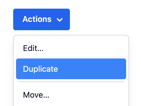
<MenuButton label="Actions" onAction={alert}>
<Item key="copy">Copy</Item>
<Item key="cut">Cut</Item>
<Item key="paste">Paste</Item>
</MenuButton>import {
DismissButton,
FocusScope,
mergeProps,
useButton,
useFocus,
useMenu,
useMenuItem,
useMenuTrigger,
useOverlay
} from 'react-aria';
import {
Item,
useMenuTriggerState,
useTreeState
} from 'react-stately';
function MenuButton(props) {
// Create state based on the incoming props
let state = useMenuTriggerState(props);
// Get props for the menu trigger and menu elements
let ref = React.useRef();
let { menuTriggerProps, menuProps } = useMenuTrigger(
{},
state,
ref
);
// Get props for the button based on the trigger props from useMenuTrigger
let { buttonProps } = useButton(menuTriggerProps, ref);
return (
<div
style={{
position: 'relative',
display: 'inline-block'
}}
>
<button
{...buttonProps}
ref={ref}
style={{ height: 30, fontSize: 14 }}
>
{props.label}
<span aria-hidden="true" style={{ paddingLeft: 5 }}>
▼
</span>
</button>
{state.isOpen &&
(
<MenuPopup
{...props}
{...menuProps}
autoFocus={state.focusStrategy}
onClose={() => state.close()}
/>
)}
</div>
);
}
function MenuPopup(props) {
// Create menu state based on the incoming props
let state = useTreeState({
...props,
selectionMode: 'none'
});
// Get props for the menu element
let ref = React.useRef();
let { menuProps } = useMenu(props, state, ref);
// Handle events that should cause the menu to close,
// e.g. blur, clicking outside, or pressing the escape key.
let overlayRef = React.useRef();
let { overlayProps } = useOverlay({
onClose: props.onClose,
shouldCloseOnBlur: true,
isOpen: true,
isDismissable: true
}, overlayRef);
// Wrap in <FocusScope> so that focus is restored back to the
// trigger when the menu is closed. In addition, add hidden
// <DismissButton> components at the start and end of the list
// to allow screen reader users to dismiss the popup easily.
return (
<FocusScope restoreFocus>
<div {...overlayProps} ref={overlayRef}>
<DismissButton onDismiss={props.onClose} />
<ul
{...mergeProps(menuProps, props.domProps)}
ref={ref}
style={{
position: 'absolute',
width: '100%',
margin: '4px 0 0 0',
padding: 0,
listStyle: 'none',
border: '1px solid gray',
background: 'lightgray'
}}
>
{[...state.collection].map((item) => (
<MenuItem
key={item.key}
item={item}
state={state}
onAction={props.onAction}
onClose={props.onClose}
/>
))}
</ul>
<DismissButton onDismiss={props.onClose} />
</div>
</FocusScope>
);
}
function MenuItem({ item, state, onAction, onClose }) {
// Get props for the menu item element
let ref = React.useRef();
let { menuItemProps } = useMenuItem(
{
key: item.key,
isDisabled: item.isDisabled,
onAction,
onClose
},
state,
ref
);
// Handle focus events so we can apply highlighted
// style to the focused menu item
let [isFocused, setFocused] = React.useState(false);
let { focusProps } = useFocus({
onFocusChange: setFocused
});
return (
<li
{...mergeProps(menuItemProps, focusProps)}
ref={ref}
style={{
background: isFocused ? 'gray' : 'transparent',
color: isFocused ? 'white' : 'black',
padding: '2px 5px',
outline: 'none',
cursor: 'pointer'
}}
>
{item.rendered}
</li>
);
}
<MenuButton label="Actions" onAction={alert}>
<Item key="copy">Copy</Item>
<Item key="cut">Cut</Item>
<Item key="paste">Paste</Item>
</MenuButton>import {
DismissButton,
FocusScope,
mergeProps,
useButton,
useFocus,
useMenu,
useMenuItem,
useMenuTrigger,
useOverlay
} from 'react-aria';
import {
Item,
useMenuTriggerState,
useTreeState
} from 'react-stately';
function MenuButton(
props
) {
// Create state based on the incoming props
let state =
useMenuTriggerState(
props
);
// Get props for the menu trigger and menu elements
let ref = React
.useRef();
let {
menuTriggerProps,
menuProps
} = useMenuTrigger(
{},
state,
ref
);
// Get props for the button based on the trigger props from useMenuTrigger
let { buttonProps } =
useButton(
menuTriggerProps,
ref
);
return (
<div
style={{
position:
'relative',
display:
'inline-block'
}}
>
<button
{...buttonProps}
ref={ref}
style={{
height: 30,
fontSize: 14
}}
>
{props.label}
<span
aria-hidden="true"
style={{
paddingLeft:
5
}}
>
▼
</span>
</button>
{state.isOpen &&
(
<MenuPopup
{...props}
{...menuProps}
autoFocus={state
.focusStrategy}
onClose={() =>
state
.close()}
/>
)}
</div>
);
}
function MenuPopup(
props
) {
// Create menu state based on the incoming props
let state =
useTreeState({
...props,
selectionMode:
'none'
});
// Get props for the menu element
let ref = React
.useRef();
let { menuProps } =
useMenu(
props,
state,
ref
);
// Handle events that should cause the menu to close,
// e.g. blur, clicking outside, or pressing the escape key.
let overlayRef = React
.useRef();
let { overlayProps } =
useOverlay({
onClose:
props.onClose,
shouldCloseOnBlur:
true,
isOpen: true,
isDismissable: true
}, overlayRef);
// Wrap in <FocusScope> so that focus is restored back to the
// trigger when the menu is closed. In addition, add hidden
// <DismissButton> components at the start and end of the list
// to allow screen reader users to dismiss the popup easily.
return (
<FocusScope
restoreFocus
>
<div
{...overlayProps}
ref={overlayRef}
>
<DismissButton
onDismiss={props
.onClose}
/>
<ul
{...mergeProps(
menuProps,
props
.domProps
)}
ref={ref}
style={{
position:
'absolute',
width:
'100%',
margin:
'4px 0 0 0',
padding: 0,
listStyle:
'none',
border:
'1px solid gray',
background:
'lightgray'
}}
>
{[
...state
.collection
].map(
(item) => (
<MenuItem
key={item
.key}
item={item}
state={state}
onAction={props
.onAction}
onClose={props
.onClose}
/>
)
)}
</ul>
<DismissButton
onDismiss={props
.onClose}
/>
</div>
</FocusScope>
);
}
function MenuItem(
{
item,
state,
onAction,
onClose
}
) {
// Get props for the menu item element
let ref = React
.useRef();
let { menuItemProps } =
useMenuItem(
{
key: item.key,
isDisabled:
item
.isDisabled,
onAction,
onClose
},
state,
ref
);
// Handle focus events so we can apply highlighted
// style to the focused menu item
let [
isFocused,
setFocused
] = React.useState(
false
);
let { focusProps } =
useFocus({
onFocusChange:
setFocused
});
return (
<li
{...mergeProps(
menuItemProps,
focusProps
)}
ref={ref}
style={{
background:
isFocused
? 'gray'
: 'transparent',
color: isFocused
? 'white'
: 'black',
padding:
'2px 5px',
outline: 'none',
cursor: 'pointer'
}}
>
{item.rendered}
</li>
);
}
<MenuButton
label="Actions"
onAction={alert}
>
<Item key="copy">
Copy
</Item>
<Item key="cut">
Cut
</Item>
<Item key="paste">
Paste
</Item>
</MenuButton>Styled examples#
Internationalization#
RTL#
In right-to-left languages, the menu button should be mirrored. The arrow should be on the left, and the label should be on the right. In addition, the content of menu items should flip. Ensure that your CSS accounts for this.