useMenu
Provides the behavior and accessibility implementation for a menu component. A menu displays a list of actions or options that a user can choose.
| install | yarn add react-aria |
|---|---|
| version | 3.44.0 |
| usage | import {useMenuTrigger, useMenu, useMenuItem, useMenuSection} from 'react-aria' |
API#
useMenuTrigger<T>(
  props: AriaMenuTriggerProps,
  state: MenuTriggerState,
  ref: RefObject<Element
    |  | null>
): MenuTriggerAria<T>
useMenu<T>(
  props: AriaMenuOptions<T>,
  state: TreeState<T>,
  ref: RefObject<HTMLElement
    |  | null>
): MenuAria
useMenuItem<T>(
  props: AriaMenuItemProps,
  state: TreeState<T>,
  ref: RefObject<FocusableElement
    |  | null>
): MenuItemAria
useMenuSection(
  (props: AriaMenuSectionProps
)): MenuSectionAria
Features#
There is no native element to implement a menu in HTML that is widely supported. useMenuTrigger and useMenu
help achieve accessible menu components that can be styled as needed.
- Exposed to assistive technology as a button with a
menuusing ARIA - Support for single, multiple, or no selection
- Support for disabled items
- Support for sections
- Complex item labeling support for accessibility
- Keyboard navigation support including arrow keys, home/end, page up/down
- Automatic scrolling support during keyboard navigation
- Keyboard support for opening the menu using the arrow keys, including automatically focusing the first or last item accordingly
- Typeahead to allow focusing items by typing text
- Support for use with virtualized lists
Anatomy#
A menu trigger consists of a button or other trigger element combined with a popup menu,
with a list of menu items or groups inside. useMenuTrigger, useMenu, useMenuItem,
and useMenuSection handle exposing this to assistive technology using ARIA, along with
handling keyboard, mouse, and interactions to support selection and focus behavior.
useMenuTrigger returns props that you should spread onto the appropriate element:
| Name | Type | Description |
menuTriggerProps | AriaButtonProps | Props for the menu trigger element. |
menuProps | AriaMenuOptions<T> | Props for the menu. |
useMenu returns props that you should spread onto the menu container element:
| Name | Type | Description |
menuProps | DOMAttributes | Props for the menu element. |
useMenuItem returns props for an individual item and its children:
| Name | Type | Description |
menuItemProps | DOMAttributes | Props for the menu item element. |
labelProps | DOMAttributes | Props for the main text element inside the menu item. |
descriptionProps | DOMAttributes | Props for the description text element inside the menu item, if any. |
keyboardShortcutProps | DOMAttributes | Props for the keyboard shortcut text element inside the item, if any. |
isFocused | boolean | Whether the item is currently focused. |
isFocusVisible | boolean | Whether the item is keyboard focused. |
isSelected | boolean | Whether the item is currently selected. |
isPressed | boolean | Whether the item is currently in a pressed state. |
isDisabled | boolean | Whether the item is disabled. |
useMenuSection returns props for a section:
| Name | Type | Description |
itemProps | DOMAttributes | Props for the wrapper list item. |
headingProps | DOMAttributes | Props for the heading element, if any. |
groupProps | DOMAttributes | Props for the group element. |
State for the trigger is managed by the useMenuTriggerState
hook from @react-stately/menu. State for the menu itself is managed by the useTreeState
hook from @react-stately/tree. These state objects should be passed to the appropriate React Aria hooks.
If a menu, menu item, or group does not have a visible label, an aria-label or aria-labelledby
prop must be passed instead to identify the element to assistive technology.
Example#
A menu consists of several components: a menu button to toggle the menu popup, and the menu itself, which contains items or sections of items. We'll go through each component one by one.
MenuButton#
We'll start with the MenuButton component, which is what will trigger our menu to appear. This uses
the useMenuTrigger and useMenuTriggerState hooks.
The Popover and Button components used in this example are independent, and can be shared by many other components.
The code is available below, and documentation is available on the corresponding pages.
import type {MenuTriggerProps} from 'react-stately';
import {useMenuTrigger} from 'react-aria';
import {Item, useMenuTriggerState} from 'react-stately';

// Reuse the Popover, and Button from your component library. See below for details.
import {Button, Popover} from 'your-component-library';

interface MenuButtonProps<T> extends AriaMenuProps<T>, MenuTriggerProps {
  label?: string;
}

function MenuButton<T extends object>(props: MenuButtonProps<T>) {
  // Create state based on the incoming props
  let state = useMenuTriggerState(props);

  // Get props for the button and menu elements
  let ref = React.useRef(null);
  let { menuTriggerProps, menuProps } = useMenuTrigger<T>({}, state, ref);

  return (
    <>
      <Button
        {...menuTriggerProps}
        buttonRef={ref}
        style={{ height: 30, fontSize: 14 }}
      >
        {props.label}
        <span aria-hidden="true" style={{ paddingLeft: 5 }}>▼</span>
      </Button>
      {state.isOpen &&
        (
          <Popover state={state} triggerRef={ref} placement="bottom start">
            <Menu
              {...props}
              {...menuProps}
            />
          </Popover>
        )}
    </>
  );
}
import type {MenuTriggerProps} from 'react-stately';
import {useMenuTrigger} from 'react-aria';
import {Item, useMenuTriggerState} from 'react-stately';

// Reuse the Popover, and Button from your component library. See below for details.
import {Button, Popover} from 'your-component-library';

interface MenuButtonProps<T>
  extends AriaMenuProps<T>, MenuTriggerProps {
  label?: string;
}

function MenuButton<T extends object>(
  props: MenuButtonProps<T>
) {
  // Create state based on the incoming props
  let state = useMenuTriggerState(props);

  // Get props for the button and menu elements
  let ref = React.useRef(null);
  let { menuTriggerProps, menuProps } = useMenuTrigger<T>(
    {},
    state,
    ref
  );

  return (
    <>
      <Button
        {...menuTriggerProps}
        buttonRef={ref}
        style={{ height: 30, fontSize: 14 }}
      >
        {props.label}
        <span aria-hidden="true" style={{ paddingLeft: 5 }}>
          ▼
        </span>
      </Button>
      {state.isOpen &&
        (
          <Popover
            state={state}
            triggerRef={ref}
            placement="bottom start"
          >
            <Menu
              {...props}
              {...menuProps}
            />
          </Popover>
        )}
    </>
  );
}
import type {MenuTriggerProps} from 'react-stately';
import {useMenuTrigger} from 'react-aria';
import {
  Item,
  useMenuTriggerState
} from 'react-stately';

// Reuse the Popover, and Button from your component library. See below for details.
import {
  Button,
  Popover
} from 'your-component-library';

interface MenuButtonProps<
  T
> extends
  AriaMenuProps<T>,
  MenuTriggerProps {
  label?: string;
}

function MenuButton<
  T extends object
>(
  props: MenuButtonProps<
    T
  >
) {
  // Create state based on the incoming props
  let state =
    useMenuTriggerState(
      props
    );

  // Get props for the button and menu elements
  let ref = React.useRef(
    null
  );
  let {
    menuTriggerProps,
    menuProps
  } = useMenuTrigger<T>(
    {},
    state,
    ref
  );

  return (
    <>
      <Button
        {...menuTriggerProps}
        buttonRef={ref}
        style={{
          height: 30,
          fontSize: 14
        }}
      >
        {props.label}
        <span
          aria-hidden="true"
          style={{
            paddingLeft:
              5
          }}
        >
          ▼
        </span>
      </Button>
      {state.isOpen &&
        (
          <Popover
            state={state}
            triggerRef={ref}
            placement="bottom start"
          >
            <Menu
              {...props}
              {...menuProps}
            />
          </Popover>
        )}
    </>
  );
}
Menu#
Next, let's implement the Menu component. This will appear inside the Popover when the user presses the button.
It is built using the useMenu and useTreeState hooks.
For each item in the collection in state, we render either a MenuItem or MenuSection (defined below) according to the item's type property.
import type {AriaMenuProps} from 'react-aria';
import {useTreeState} from 'react-stately';
import {useMenu} from 'react-aria';

function Menu<T extends object>(props: AriaMenuProps<T>) {
  // Create menu state based on the incoming props
  let state = useTreeState(props);

  // Get props for the menu element
  let ref = React.useRef(null);
  let { menuProps } = useMenu(props, state, ref);

  return (
    <ul {...menuProps} ref={ref}>
      {[...state.collection].map((item) => (
        item.type === 'section'
          ? <MenuSection key={item.key} section={item} state={state} />
          : <MenuItem key={item.key} item={item} state={state} />
      ))}
    </ul>
  );
}
import type {AriaMenuProps} from 'react-aria';
import {useTreeState} from 'react-stately';
import {useMenu} from 'react-aria';

function Menu<T extends object>(props: AriaMenuProps<T>) {
  // Create menu state based on the incoming props
  let state = useTreeState(props);

  // Get props for the menu element
  let ref = React.useRef(null);
  let { menuProps } = useMenu(props, state, ref);

  return (
    <ul {...menuProps} ref={ref}>
      {[...state.collection].map((item) => (
        item.type === 'section'
          ? (
            <MenuSection
              key={item.key}
              section={item}
              state={state}
            />
          )
          : (
            <MenuItem
              key={item.key}
              item={item}
              state={state}
            />
          )
      ))}
    </ul>
  );
}
import type {AriaMenuProps} from 'react-aria';
import {useTreeState} from 'react-stately';
import {useMenu} from 'react-aria';

function Menu<
  T extends object
>(
  props: AriaMenuProps<T>
) {
  // Create menu state based on the incoming props
  let state =
    useTreeState(props);

  // Get props for the menu element
  let ref = React.useRef(
    null
  );
  let { menuProps } =
    useMenu(
      props,
      state,
      ref
    );

  return (
    <ul
      {...menuProps}
      ref={ref}
    >
      {[
        ...state
          .collection
      ].map((item) => (
        item.type ===
            'section'
          ? (
            <MenuSection
              key={item
                .key}
              section={item}
              state={state}
            />
          )
          : (
            <MenuItem
              key={item
                .key}
              item={item}
              state={state}
            />
          )
      ))}
    </ul>
  );
}
MenuItem#
Now let's implement MenuItem. This is built using useMenuItem,
and the state object passed via props from Menu.
import {useMenuItem} from 'react-aria';

function MenuItem({ item, state }) {
  // Get props for the menu item element
  let ref = React.useRef(null);
  let { menuItemProps, isSelected } = useMenuItem(
    { key: item.key },
    state,
    ref
  );

  return (
    <li {...menuItemProps} ref={ref}>
      {item.rendered}
      {isSelected && <span aria-hidden="true">✅</span>}
    </li>
  );
}
import {useMenuItem} from 'react-aria';

function MenuItem(
  { item, state }
) {
  // Get props for the menu item element
  let ref = React.useRef(
    null
  );
  let {
    menuItemProps,
    isSelected
  } = useMenuItem(
    { key: item.key },
    state,
    ref
  );

  return (
    <li
      {...menuItemProps}
      ref={ref}
    >
      {item.rendered}
      {isSelected && (
        <span aria-hidden="true">
          ✅
        </span>
      )}
    </li>
  );
}
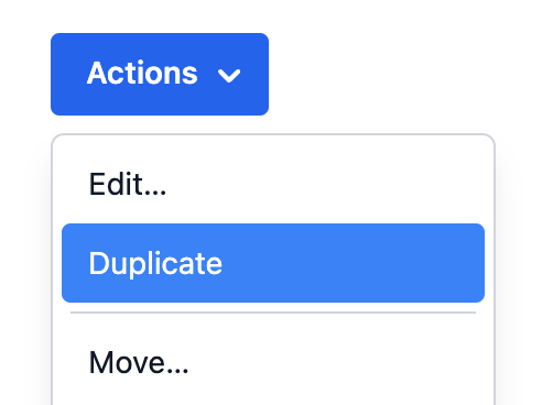
Now we can render a simple menu with actionable items:
<MenuButton label="Actions" onAction={alert}>
  <Item key="copy">Copy</Item>
  <Item key="cut">Cut</Item>
  <Item key="paste">Paste</Item>
</MenuButton><MenuButton label="Actions" onAction={alert}>
<Item key="copy">Copy</Item>
<Item key="cut">Cut</Item>
<Item key="paste">Paste</Item>
</MenuButton><MenuButton
label="Actions"
onAction={alert}
>
<Item key="copy">
Copy
</Item>
<Item key="cut">
Cut
</Item>
<Item key="paste">
Paste
</Item>
</MenuButton>Show CSS
[role=menu] {
  margin: 0;
  padding: 0;
  list-style: none;
  width: 200px;
}

[role=menuitem],
[role=menuitemradio],
[role=menuitemcheckbox] {
  padding: 2px 5px;
  outline: none;
  cursor: default;
  display: flex;
  justify-content: space-between;
  color: black;

  &:focus {
    background: gray;
    color: white;
  }

  &[aria-disabled] {
    color: gray;
  }
}[role=menu] {
margin: 0;
padding: 0;
list-style: none;
width: 200px;
}
[role=menuitem],
[role=menuitemradio],
[role=menuitemcheckbox] {
padding: 2px 5px;
outline: none;
cursor: default;
display: flex;
justify-content: space-between;
color: black;
&:focus {
background: gray;
color: white;
}
&[aria-disabled] {
color: gray;
}
}Popover#
The Popover component is used to contain the menu.
It can be shared between many other components, including ComboBox,
Select, and others.
See usePopover for more examples of popovers.
Show code
import {DismissButton, Overlay, usePopover} from 'react-aria';
import type {AriaPopoverProps} from 'react-aria';
import type {OverlayTriggerState} from 'react-stately';

interface PopoverProps extends Omit<AriaPopoverProps, 'popoverRef'> {
  children: React.ReactNode;
  state: OverlayTriggerState;
}

function Popover({ children, state, ...props }: PopoverProps) {
  let popoverRef = React.useRef(null);
  let { popoverProps, underlayProps } = usePopover({
    ...props,
    popoverRef
  }, state);

  return (
    <Overlay>
      <div {...underlayProps} style={{ position: 'fixed', inset: 0 }} />
      <div
        {...popoverProps}
        ref={popoverRef}
        style={{
          ...popoverProps.style,
          background: 'lightgray',
          border: '1px solid gray'
        }}
      >
        <DismissButton onDismiss={state.close} />
        {children}
        <DismissButton onDismiss={state.close} />
      </div>
    </Overlay>
  );
}
import {
  DismissButton,
  Overlay,
  usePopover
} from 'react-aria';
import type {AriaPopoverProps} from 'react-aria';
import type {OverlayTriggerState} from 'react-stately';

interface PopoverProps
  extends Omit<AriaPopoverProps, 'popoverRef'> {
  children: React.ReactNode;
  state: OverlayTriggerState;
}

function Popover(
  { children, state, ...props }: PopoverProps
) {
  let popoverRef = React.useRef(null);
  let { popoverProps, underlayProps } = usePopover({
    ...props,
    popoverRef
  }, state);

  return (
    <Overlay>
      <div
        {...underlayProps}
        style={{ position: 'fixed', inset: 0 }}
      />
      <div
        {...popoverProps}
        ref={popoverRef}
        style={{
          ...popoverProps.style,
          background: 'lightgray',
          border: '1px solid gray'
        }}
      >
        <DismissButton onDismiss={state.close} />
        {children}
        <DismissButton onDismiss={state.close} />
      </div>
    </Overlay>
  );
}
import {
  DismissButton,
  Overlay,
  usePopover
} from 'react-aria';
import type {AriaPopoverProps} from 'react-aria';
import type {OverlayTriggerState} from 'react-stately';

interface PopoverProps
  extends
    Omit<
      AriaPopoverProps,
      'popoverRef'
    > {
  children:
    React.ReactNode;
  state:
    OverlayTriggerState;
}

function Popover(
  {
    children,
    state,
    ...props
  }: PopoverProps
) {
  let popoverRef = React
    .useRef(null);
  let {
    popoverProps,
    underlayProps
  } = usePopover({
    ...props,
    popoverRef
  }, state);

  return (
    <Overlay>
      <div
        {...underlayProps}
        style={{
          position:
            'fixed',
          inset: 0
        }}
      />
      <div
        {...popoverProps}
        ref={popoverRef}
        style={{
          ...popoverProps
            .style,
          background:
            'lightgray',
          border:
            '1px solid gray'
        }}
      >
        <DismissButton
          onDismiss={state
            .close}
        />
        {children}
        <DismissButton
          onDismiss={state
            .close}
        />
      </div>
    </Overlay>
  );
}
Button#
The Button component is used in the above example to toggle the menu. It is built using the useButton hook, and can be shared with many other components.
Show code
import {useButton} from 'react-aria';

function Button(props) {
  let ref = props.buttonRef;
  let { buttonProps } = useButton(props, ref);
  return (
    <button {...buttonProps} ref={ref} style={props.style}>
      {props.children}
    </button>
  );
}
import {useButton} from 'react-aria';

function Button(props) {
  let ref = props.buttonRef;
  let { buttonProps } = useButton(props, ref);
  return (
    <button {...buttonProps} ref={ref} style={props.style}>
      {props.children}
    </button>
  );
}
import {useButton} from 'react-aria';

function Button(props) {
  let ref =
    props.buttonRef;
  let { buttonProps } =
    useButton(
      props,
      ref
    );
  return (
    <button
      {...buttonProps}
      ref={ref}
      style={props.style}
    >
      {props.children}
    </button>
  );
}
Styled examples#
Dynamic collections#
Menu follows the Collection Components API, accepting both static and dynamic collections.
The examples above show static collections, which can be used when the full list of options is known ahead of time. Dynamic collections,
as shown below, can be used when the options come from an external data source such as an API call, or update over time.
As seen below, an iterable list of options is passed to the ComboBox using the items prop. Each item accepts a key prop, which
is passed to the onSelectionChange handler to identify the selected item. Alternatively, if the item objects contain an id property,
as shown in the example below, then this is used automatically and a key prop is not required.
function Example() {
  let items = [
    {id: 1, name: 'New'},
    {id: 2, name: 'Open'},
    {id: 3, name: 'Close'},
    {id: 4, name: 'Save'},
    {id: 5, name: 'Duplicate'},
    {id: 6, name: 'Rename'},
    {id: 7, name: 'Move'}
  ];

  return (
    <MenuButton label="Actions" items={items} onAction={alert}>
      {(item) => <Item>{item.name}</Item>}
    </MenuButton>
  );
}
function Example() {
let items = [
{ id: 1, name: 'New' },
{ id: 2, name: 'Open' },
{ id: 3, name: 'Close' },
{ id: 4, name: 'Save' },
{ id: 5, name: 'Duplicate' },
{ id: 6, name: 'Rename' },
{ id: 7, name: 'Move' }
];
return (
<MenuButton
label="Actions"
items={items}
onAction={alert}
>
{(item) => <Item>{item.name}</Item>}
</MenuButton>
);
}
function Example() {
  let items = [
    {
      id: 1,
      name: 'New'
    },
    {
      id: 2,
      name: 'Open'
    },
    {
      id: 3,
      name: 'Close'
    },
    {
      id: 4,
      name: 'Save'
    },
    {
      id: 5,
      name: 'Duplicate'
    },
    {
      id: 6,
      name: 'Rename'
    },
    {
      id: 7,
      name: 'Move'
    }
  ];

  return (
    <MenuButton
      label="Actions"
      items={items}
      onAction={alert}
    >
      {(item) => (
        <Item>
          {item.name}
        </Item>
      )}
    </MenuButton>
  );
}
Selection#
Menu supports multiple selection modes. By default, selection is disabled, however this can be changed using the selectionMode prop.
Use defaultSelectedKeys to provide a default set of selected items (uncontrolled) and selectedKeys to set the selected items (controlled). The value of the selected keys must match the key prop of the items.
See the react-stately Selection docs for more details.
import type {Selection} from 'react-stately';

function Example() {
  let [selected, setSelected] = React.useState<Selection>(
    new Set(['sidebar', 'console'])
  );

  return (
    <>
      <MenuButton
        label="View"
        selectionMode="multiple"
        selectedKeys={selected}
        onSelectionChange={setSelected}
      >
        <Item key="sidebar">Sidebar</Item>
        <Item key="searchbar">Searchbar</Item>
        <Item key="tools">Tools</Item>
        <Item key="console">Console</Item>
      </MenuButton>
      <p>
        Current selection (controlled):{' '}
        {selected === 'all' ? 'all' : [...selected].join(', ')}
      </p>
    </>
  );
}
import type {Selection} from 'react-stately';

function Example() {
  let [selected, setSelected] = React.useState<Selection>(
    new Set(['sidebar', 'console'])
  );

  return (
    <>
      <MenuButton
        label="View"
        selectionMode="multiple"
        selectedKeys={selected}
        onSelectionChange={setSelected}
      >
        <Item key="sidebar">Sidebar</Item>
        <Item key="searchbar">Searchbar</Item>
        <Item key="tools">Tools</Item>
        <Item key="console">Console</Item>
      </MenuButton>
      <p>
        Current selection (controlled): {selected === 'all'
          ? 'all'
          : [...selected].join(', ')}
      </p>
    </>
  );
}
import type {Selection} from 'react-stately';

function Example() {
  let [
    selected,
    setSelected
  ] = React.useState<
    Selection
  >(
    new Set([
      'sidebar',
      'console'
    ])
  );

  return (
    <>
      <MenuButton
        label="View"
        selectionMode="multiple"
        selectedKeys={selected}
        onSelectionChange={setSelected}
      >
        <Item key="sidebar">
          Sidebar
        </Item>
        <Item key="searchbar">
          Searchbar
        </Item>
        <Item key="tools">
          Tools
        </Item>
        <Item key="console">
          Console
        </Item>
      </MenuButton>
      <p>
        Current selection
        (controlled):
        {' '}
        {selected ===
            'all'
          ? 'all'
          : [...selected]
            .join(', ')}
      </p>
    </>
  );
}
Sections#
Menu supports sections with separators and headings in order to group options. Sections can be used by wrapping groups of Items in a Section component. Each Section takes a title and key prop.
To implement sections, implement the ListBoxSection component referenced above
using the useMenuSection hook. It will include four extra elements:
an <li> between the sections to represent the separator, an <li> to contain the heading <span> element, and a
<ul> to contain the child items. This structure is necessary to ensure HTML
semantics are correct.
import {useMenuSection, useSeparator} from 'react-aria';

function MenuSection({ section, state }) {
  let { itemProps, headingProps, groupProps } = useMenuSection({
    heading: section.rendered,
    'aria-label': section['aria-label']
  });

  let { separatorProps } = useSeparator({
    elementType: 'li'
  });

  // If the section is not the first, add a separator element.
  // The heading is rendered inside an <li> element, which contains
  // a <ul> with the child items.
  return (
    <>
      {section.key !== state.collection.getFirstKey() &&
        (
          <li
            {...separatorProps}
            style={{
              borderTop: '1px solid gray',
              margin: '2px 5px'
            }}
          />
        )}
      <li {...itemProps}>
        {section.rendered &&
          (
            <span
              {...headingProps}
              style={{
                fontWeight: 'bold',
                fontSize: '1.1em',
                padding: '2px 5px'
              }}
            >
              {section.rendered}
            </span>
          )}
        <ul
          {...groupProps}
          style={{
            padding: 0,
            listStyle: 'none'
          }}
        >
          {[...section.childNodes].map((node) => (
            <MenuItem
              key={node.key}
              item={node}
              state={state}
            />
          ))}
        </ul>
      </li>
    </>
  );
}
import {useMenuSection, useSeparator} from 'react-aria';

function MenuSection({ section, state }) {
  let { itemProps, headingProps, groupProps } =
    useMenuSection({
      heading: section.rendered,
      'aria-label': section['aria-label']
    });

  let { separatorProps } = useSeparator({
    elementType: 'li'
  });

  // If the section is not the first, add a separator element.
  // The heading is rendered inside an <li> element, which contains
  // a <ul> with the child items.
  return (
    <>
      {section.key !== state.collection.getFirstKey() &&
        (
          <li
            {...separatorProps}
            style={{
              borderTop: '1px solid gray',
              margin: '2px 5px'
            }}
          />
        )}
      <li {...itemProps}>
        {section.rendered &&
          (
            <span
              {...headingProps}
              style={{
                fontWeight: 'bold',
                fontSize: '1.1em',
                padding: '2px 5px'
              }}
            >
              {section.rendered}
            </span>
          )}
        <ul
          {...groupProps}
          style={{
            padding: 0,
            listStyle: 'none'
          }}
        >
          {[...section.childNodes].map((node) => (
            <MenuItem
              key={node.key}
              item={node}
              state={state}
            />
          ))}
        </ul>
      </li>
    </>
  );
}
import {
  useMenuSection,
  useSeparator
} from 'react-aria';

function MenuSection(
  { section, state }
) {
  let {
    itemProps,
    headingProps,
    groupProps
  } = useMenuSection({
    heading:
      section.rendered,
    'aria-label':
      section[
        'aria-label'
      ]
  });

  let {
    separatorProps
  } = useSeparator({
    elementType: 'li'
  });

  // If the section is not the first, add a separator element.
  // The heading is rendered inside an <li> element, which contains
  // a <ul> with the child items.
  return (
    <>
      {section.key !==
          state
            .collection
            .getFirstKey() &&
        (
          <li
            {...separatorProps}
            style={{
              borderTop:
                '1px solid gray',
              margin:
                '2px 5px'
            }}
          />
        )}
      <li {...itemProps}>
        {section
          .rendered &&
          (
            <span
              {...headingProps}
              style={{
                fontWeight:
                  'bold',
                fontSize:
                  '1.1em',
                padding:
                  '2px 5px'
              }}
            >
              {section
                .rendered}
            </span>
          )}
        <ul
          {...groupProps}
          style={{
            padding: 0,
            listStyle:
              'none'
          }}
        >
          {[
            ...section
              .childNodes
          ].map(
            (node) => (
              <MenuItem
                key={node
                  .key}
                item={node}
                state={state}
              />
            )
          )}
        </ul>
      </li>
    </>
  );
}
Static items#
With this in place, we can now render a static menu with multiple sections:
import {Section} from 'react-stately';

<MenuButton label="Actions" onAction={alert}>
  <Section title="Styles">
    <Item key="bold">Bold</Item>
    <Item key="underline">Underline</Item>
  </Section>
  <Section title="Align">
    <Item key="left">Left</Item>
    <Item key="middle">Middle</Item>
    <Item key="right">Right</Item>
  </Section>
</MenuButton>
import {Section} from 'react-stately';
<MenuButton label="Actions" onAction={alert}>
<Section title="Styles">
<Item key="bold">Bold</Item>
<Item key="underline">Underline</Item>
</Section>
<Section title="Align">
<Item key="left">Left</Item>
<Item key="middle">Middle</Item>
<Item key="right">Right</Item>
</Section>
</MenuButton>import {Section} from 'react-stately';
<MenuButton
label="Actions"
onAction={alert}
>
<Section title="Styles">
<Item key="bold">
Bold
</Item>
<Item key="underline">
Underline
</Item>
</Section>
<Section title="Align">
<Item key="left">
Left
</Item>
<Item key="middle">
Middle
</Item>
<Item key="right">
Right
</Item>
</Section>
</MenuButton>Dynamic items#
The above example shows sections with static items. Sections can also be populated from a hierarchical data structure.
Similarly to the props on Menu, <Section> takes an array of data using the items prop.
import type {Selection} from 'react-stately';

function Example() {
  let [selected, setSelected] = React.useState<Selection>(new Set([1,3]));
  let openWindows = [
    {
      name: 'Left Panel',
      id: 'left',
      children: [
        {id: 1, name: 'Final Copy (1)'}
      ]
    },
    {
      name: 'Right Panel',
      id: 'right',
      children: [
        {id: 2, name: 'index.ts'},
        {id: 3, name: 'package.json'},
        {id: 4, name: 'license.txt'}
      ]
    }
  ];

  return (
    <MenuButton
      label="Window"
      items={openWindows}
      selectionMode="multiple"
      selectedKeys={selected}
      onSelectionChange={setSelected}>
      {item => (
        <Section items={item.children} title={item.name}>
          {item => <Item>{item.name}</Item>}
        </Section>
      )}
    </MenuButton>
  );
}
import type {Selection} from 'react-stately';
function Example() {
let [selected, setSelected] = React.useState<Selection>(
new Set([1, 3])
);
let openWindows = [
{
name: 'Left Panel',
id: 'left',
children: [
{ id: 1, name: 'Final Copy (1)' }
]
},
{
name: 'Right Panel',
id: 'right',
children: [
{ id: 2, name: 'index.ts' },
{ id: 3, name: 'package.json' },
{ id: 4, name: 'license.txt' }
]
}
];
return (
<MenuButton
label="Window"
items={openWindows}
selectionMode="multiple"
selectedKeys={selected}
onSelectionChange={setSelected}
>
{(item) => (
<Section items={item.children} title={item.name}>
{(item) => <Item>{item.name}</Item>}
</Section>
)}
</MenuButton>
);
}
import type {Selection} from 'react-stately';

function Example() {
  let [
    selected,
    setSelected
  ] = React.useState<
    Selection
  >(new Set([1, 3]));
  let openWindows = [
    {
      name: 'Left Panel',
      id: 'left',
      children: [
        {
          id: 1,
          name:
            'Final Copy (1)'
        }
      ]
    },
    {
      name:
        'Right Panel',
      id: 'right',
      children: [
        {
          id: 2,
          name:
            'index.ts'
        },
        {
          id: 3,
          name:
            'package.json'
        },
        {
          id: 4,
          name:
            'license.txt'
        }
      ]
    }
  ];

  return (
    <MenuButton
      label="Window"
      items={openWindows}
      selectionMode="multiple"
      selectedKeys={selected}
      onSelectionChange={setSelected}
    >
      {(item) => (
        <Section
          items={item
            .children}
          title={item
            .name}
        >
          {(item) => (
            <Item>
              {item.name}
            </Item>
          )}
        </Section>
      )}
    </MenuButton>
  );
}
Accessibility#
Sections without a title must provide an aria-label for accessibility.
Complex menu items#
By default, menu items that only contain text will be labeled by the contents of the item.
For items that have more complex content (e.g. icons, multiple lines of text, keyboard shortcuts, etc.),
use labelProps, descriptionProps, and keyboardShortcutProps
from useMenuItem
as needed to apply to the main text element of the menu item, its description, and keyboard
shortcut text. This improves screen reader announcement.
NOTE: menu items cannot contain interactive content (e.g. buttons, checkboxes, etc.).
To implement this, we'll update the MenuItem component to apply the ARIA properties
returned by useMenuItem to the appropriate
elements. In this example, we'll pull them out of props.children and use React.cloneElement
to apply the props, but you may want to use a more robust approach (e.g. context).
function MenuItem({item, state}) {
  // Get props for the menu item element and child elements
  let ref = React.useRef(null);
  let {
    menuItemProps,
    labelProps,
    descriptionProps,
    keyboardShortcutProps
  } = useMenuItem({key: item.key}, state, ref);

  // Pull out the three expected children. We will clone them
  // and add the necessary props for accessibility.
  let [title, description, shortcut] = item.rendered;

  return (
    <li {...menuItemProps} ref={ref}>
      <div>
        {React.cloneElement(title, labelProps)}
        {React.cloneElement(description, descriptionProps)}
      </div>
      {React.cloneElement(shortcut, keyboardShortcutProps)}
    </li>
  );
}

<MenuButton label="Actions" onAction={alert}>
  <Item textValue="Copy" key="copy">
    <div><strong>Copy</strong></div>
    <div>Copy the selected text</div>
    <kbd>⌘C</kbd>
  </Item>
  <Item textValue="Cut" key="cut">
    <div><strong>Cut</strong></div>
    <div>Cut the selected text</div>
    <kbd>⌘X</kbd>
  </Item>
  <Item textValue="Paste" key="paste">
    <div><strong>Paste</strong></div>
    <div>Paste the copied text</div>
    <kbd>⌘V</kbd>
  </Item>
</MenuButton>
function MenuItem({ item, state }) {
// Get props for the menu item element and child elements
let ref = React.useRef(null);
let {
menuItemProps,
labelProps,
descriptionProps,
keyboardShortcutProps
} = useMenuItem({ key: item.key }, state, ref);
// Pull out the three expected children. We will clone them
// and add the necessary props for accessibility.
let [title, description, shortcut] = item.rendered;
return (
<li {...menuItemProps} ref={ref}>
<div>
{React.cloneElement(title, labelProps)}
{React.cloneElement(description, descriptionProps)}
</div>
{React.cloneElement(shortcut, keyboardShortcutProps)}
</li>
);
}
<MenuButton label="Actions" onAction={alert}>
<Item textValue="Copy" key="copy">
<div>
<strong>Copy</strong>
</div>
<div>Copy the selected text</div>
<kbd>⌘C</kbd>
</Item>
<Item textValue="Cut" key="cut">
<div>
<strong>Cut</strong>
</div>
<div>Cut the selected text</div>
<kbd>⌘X</kbd>
</Item>
<Item textValue="Paste" key="paste">
<div>
<strong>Paste</strong>
</div>
<div>Paste the copied text</div>
<kbd>⌘V</kbd>
</Item>
</MenuButton>function MenuItem(
{ item, state }
) {
// Get props for the menu item element and child elements
let ref = React.useRef(
null
);
let {
menuItemProps,
labelProps,
descriptionProps,
keyboardShortcutProps
} = useMenuItem(
{ key: item.key },
state,
ref
);
// Pull out the three expected children. We will clone them
// and add the necessary props for accessibility.
let [
title,
description,
shortcut
] = item.rendered;
return (
<li
{...menuItemProps}
ref={ref}
>
<div>
{React
.cloneElement(
title,
labelProps
)}
{React
.cloneElement(
description,
descriptionProps
)}
</div>
{React
.cloneElement(
shortcut,
keyboardShortcutProps
)}
</li>
);
}
<MenuButton
label="Actions"
onAction={alert}
>
<Item
textValue="Copy"
key="copy"
>
<div>
<strong>
Copy
</strong>
</div>
<div>
Copy the selected
text
</div>
<kbd>⌘C</kbd>
</Item>
<Item
textValue="Cut"
key="cut"
>
<div>
<strong>
Cut
</strong>
</div>
<div>
Cut the selected
text
</div>
<kbd>⌘X</kbd>
</Item>
<Item
textValue="Paste"
key="paste"
>
<div>
<strong>
Paste
</strong>
</div>
<div>
Paste the copied
text
</div>
<kbd>⌘V</kbd>
</Item>
</MenuButton>Disabled items#
useMenu supports marking items as disabled using the disabledKeys prop. Each key in this list
corresponds with the key prop passed to the Item component, or automatically derived from the values passed
to the items prop. See Collections for more details.
Disabled items are not focusable or keyboard navigable, and do not trigger onAction or onSelectionChange.
The isDisabled property returned by useMenuItem can be used to style the item appropriately.
<MenuButton label="Actions" onAction={alert} disabledKeys={['paste']}>
  <Item key="copy">Copy</Item>
  <Item key="cut">Cut</Item>
  <Item key="paste">Paste</Item>
</MenuButton><MenuButton
label="Actions"
onAction={alert}
disabledKeys={['paste']}
>
<Item key="copy">Copy</Item>
<Item key="cut">Cut</Item>
<Item key="paste">Paste</Item>
</MenuButton><MenuButton
label="Actions"
onAction={alert}
disabledKeys={[
'paste'
]}
>
<Item key="copy">
Copy
</Item>
<Item key="cut">
Cut
</Item>
<Item key="paste">
Paste
</Item>
</MenuButton>Links#
By default, interacting with an item in a Menu triggers onAction and optionally onSelectionChange depending on the selectionMode. Alternatively, items may be links to another page or website. This can be achieved by passing the href prop to the <Item> component. Link items in a menu are not selectable.
This example shows how to update the MenuItem component with support for rendering an <a> element if an href prop is passed to the item. Note that you'll also need to render the Menu as a <div> instead of a <ul>, since an <a> inside a <ul> is not valid HTML.
function MenuItem({item, state}) {
  // Get props for the menu item element and child elements
  let ref = React.useRef(null);
  let {menuItemProps} = useMenuItem({key: item.key}, state, ref);
  let ElementType: React.ElementType = item.props.href ? 'a' : 'div';
  return (
    <ElementType {...menuItemProps} ref={ref}>
      {item.rendered}
    </ElementType>
  );
}

<MenuButton label="Links">
  <Item href="https://adobe.com/" target="_blank">Adobe</Item>
  <Item href="https://apple.com/" target="_blank">Apple</Item>
  <Item href="https://google.com/" target="_blank">Google</Item>
  <Item href="https://microsoft.com/" target="_blank">Microsoft</Item>
</MenuButton>
function MenuItem({ item, state }) {
// Get props for the menu item element and child elements
let ref = React.useRef(null);
let { menuItemProps } = useMenuItem(
{ key: item.key },
state,
ref
);
let ElementType: React.ElementType = item.props.href
? 'a'
: 'div';
return (
<ElementType {...menuItemProps} ref={ref}>
{item.rendered}
</ElementType>
);
}
<MenuButton label="Links">
<Item href="https://adobe.com/" target="_blank">
Adobe
</Item>
<Item href="https://apple.com/" target="_blank">
Apple
</Item>
<Item href="https://google.com/" target="_blank">
Google
</Item>
<Item href="https://microsoft.com/" target="_blank">
Microsoft
</Item>
</MenuButton>function MenuItem(
{ item, state }
) {
// Get props for the menu item element and child elements
let ref = React.useRef(
null
);
let { menuItemProps } =
useMenuItem(
{ key: item.key },
state,
ref
);
let ElementType:
React.ElementType =
item.props.href
? 'a'
: 'div';
return (
<ElementType
{...menuItemProps}
ref={ref}
>
{item.rendered}
</ElementType>
);
}
<MenuButton label="Links">
<Item
href="https://adobe.com/"
target="_blank"
>
Adobe
</Item>
<Item
href="https://apple.com/"
target="_blank"
>
Apple
</Item>
<Item
href="https://google.com/"
target="_blank"
>
Google
</Item>
<Item
href="https://microsoft.com/"
target="_blank"
>
Microsoft
</Item>
</MenuButton>Client side routing#
The <Item> component works with frameworks and client side routers like Next.js and React Router. As with other React Aria components that support links, this works via the RouterProvider component at the root of your app. See the client side routing guide to learn how to set this up.
Controlled open state#
The open state of the menu can be controlled via the defaultOpen and isOpen props
function Example() {
  let [open, setOpen] = React.useState(false);

  return (
    <>
      <p>Menu is {open ? 'open' : 'closed'}</p>
      <MenuButton
        label="View"
        isOpen={open}
        onOpenChange={setOpen}>
        <Item key="side">Side bar</Item>
        <Item key="options">Page options</Item>
        <Item key="edit">Edit Panel</Item>
      </MenuButton>
    </>
  );
}
function Example() {
let [open, setOpen] = React.useState(false);
return (
<>
<p>Menu is {open ? 'open' : 'closed'}</p>
<MenuButton
label="View"
isOpen={open}
onOpenChange={setOpen}>
<Item key="side">Side bar</Item>
<Item key="options">Page options</Item>
<Item key="edit">Edit Panel</Item>
</MenuButton>
</>
);
}function Example() {
let [open, setOpen] =
React.useState(
false
);
return (
<>
<p>
Menu is {open
? 'open'
: 'closed'}
</p>
<MenuButton
label="View"
isOpen={open}
onOpenChange={setOpen}
>
<Item key="side">
Side bar
</Item>
<Item key="options">
Page options
</Item>
<Item key="edit">
Edit Panel
</Item>
</MenuButton>
</>
);
}
Internationalization#
useMenu handles some aspects of internationalization automatically.
For example, type to select is implemented with an
Intl.Collator
for internationalized string matching. You are responsible for localizing all menu item labels for
content that is passed into the menu.
RTL#
In right-to-left languages, the menu button should be mirrored. The arrow should be on the left, and the label should be on the right. In addition, the content of menu items should flip. Ensure that your CSS accounts for this.