useTable
Provides the behavior and accessibility implementation for a table component. A table displays data in rows and columns and enables a user to navigate its contents via directional navigation keys, and optionally supports row selection and sorting.
| install | yarn add react-aria |
|---|---|
| version | 3.44.0 |
| usage | import {useTable, useTableCell, useTableColumnHeader, useTableRow, useTableHeaderRow, useTableRowGroup, useTableSelectAllCheckbox, useTableSelectionCheckbox, useTableColumnResize} from 'react-aria' |
API#
useTable<T>(
  props: AriaTableProps,
  state: TableState<T>
    |  | TreeGridState<T>,
  ref: RefObject<HTMLElement
    |  | null>
): GridAria
useTableRowGroup(): GridRowGroupAria
useTableHeaderRow<T>(
  props: GridRowProps<T>,
  state: TableState<T>,
  ref: RefObject<Element
    |  | null>
): TableHeaderRowAria
useTableColumnHeader<T>(
  props: AriaTableColumnHeaderProps<T>,
  state: TableState<T>,
  ref: RefObject<FocusableElement
    |  | null>
): TableColumnHeaderAria
useTableRow<T>(
  props: GridRowProps<T>,
  state: TableState<T>
    |  | TreeGridState<T>,
  ref: RefObject<FocusableElement
    |  | null>
): GridRowAria
useTableCell<T>(
  props: AriaTableCellProps,
  state: TableState<T>,
  ref: RefObject<FocusableElement
    |  | null>
): TableCellAria
useTableSelectionCheckbox<T>(
  (props: AriaTableSelectionCheckboxProps,
  , state: TableState<T>
)): TableSelectionCheckboxAria
useTableSelectAllCheckbox<T>(
  (state: TableState<T>
)): TableSelectAllCheckboxAria
useTableColumnResize<T>(
  props: AriaTableColumnResizeProps<T>,
  state: TableColumnResizeState<T>,
  ref: RefObject<HTMLInputElement
    |  | null>
): TableColumnResizeAria
Features#
A table can be built using the <table>, <tr>,
<td>, and other table specific HTML elements, but is very limited in functionality especially when it comes to user interactions.
HTML tables are meant for static content, rather than tables with rich interactions like focusable elements within cells, keyboard navigation, row selection, sorting, etc.
useTable helps achieve accessible and interactive table components that can be styled as needed.
- Exposed to assistive technology as a
gridusing ARIA - Keyboard navigation between columns, rows, cells, and in-cell focusable elements via the arrow keys
- Single, multiple, or no row selection via mouse, touch, or keyboard interactions
- Support for disabled rows, which cannot be selected
- Optional support for checkboxes in each row for selection, as well as in the header to select all rows
- Support for both
toggleandreplaceselection behaviors - Support for row actions via double click, Enter key, or tapping
- Long press to enter selection mode on touch when there is both selection and row actions
- Column sorting support
- Async loading, infinite scrolling, filtering, and sorting support
- Support for column groups via nested columns
- Typeahead to allow focusing rows by typing text
- Automatic scrolling support during keyboard navigation
- Labeling support for accessibility
- Support for marking columns as row headers, which will be read when navigating the rows with a screen reader
- Ensures that selections are announced using an ARIA live region
- Support for using HTML table elements, or custom element types (e.g.
<div>) for layout flexibility - Support for use with virtualized lists
- Support for resizable columns
Anatomy#
A table consists of a container element, with columns and rows of cells containing data inside. The cells within a table may contain focusable elements or plain text content. If the table supports row selection, each row can optionally include a selection checkbox in the first column. Additionally, a "select all" checkbox is displayed as the first column header if the table supports multiple row selection.
The useTable, useTableRow, useTableCell, and useTableColumnHeader hooks handle keyboard, mouse, and other interactions to support
row selection, in table navigation, and overall focus behavior. Those hooks, along with useTableRowGroup and useTableHeaderRow, also handle exposing the table and its contents
to assistive technology using ARIA. useTableSelectAllCheckbox and useTableSelectionCheckbox handle row selection and associating each checkbox with its respective rows
for assistive technology. Each of these hooks returns props to be spread onto the appropriate HTML element.
State is managed by the useTableState
hook from @react-stately/table. The state object should be passed as an option to each of the above hooks where applicable.
Note that an aria-label or aria-labelledby must be passed to the table to identify the element to assistive technology.
State management#
useTable requires knowledge of the rows, cells, and columns in the table in order to handle keyboard
navigation and other interactions. It does this using
the Collection
interface, which is a generic interface to access sequential unique keyed data. You can
implement this interface yourself, e.g. by using a prop to pass a list of item objects,
but useTableState from
@react-stately/table implements a JSX based interface for building collections instead.
See Collection Components for more information,
and Collection Interface for internal details.
Data is defined using the TableHeader, Column, TableBody, Row, and Cell components, which support both static and dynamic data.
See the examples in the usage section below for details on how to use these components.
In addition, useTableState
manages the state necessary for multiple selection and exposes
a SelectionManager,
which makes use of the collection to provide an interface to update the selection state.
For more information, see Selection.
Example#
Tables are complex collection components that are built up from many child elements
including columns, rows, and cells. In this example, we'll use the standard HTML table elements along with hooks from React
Aria for each child. You may also use other elements like <div> to render these components as appropriate.
Since there are many pieces, we'll walk through each of them one by one.
The useTable hook will be used to render the outer most table element. It uses
the useTableState hook to construct the table's collection of rows and columns,
and manage state such as the focused row/cell, selection, and sort column/direction. We'll use the collection to iterate through
the rows and cells of the table and render the relevant components, which we'll define below.
import {mergeProps, useFocusRing, useTable} from 'react-aria';
import {Cell, Column, Row, TableBody, TableHeader, useTableState} from 'react-stately';
import {useRef} from 'react';

function Table(props) {
  let { selectionMode, selectionBehavior } = props;
  let state = useTableState({
    ...props,
    showSelectionCheckboxes: selectionMode === 'multiple' &&
      selectionBehavior !== 'replace'
  });

  let ref = useRef<HTMLTableElement | null>(null);
  let { collection } = state;
  let { gridProps } = useTable(props, state, ref);

  return (
    <table {...gridProps} ref={ref} style={{ borderCollapse: 'collapse' }}>
      <TableRowGroup type="thead">
        {collection.headerRows.map((headerRow) => (
          <TableHeaderRow key={headerRow.key} item={headerRow} state={state}>
            {[...headerRow.childNodes].map((column) =>
              column.props.isSelectionCell
                ? (
                  <TableSelectAllCell
                    key={column.key}
                    column={column}
                    state={state}
                  />
                )
                : (
                  <TableColumnHeader
                    key={column.key}
                    column={column}
                    state={state}
                  />
                )
            )}
          </TableHeaderRow>
        ))}
      </TableRowGroup>
      <TableRowGroup type="tbody">
        {[...collection.body.childNodes].map((row) => (
          <TableRow key={row.key} item={row} state={state}>
            {[...row.childNodes].map((cell) =>
              cell.props.isSelectionCell
                ? <TableCheckboxCell key={cell.key} cell={cell} state={state} />
                : <TableCell key={cell.key} cell={cell} state={state} />
            )}
          </TableRow>
        ))}
      </TableRowGroup>
    </table>
  );
}
import {
  mergeProps,
  useFocusRing,
  useTable
} from 'react-aria';
import {
  Cell,
  Column,
  Row,
  TableBody,
  TableHeader,
  useTableState
} from 'react-stately';
import {useRef} from 'react';

function Table(props) {
  let { selectionMode, selectionBehavior } = props;
  let state = useTableState({
    ...props,
    showSelectionCheckboxes: selectionMode === 'multiple' &&
      selectionBehavior !== 'replace'
  });

  let ref = useRef<HTMLTableElement | null>(null);
  let { collection } = state;
  let { gridProps } = useTable(props, state, ref);

  return (
    <table
      {...gridProps}
      ref={ref}
      style={{ borderCollapse: 'collapse' }}
    >
      <TableRowGroup type="thead">
        {collection.headerRows.map((headerRow) => (
          <TableHeaderRow
            key={headerRow.key}
            item={headerRow}
            state={state}
          >
            {[...headerRow.childNodes].map((column) =>
              column.props.isSelectionCell
                ? (
                  <TableSelectAllCell
                    key={column.key}
                    column={column}
                    state={state}
                  />
                )
                : (
                  <TableColumnHeader
                    key={column.key}
                    column={column}
                    state={state}
                  />
                )
            )}
          </TableHeaderRow>
        ))}
      </TableRowGroup>
      <TableRowGroup type="tbody">
        {[...collection.body.childNodes].map((row) => (
          <TableRow key={row.key} item={row} state={state}>
            {[...row.childNodes].map((cell) =>
              cell.props.isSelectionCell
                ? (
                  <TableCheckboxCell
                    key={cell.key}
                    cell={cell}
                    state={state}
                  />
                )
                : (
                  <TableCell
                    key={cell.key}
                    cell={cell}
                    state={state}
                  />
                )
            )}
          </TableRow>
        ))}
      </TableRowGroup>
    </table>
  );
}
import {
  mergeProps,
  useFocusRing,
  useTable
} from 'react-aria';
import {
  Cell,
  Column,
  Row,
  TableBody,
  TableHeader,
  useTableState
} from 'react-stately';
import {useRef} from 'react';

function Table(props) {
  let {
    selectionMode,
    selectionBehavior
  } = props;
  let state =
    useTableState({
      ...props,
      showSelectionCheckboxes:
        selectionMode ===
          'multiple' &&
        selectionBehavior !==
          'replace'
    });

  let ref = useRef<
    | HTMLTableElement
    | null
  >(null);
  let { collection } =
    state;
  let { gridProps } =
    useTable(
      props,
      state,
      ref
    );

  return (
    <table
      {...gridProps}
      ref={ref}
      style={{
        borderCollapse:
          'collapse'
      }}
    >
      <TableRowGroup type="thead">
        {collection
          .headerRows
          .map(
            (headerRow) => (
              <TableHeaderRow
                key={headerRow
                  .key}
                item={headerRow}
                state={state}
              >
                {[
                  ...headerRow
                    .childNodes
                ].map(
                  (column) =>
                    column
                        .props
                        .isSelectionCell
                      ? (
                        <TableSelectAllCell
                          key={column
                            .key}
                          column={column}
                          state={state}
                        />
                      )
                      : (
                        <TableColumnHeader
                          key={column
                            .key}
                          column={column}
                          state={state}
                        />
                      )
                )}
              </TableHeaderRow>
            )
          )}
      </TableRowGroup>
      <TableRowGroup type="tbody">
        {[
          ...collection
            .body
            .childNodes
        ].map((row) => (
          <TableRow
            key={row.key}
            item={row}
            state={state}
          >
            {[
              ...row
                .childNodes
            ].map(
              (cell) =>
                cell
                    .props
                    .isSelectionCell
                  ? (
                    <TableCheckboxCell
                      key={cell
                        .key}
                      cell={cell}
                      state={state}
                    />
                  )
                  : (
                    <TableCell
                      key={cell
                        .key}
                      cell={cell}
                      state={state}
                    />
                  )
            )}
          </TableRow>
        ))}
      </TableRowGroup>
    </table>
  );
}
Table header#
A useTableRowGroup hook will be used to group the rows in the table header and table body. In this example,
we're using HTML table elements, so this will be either a <thead> or <tbody> element, as passed from the
above Table component via the type prop.
import {useTableRowGroup} from 'react-aria';

function TableRowGroup({ type: Element, children }) {
  let { rowGroupProps } = useTableRowGroup();
  return (
    <Element
      {...rowGroupProps}
      style={Element === 'thead'
        ? { borderBottom: '2px solid var(--spectrum-global-color-gray-800)' }
        : null}
    >
      {children}
    </Element>
  );
}
import {useTableRowGroup} from 'react-aria';

function TableRowGroup({ type: Element, children }) {
  let { rowGroupProps } = useTableRowGroup();
  return (
    <Element
      {...rowGroupProps}
      style={Element === 'thead'
        ? {
          borderBottom:
            '2px solid var(--spectrum-global-color-gray-800)'
        }
        : null}
    >
      {children}
    </Element>
  );
}
import {useTableRowGroup} from 'react-aria';

function TableRowGroup(
  {
    type: Element,
    children
  }
) {
  let { rowGroupProps } =
    useTableRowGroup();
  return (
    <Element
      {...rowGroupProps}
      style={Element ===
          'thead'
        ? {
          borderBottom:
            '2px solid var(--spectrum-global-color-gray-800)'
        }
        : null}
    >
      {children}
    </Element>
  );
}
The useTableHeaderRow hook will be used to render a header row. Header rows are similar to other rows,
but they don't support user interaction like selection. In this example, there's only one header
row, but there could be multiple in the case of nested columns. See the example below for details.
import {useTableHeaderRow} from 'react-aria';

function TableHeaderRow({ item, state, children }) {
  let ref = useRef<HTMLTableRowElement | null>(null);
  let { rowProps } = useTableHeaderRow({ node: item }, state, ref);

  return (
    <tr {...rowProps} ref={ref}>
      {children}
    </tr>
  );
}
import {useTableHeaderRow} from 'react-aria';

function TableHeaderRow({ item, state, children }) {
  let ref = useRef<HTMLTableRowElement | null>(null);
  let { rowProps } = useTableHeaderRow(
    { node: item },
    state,
    ref
  );

  return (
    <tr {...rowProps} ref={ref}>
      {children}
    </tr>
  );
}
import {useTableHeaderRow} from 'react-aria';

function TableHeaderRow(
  {
    item,
    state,
    children
  }
) {
  let ref = useRef<
    | HTMLTableRowElement
    | null
  >(null);
  let { rowProps } =
    useTableHeaderRow(
      { node: item },
      state,
      ref
    );

  return (
    <tr
      {...rowProps}
      ref={ref}
    >
      {children}
    </tr>
  );
}
The useTableColumnHeader hook will be used to render each column header. Column headers act as a label
for all of the cells in that column, and can optionally support user interaction to sort by the column
and change the sort order.
The allowsSorting property of the column object can be used to determine
if the column supports sorting at all.
The sortDescriptor object stored in the state object indicates which column the table is currently sorted by,
as well as the sort direction (ascending or descending). This is used to render an arrow icon to visually
indicate the sort direction. When not sorted by this column, we use visibility: hidden to ensure that
we reserve space for this icon at all times. That way the table's layout doesn't shift when we change the
column we're sorting by. See the example below of all of this in action.
Finally, we use the useFocusRing hook to ensure that a focus ring is rendered when
the cell is navigated to with the keyboard.
import {useTableColumnHeader} from 'react-aria';

function TableColumnHeader({ column, state }) {
  let ref = useRef<HTMLTableCellElement | null>(null);
  let { columnHeaderProps } = useTableColumnHeader(
    { node: column },
    state,
    ref
  );
  let { isFocusVisible, focusProps } = useFocusRing();
  let arrowIcon = state.sortDescriptor?.direction === 'ascending' ? '▲' : '▼';

  return (
    <th
      {...mergeProps(columnHeaderProps, focusProps)}
      style={{
        textAlign: column.colSpan > 1 ? 'center' : 'left',
        padding: '5px 10px',
        outline: 'none',
        boxShadow: isFocusVisible ? 'inset 0 0 0 2px orange' : 'none',
        cursor: 'default'
      }}
      ref={ref}
    >
      {column.rendered}
      {column.props.allowsSorting &&
        (
          <span
            aria-hidden="true"
            style={{
              padding: '0 2px',
              visibility: state.sortDescriptor?.column === column.key
                ? 'visible'
                : 'hidden'
            }}
          >
            {arrowIcon}
          </span>
        )}
    </th>
  );
}
import {useTableColumnHeader} from 'react-aria';

function TableColumnHeader({ column, state }) {
  let ref = useRef<HTMLTableCellElement | null>(null);
  let { columnHeaderProps } = useTableColumnHeader(
    { node: column },
    state,
    ref
  );
  let { isFocusVisible, focusProps } = useFocusRing();
  let arrowIcon =
    state.sortDescriptor?.direction === 'ascending'
      ? '▲'
      : '▼';

  return (
    <th
      {...mergeProps(columnHeaderProps, focusProps)}
      style={{
        textAlign: column.colSpan > 1 ? 'center' : 'left',
        padding: '5px 10px',
        outline: 'none',
        boxShadow: isFocusVisible
          ? 'inset 0 0 0 2px orange'
          : 'none',
        cursor: 'default'
      }}
      ref={ref}
    >
      {column.rendered}
      {column.props.allowsSorting &&
        (
          <span
            aria-hidden="true"
            style={{
              padding: '0 2px',
              visibility:
                state.sortDescriptor?.column === column.key
                  ? 'visible'
                  : 'hidden'
            }}
          >
            {arrowIcon}
          </span>
        )}
    </th>
  );
}
import {useTableColumnHeader} from 'react-aria';

function TableColumnHeader(
  { column, state }
) {
  let ref = useRef<
    | HTMLTableCellElement
    | null
  >(null);
  let {
    columnHeaderProps
  } =
    useTableColumnHeader(
      { node: column },
      state,
      ref
    );
  let {
    isFocusVisible,
    focusProps
  } = useFocusRing();
  let arrowIcon =
    state.sortDescriptor
        ?.direction ===
        'ascending'
      ? '▲'
      : '▼';

  return (
    <th
      {...mergeProps(
        columnHeaderProps,
        focusProps
      )}
      style={{
        textAlign:
          column
              .colSpan >
              1
            ? 'center'
            : 'left',
        padding:
          '5px 10px',
        outline: 'none',
        boxShadow:
          isFocusVisible
            ? 'inset 0 0 0 2px orange'
            : 'none',
        cursor: 'default'
      }}
      ref={ref}
    >
      {column.rendered}
      {column.props
        .allowsSorting &&
        (
          <span
            aria-hidden="true"
            style={{
              padding:
                '0 2px',
              visibility:
                state
                    .sortDescriptor
                    ?.column ===
                    column
                      .key
                  ? 'visible'
                  : 'hidden'
            }}
          >
            {arrowIcon}
          </span>
        )}
    </th>
  );
}
Table body#
Now that we've covered the table header, let's move on to the body. We'll use
the useTableRow hook to render each row in the table.
Table rows can be focused and navigated to using the keyboard via the arrow keys. In addition, table rows
can optionally support selection via mouse, touch, or keyboard. Clicking, tapping, or pressing the Space
key anywhere in the row selects it. Row actions are also supported, see below for details.
We'll use the SelectionManager object exposed
by the state to determine if a row is selected, and render a pink background if so. We'll also use the useFocusRing
hook to render a focus ring when the user navigates to the row with the keyboard.
import {useTableRow} from 'react-aria';

function TableRow({ item, children, state }) {
  let ref = useRef<HTMLTableRowElement | null>(null);
  let isSelected = state.selectionManager.isSelected(item.key);
  let { rowProps, isPressed } = useTableRow(
    {
      node: item
    },
    state,
    ref
  );
  let { isFocusVisible, focusProps } = useFocusRing();

  return (
    <tr
      style={{
        background: isSelected
          ? 'blueviolet'
          : isPressed
          ? 'var(--spectrum-global-color-gray-400)'
          : item.index % 2
          ? 'var(--spectrum-alias-highlight-hover)'
          : 'none',
        color: isSelected ? 'white' : null,
        outline: 'none',
        boxShadow: isFocusVisible ? 'inset 0 0 0 2px orange' : 'none',
        cursor: 'default'
      }}
      {...mergeProps(rowProps, focusProps)}
      ref={ref}
    >
      {children}
    </tr>
  );
}
import {useTableRow} from 'react-aria';

function TableRow({ item, children, state }) {
  let ref = useRef<HTMLTableRowElement | null>(null);
  let isSelected = state.selectionManager.isSelected(
    item.key
  );
  let { rowProps, isPressed } = useTableRow(
    {
      node: item
    },
    state,
    ref
  );
  let { isFocusVisible, focusProps } = useFocusRing();

  return (
    <tr
      style={{
        background: isSelected
          ? 'blueviolet'
          : isPressed
          ? 'var(--spectrum-global-color-gray-400)'
          : item.index % 2
          ? 'var(--spectrum-alias-highlight-hover)'
          : 'none',
        color: isSelected ? 'white' : null,
        outline: 'none',
        boxShadow: isFocusVisible
          ? 'inset 0 0 0 2px orange'
          : 'none',
        cursor: 'default'
      }}
      {...mergeProps(rowProps, focusProps)}
      ref={ref}
    >
      {children}
    </tr>
  );
}
import {useTableRow} from 'react-aria';

function TableRow(
  {
    item,
    children,
    state
  }
) {
  let ref = useRef<
    | HTMLTableRowElement
    | null
  >(null);
  let isSelected = state
    .selectionManager
    .isSelected(
      item.key
    );
  let {
    rowProps,
    isPressed
  } = useTableRow(
    {
      node: item
    },
    state,
    ref
  );
  let {
    isFocusVisible,
    focusProps
  } = useFocusRing();

  return (
    <tr
      style={{
        background:
          isSelected
            ? 'blueviolet'
            : isPressed
            ? 'var(--spectrum-global-color-gray-400)'
            : item
                .index %
                2
            ? 'var(--spectrum-alias-highlight-hover)'
            : 'none',
        color: isSelected
          ? 'white'
          : null,
        outline: 'none',
        boxShadow:
          isFocusVisible
            ? 'inset 0 0 0 2px orange'
            : 'none',
        cursor: 'default'
      }}
      {...mergeProps(
        rowProps,
        focusProps
      )}
      ref={ref}
    >
      {children}
    </tr>
  );
}
Finally, we'll use the useTableCell hook to render each cell.
Users can use the left and right arrow keys to navigate to each cell in a row, as well as any focusable elements
within a cell. This is indicated by the focus ring, as created with the useFocusRing
hook. The cell's contents are available in the rendered property of the cell Node
object.
import {useTableCell} from 'react-aria';

function TableCell({ cell, state }) {
  let ref = useRef<HTMLTableCellElement | null>(null);
  let { gridCellProps } = useTableCell({ node: cell }, state, ref);
  let { isFocusVisible, focusProps } = useFocusRing();

  return (
    <td
      {...mergeProps(gridCellProps, focusProps)}
      style={{
        padding: '5px 10px',
        outline: 'none',
        boxShadow: isFocusVisible ? 'inset 0 0 0 2px orange' : 'none'
      }}
      ref={ref}
    >
      {cell.rendered}
    </td>
  );
}
import {useTableCell} from 'react-aria';

function TableCell({ cell, state }) {
  let ref = useRef<HTMLTableCellElement | null>(null);
  let { gridCellProps } = useTableCell(
    { node: cell },
    state,
    ref
  );
  let { isFocusVisible, focusProps } = useFocusRing();

  return (
    <td
      {...mergeProps(gridCellProps, focusProps)}
      style={{
        padding: '5px 10px',
        outline: 'none',
        boxShadow: isFocusVisible
          ? 'inset 0 0 0 2px orange'
          : 'none'
      }}
      ref={ref}
    >
      {cell.rendered}
    </td>
  );
}
import {useTableCell} from 'react-aria';

function TableCell(
  { cell, state }
) {
  let ref = useRef<
    | HTMLTableCellElement
    | null
  >(null);
  let { gridCellProps } =
    useTableCell(
      { node: cell },
      state,
      ref
    );
  let {
    isFocusVisible,
    focusProps
  } = useFocusRing();

  return (
    <td
      {...mergeProps(
        gridCellProps,
        focusProps
      )}
      style={{
        padding:
          '5px 10px',
        outline: 'none',
        boxShadow:
          isFocusVisible
            ? 'inset 0 0 0 2px orange'
            : 'none'
      }}
      ref={ref}
    >
      {cell.rendered}
    </td>
  );
}
With all of the above components in place, we can render an example of our Table in action. This example shows a static collection, where all of the data is hard coded. See below for examples of using this Table component with dynamic collections (e.g. from a server).
Try tabbing into the table and navigating using the arrow keys.
<Table
  aria-label="Example static collection table"
  style={{ height: '210px', maxWidth: '400px' }}
>
  <TableHeader>
    <Column>Name</Column>
    <Column>Type</Column>
    <Column>Date Modified</Column>
  </TableHeader>
  <TableBody>
    <Row>
      <Cell>Games</Cell>
      <Cell>File folder</Cell>
      <Cell>6/7/2020</Cell>
    </Row>
    <Row>
      <Cell>Program Files</Cell>
      <Cell>File folder</Cell>
      <Cell>4/7/2021</Cell>
    </Row>
    <Row>
      <Cell>bootmgr</Cell>
      <Cell>System file</Cell>
      <Cell>11/20/2010</Cell>
    </Row>
    <Row>
      <Cell>log.txt</Cell>
      <Cell>Text Document</Cell>
      <Cell>1/18/2016</Cell>
    </Row>
  </TableBody>
</Table><Table
aria-label="Example static collection table"
style={{ height: '210px', maxWidth: '400px' }}
>
<TableHeader>
<Column>Name</Column>
<Column>Type</Column>
<Column>Date Modified</Column>
</TableHeader>
<TableBody>
<Row>
<Cell>Games</Cell>
<Cell>File folder</Cell>
<Cell>6/7/2020</Cell>
</Row>
<Row>
<Cell>Program Files</Cell>
<Cell>File folder</Cell>
<Cell>4/7/2021</Cell>
</Row>
<Row>
<Cell>bootmgr</Cell>
<Cell>System file</Cell>
<Cell>11/20/2010</Cell>
</Row>
<Row>
<Cell>log.txt</Cell>
<Cell>Text Document</Cell>
<Cell>1/18/2016</Cell>
</Row>
</TableBody>
</Table><Table
aria-label="Example static collection table"
style={{
height: '210px',
maxWidth: '400px'
}}
>
<TableHeader>
<Column>
Name
</Column>
<Column>
Type
</Column>
<Column>
Date Modified
</Column>
</TableHeader>
<TableBody>
<Row>
<Cell>
Games
</Cell>
<Cell>
File folder
</Cell>
<Cell>
6/7/2020
</Cell>
</Row>
<Row>
<Cell>
Program Files
</Cell>
<Cell>
File folder
</Cell>
<Cell>
4/7/2021
</Cell>
</Row>
<Row>
<Cell>
bootmgr
</Cell>
<Cell>
System file
</Cell>
<Cell>
11/20/2010
</Cell>
</Row>
<Row>
<Cell>
log.txt
</Cell>
<Cell>
Text Document
</Cell>
<Cell>
1/18/2016
</Cell>
</Row>
</TableBody>
</Table>Adding selection#
Next, let's add support for selection. For multiple selection, we'll want to add a column of checkboxes to the left
of the table to allow the user to select rows. This is done using the useTableSelectionCheckbox
hook. It is passed the parentKey of the cell, which refers to the row the cell is contained within. When the user
checks or unchecks the checkbox, the row will be added or removed from the Table's selection.
The Checkbox component used in this example is independent and can be used separately from Table. The code is
available below. See useCheckbox for documentation.
import {useTableSelectionCheckbox} from 'react-aria';

// Reuse the Checkbox from your component library. See below for details.
import {Checkbox} from 'your-component-library';

function TableCheckboxCell({ cell, state }) {
  let ref = useRef<HTMLTableCellElement | null>(null);
  let { gridCellProps } = useTableCell({ node: cell }, state, ref);
  let { checkboxProps } = useTableSelectionCheckbox(
    { key: cell.parentKey },
    state
  );

  return (
    <td
      {...gridCellProps}
      ref={ref}
    >
      <Checkbox {...checkboxProps} />
    </td>
  );
}
import {useTableSelectionCheckbox} from 'react-aria';

// Reuse the Checkbox from your component library. See below for details.
import {Checkbox} from 'your-component-library';

function TableCheckboxCell({ cell, state }) {
  let ref = useRef<HTMLTableCellElement | null>(null);
  let { gridCellProps } = useTableCell(
    { node: cell },
    state,
    ref
  );
  let { checkboxProps } = useTableSelectionCheckbox({
    key: cell.parentKey
  }, state);

  return (
    <td
      {...gridCellProps}
      ref={ref}
    >
      <Checkbox {...checkboxProps} />
    </td>
  );
}
import {useTableSelectionCheckbox} from 'react-aria';

// Reuse the Checkbox from your component library. See below for details.
import {Checkbox} from 'your-component-library';

function TableCheckboxCell(
  { cell, state }
) {
  let ref = useRef<
    | HTMLTableCellElement
    | null
  >(null);
  let { gridCellProps } =
    useTableCell(
      { node: cell },
      state,
      ref
    );
  let { checkboxProps } =
    useTableSelectionCheckbox(
      {
        key:
          cell.parentKey
      },
      state
    );

  return (
    <td
      {...gridCellProps}
      ref={ref}
    >
      <Checkbox
        {...checkboxProps}
      />
    </td>
  );
}
We also want the user to be able to select all rows in the table at once. This is possible using the ⌘ Cmd + A
keyboard shortcut, but we'll also add a checkbox into the table header to do this and represent the selection state visually.
This is done using the useTableSelectAllCheckbox hook. When all rows are selected,
the checkbox will be shown as checked, and when only some rows are selected, the checkbox will be rendered in an indeterminate state.
The user can check or uncheck the checkbox to select all or clear the selection, respectively.
Note: Always ensure that the cell has accessible content, even when the checkbox is hidden (i.e. in single selection mode). The VisuallyHidden component can be used to do this.
import {useTableSelectAllCheckbox, VisuallyHidden} from 'react-aria';

function TableSelectAllCell({ column, state }) {
  let ref = useRef<HTMLTableCellElement | null>(null);
  let { columnHeaderProps } = useTableColumnHeader(
    { node: column },
    state,
    ref
  );
  let { checkboxProps } = useTableSelectAllCheckbox(state);

  return (
    <th
      {...columnHeaderProps}
      ref={ref}
    >
      {state.selectionManager.selectionMode === 'single'
        ? <VisuallyHidden>{checkboxProps['aria-label']}</VisuallyHidden>
        : <Checkbox {...checkboxProps} />}
    </th>
  );
}
import {
  useTableSelectAllCheckbox,
  VisuallyHidden
} from 'react-aria';

function TableSelectAllCell({ column, state }) {
  let ref = useRef<HTMLTableCellElement | null>(null);
  let { columnHeaderProps } = useTableColumnHeader(
    { node: column },
    state,
    ref
  );
  let { checkboxProps } = useTableSelectAllCheckbox(state);

  return (
    <th
      {...columnHeaderProps}
      ref={ref}
    >
      {state.selectionManager.selectionMode === 'single'
        ? (
          <VisuallyHidden>
            {checkboxProps['aria-label']}
          </VisuallyHidden>
        )
        : <Checkbox {...checkboxProps} />}
    </th>
  );
}
import {
  useTableSelectAllCheckbox,
  VisuallyHidden
} from 'react-aria';

function TableSelectAllCell(
  { column, state }
) {
  let ref = useRef<
    | HTMLTableCellElement
    | null
  >(null);
  let {
    columnHeaderProps
  } =
    useTableColumnHeader(
      { node: column },
      state,
      ref
    );
  let { checkboxProps } =
    useTableSelectAllCheckbox(
      state
    );

  return (
    <th
      {...columnHeaderProps}
      ref={ref}
    >
      {state
          .selectionManager
          .selectionMode ===
          'single'
        ? (
          <VisuallyHidden>
            {checkboxProps[
              'aria-label'
            ]}
          </VisuallyHidden>
        )
        : (
          <Checkbox
            {...checkboxProps}
          />
        )}
    </th>
  );
}
The following example shows how to enable multiple selection support using the Table component we built above.
It's as simple as setting the selectionMode prop to "multiple". Because we set the showSelectionCheckboxes
option of useTableState to true when multiple selection is enabled, an extra column for these checkboxes is
automatically added for us.
And that's it! We now have a fully interactive table component that can support keyboard navigation, single or multiple selection, as well as column sorting. In addition, it is fully accessible for screen readers and other assistive technology. See below for more examples of how to use the Table component that we've built.
<Table aria-label="Table with selection" selectionMode="multiple">
  <TableHeader>
    <Column>Name</Column>
    <Column>Type</Column>
    <Column>Level</Column>
  </TableHeader>
  <TableBody>
    <Row key="1">
      <Cell>Charizard</Cell>
      <Cell>Fire, Flying</Cell>
      <Cell>67</Cell>
    </Row>
    <Row key="2">
      <Cell>Blastoise</Cell>
      <Cell>Water</Cell>
      <Cell>56</Cell>
    </Row>
    <Row key="3">
      <Cell>Venusaur</Cell>
      <Cell>Grass, Poison</Cell>
      <Cell>83</Cell>
    </Row>
    <Row key="4">
      <Cell>Pikachu</Cell>
      <Cell>Electric</Cell>
      <Cell>100</Cell>
    </Row>
  </TableBody>
</Table><Table
aria-label="Table with selection"
selectionMode="multiple"
>
<TableHeader>
<Column>Name</Column>
<Column>Type</Column>
<Column>Level</Column>
</TableHeader>
<TableBody>
<Row key="1">
<Cell>Charizard</Cell>
<Cell>Fire, Flying</Cell>
<Cell>67</Cell>
</Row>
<Row key="2">
<Cell>Blastoise</Cell>
<Cell>Water</Cell>
<Cell>56</Cell>
</Row>
<Row key="3">
<Cell>Venusaur</Cell>
<Cell>Grass, Poison</Cell>
<Cell>83</Cell>
</Row>
<Row key="4">
<Cell>Pikachu</Cell>
<Cell>Electric</Cell>
<Cell>100</Cell>
</Row>
</TableBody>
</Table><Table
aria-label="Table with selection"
selectionMode="multiple"
>
<TableHeader>
<Column>
Name
</Column>
<Column>
Type
</Column>
<Column>
Level
</Column>
</TableHeader>
<TableBody>
<Row key="1">
<Cell>
Charizard
</Cell>
<Cell>
Fire, Flying
</Cell>
<Cell>67</Cell>
</Row>
<Row key="2">
<Cell>
Blastoise
</Cell>
<Cell>
Water
</Cell>
<Cell>56</Cell>
</Row>
<Row key="3">
<Cell>
Venusaur
</Cell>
<Cell>
Grass, Poison
</Cell>
<Cell>83</Cell>
</Row>
<Row key="4">
<Cell>
Pikachu
</Cell>
<Cell>
Electric
</Cell>
<Cell>100</Cell>
</Row>
</TableBody>
</Table>Checkbox#
The Checkbox component used in the above example is used to implement row selection. It is built using the useCheckbox
hook, and can be shared with many other components.
Show code
import {useCheckbox} from 'react-aria';
import {useToggleState} from 'react-stately';

function Checkbox(props) {
  let ref = React.useRef<HTMLInputElement | null>(null);
  let state = useToggleState(props);
  let { inputProps } = useCheckbox(props, state, ref);
  return <input {...inputProps} ref={ref} style={props.style} />;
}
import {useCheckbox} from 'react-aria';
import {useToggleState} from 'react-stately';

function Checkbox(props) {
  let ref = React.useRef<HTMLInputElement | null>(null);
  let state = useToggleState(props);
  let { inputProps } = useCheckbox(props, state, ref);
  return (
    <input {...inputProps} ref={ref} style={props.style} />
  );
}
import {useCheckbox} from 'react-aria';
import {useToggleState} from 'react-stately';

function Checkbox(
  props
) {
  let ref = React.useRef<
    | HTMLInputElement
    | null
  >(null);
  let state =
    useToggleState(
      props
    );
  let { inputProps } =
    useCheckbox(
      props,
      state,
      ref
    );
  return (
    <input
      {...inputProps}
      ref={ref}
      style={props.style}
    />
  );
}
Usage#
Dynamic collections#
So far, our examples have shown static collections, where the data is hard coded. Dynamic collections, as shown below, can be used when the table data comes from an external data source such as an API, or updates over time. In the example below, both the columns and the rows are provided to the table via a render function. You can also make the columns static and only the rows dynamic.
function ExampleTable(props) {
  let columns = [
    {name: 'Name', key: 'name'},
    {name: 'Type', key: 'type'},
    {name: 'Date Modified', key: 'date'}
  ];

  let rows = [
    {id: 1, name: 'Games', date: '6/7/2020', type: 'File folder'},
    {id: 2, name: 'Program Files', date: '4/7/2021', type: 'File folder'},
    {id: 3, name: 'bootmgr', date: '11/20/2010', type: 'System file'},
    {id: 4, name: 'log.txt', date: '1/18/2016', type: 'Text Document'}
  ];

  return (
    <Table aria-label="Example dynamic collection table" {...props}>
      <TableHeader columns={columns}>
        {column => (
          <Column>
            {column.name}
          </Column>
        )}
      </TableHeader>
      <TableBody items={rows}>
        {item => (
          <Row>
            {columnKey => <Cell>{item[columnKey]}</Cell>}
          </Row>
        )}
      </TableBody>
    </Table>
  );
}
function ExampleTable(props) {
let columns = [
{ name: 'Name', key: 'name' },
{ name: 'Type', key: 'type' },
{ name: 'Date Modified', key: 'date' }
];
let rows = [
{
id: 1,
name: 'Games',
date: '6/7/2020',
type: 'File folder'
},
{
id: 2,
name: 'Program Files',
date: '4/7/2021',
type: 'File folder'
},
{
id: 3,
name: 'bootmgr',
date: '11/20/2010',
type: 'System file'
},
{
id: 4,
name: 'log.txt',
date: '1/18/2016',
type: 'Text Document'
}
];
return (
<Table
aria-label="Example dynamic collection table"
{...props}
>
<TableHeader columns={columns}>
{(column) => (
<Column>
{column.name}
</Column>
)}
</TableHeader>
<TableBody items={rows}>
{(item) => (
<Row>
{(columnKey) => <Cell>{item[columnKey]}</Cell>}
</Row>
)}
</TableBody>
</Table>
);
}
function ExampleTable(
  props
) {
  let columns = [
    {
      name: 'Name',
      key: 'name'
    },
    {
      name: 'Type',
      key: 'type'
    },
    {
      name:
        'Date Modified',
      key: 'date'
    }
  ];

  let rows = [
    {
      id: 1,
      name: 'Games',
      date: '6/7/2020',
      type: 'File folder'
    },
    {
      id: 2,
      name:
        'Program Files',
      date: '4/7/2021',
      type: 'File folder'
    },
    {
      id: 3,
      name: 'bootmgr',
      date: '11/20/2010',
      type: 'System file'
    },
    {
      id: 4,
      name: 'log.txt',
      date: '1/18/2016',
      type:
        'Text Document'
    }
  ];

  return (
    <Table
      aria-label="Example dynamic collection table"
      {...props}
    >
      <TableHeader
        columns={columns}
      >
        {(column) => (
          <Column>
            {column.name}
          </Column>
        )}
      </TableHeader>
      <TableBody
        items={rows}
      >
        {(item) => (
          <Row>
            {(columnKey) => (
              <Cell>
                {item[
                  columnKey
                ]}
              </Cell>
            )}
          </Row>
        )}
      </TableBody>
    </Table>
  );
}
Single selection#
By default, useTableState doesn't allow row selection but this can be enabled using the selectionMode prop. Use defaultSelectedKeys to provide a default set of selected rows.
Note that the value of the selected keys must match the key prop of the row.
The example below enables single selection mode, and uses defaultSelectedKeys to select the row with key equal to "2".
A user can click on a different row to change the selection, or click on the same row again to deselect it entirely.
// Using the example above
<ExampleTable selectionMode="single" defaultSelectedKeys={[2]} />
// Using the example above
<ExampleTable
selectionMode="single"
defaultSelectedKeys={[2]}
/>// Using the example above
<ExampleTable
selectionMode="single"
defaultSelectedKeys={[
2
]}
/>Multiple selection#
Multiple selection can be enabled by setting selectionMode to multiple.
// Using the example above
<ExampleTable selectionMode="multiple" defaultSelectedKeys={[2, 4]} />
// Using the example above
<ExampleTable
selectionMode="multiple"
defaultSelectedKeys={[2, 4]}
/>// Using the example above
<ExampleTable
selectionMode="multiple"
defaultSelectedKeys={[
2,
4
]}
/>Disallow empty selection#
Table also supports a disallowEmptySelection prop which forces the user to have at least one row in the Table selected at all times.
In this mode, if a single row is selected and the user presses it, it will not be deselected.
// Using the example above
<ExampleTable
  selectionMode="single"
  defaultSelectedKeys={[2]}
  disallowEmptySelection
/>
// Using the example above
<ExampleTable
selectionMode="single"
defaultSelectedKeys={[2]}
disallowEmptySelection
/>// Using the example above
<ExampleTable
selectionMode="single"
defaultSelectedKeys={[
2
]}
disallowEmptySelection
/>Controlled selection#
To programmatically control row selection, use the selectedKeys prop paired with the onSelectionChange callback. The key prop from the selected rows will
be passed into the callback when the row is pressed, allowing you to update state accordingly.
import type {Selection} from 'react-stately';

function PokemonTable(props) {
  let columns = [
    { name: 'Name', uid: 'name' },
    { name: 'Type', uid: 'type' },
    { name: 'Level', uid: 'level' }
  ];

  let rows = [
    { id: 1, name: 'Charizard', type: 'Fire, Flying', level: '67' },
    { id: 2, name: 'Blastoise', type: 'Water', level: '56' },
    { id: 3, name: 'Venusaur', type: 'Grass, Poison', level: '83' },
    { id: 4, name: 'Pikachu', type: 'Electric', level: '100' }
  ];

  let [selectedKeys, setSelectedKeys] = React.useState<Selection>(new Set([2]));

  return (
    <Table
      aria-label="Table with controlled selection"
      selectionMode="multiple"
      selectedKeys={selectedKeys}
      onSelectionChange={setSelectedKeys}
      {...props}
    >
      <TableHeader columns={columns}>
        {(column) => (
          <Column key={column.uid}>
            {column.name}
          </Column>
        )}
      </TableHeader>
      <TableBody items={rows}>
        {(item) => (
          <Row>
            {(columnKey) => <Cell>{item[columnKey]}</Cell>}
          </Row>
        )}
      </TableBody>
    </Table>
  );
}
import type {Selection} from 'react-stately';

function PokemonTable(props) {
  let columns = [
    { name: 'Name', uid: 'name' },
    { name: 'Type', uid: 'type' },
    { name: 'Level', uid: 'level' }
  ];

  let rows = [
    {
      id: 1,
      name: 'Charizard',
      type: 'Fire, Flying',
      level: '67'
    },
    {
      id: 2,
      name: 'Blastoise',
      type: 'Water',
      level: '56'
    },
    {
      id: 3,
      name: 'Venusaur',
      type: 'Grass, Poison',
      level: '83'
    },
    {
      id: 4,
      name: 'Pikachu',
      type: 'Electric',
      level: '100'
    }
  ];

  let [selectedKeys, setSelectedKeys] = React.useState<
    Selection
  >(new Set([2]));

  return (
    <Table
      aria-label="Table with controlled selection"
      selectionMode="multiple"
      selectedKeys={selectedKeys}
      onSelectionChange={setSelectedKeys}
      {...props}
    >
      <TableHeader columns={columns}>
        {(column) => (
          <Column key={column.uid}>
            {column.name}
          </Column>
        )}
      </TableHeader>
      <TableBody items={rows}>
        {(item) => (
          <Row>
            {(columnKey) => <Cell>{item[columnKey]}</Cell>}
          </Row>
        )}
      </TableBody>
    </Table>
  );
}
import type {Selection} from 'react-stately';

function PokemonTable(
  props
) {
  let columns = [
    {
      name: 'Name',
      uid: 'name'
    },
    {
      name: 'Type',
      uid: 'type'
    },
    {
      name: 'Level',
      uid: 'level'
    }
  ];

  let rows = [
    {
      id: 1,
      name: 'Charizard',
      type:
        'Fire, Flying',
      level: '67'
    },
    {
      id: 2,
      name: 'Blastoise',
      type: 'Water',
      level: '56'
    },
    {
      id: 3,
      name: 'Venusaur',
      type:
        'Grass, Poison',
      level: '83'
    },
    {
      id: 4,
      name: 'Pikachu',
      type: 'Electric',
      level: '100'
    }
  ];

  let [
    selectedKeys,
    setSelectedKeys
  ] = React.useState<
    Selection
  >(new Set([2]));

  return (
    <Table
      aria-label="Table with controlled selection"
      selectionMode="multiple"
      selectedKeys={selectedKeys}
      onSelectionChange={setSelectedKeys}
      {...props}
    >
      <TableHeader
        columns={columns}
      >
        {(column) => (
          <Column
            key={column
              .uid}
          >
            {column.name}
          </Column>
        )}
      </TableHeader>
      <TableBody
        items={rows}
      >
        {(item) => (
          <Row>
            {(columnKey) => (
              <Cell>
                {item[
                  columnKey
                ]}
              </Cell>
            )}
          </Row>
        )}
      </TableBody>
    </Table>
  );
}
Disabled rows#
You can disable specific rows by providing an array of keys to useTableState via the disabledKeys prop. This will prevent rows from being selectable as shown in the example below.
Note that you are responsible for the styling of disabled rows, however, the selection checkbox will be automatically disabled.
// Using the same table as above
<PokemonTable selectionMode="multiple" disabledKeys={[3]} />
// Using the same table as above
<PokemonTable selectionMode="multiple" disabledKeys={[3]} />// Using the same table as above
<PokemonTable
selectionMode="multiple"
disabledKeys={[3]}
/>Selection behavior#
By default, useTable uses the "toggle" selection behavior, which behaves like a checkbox group: clicking, tapping, or pressing the Space or Enter keys toggles selection for the focused row. Using the arrow keys moves focus but does not change selection. The "toggle" selection mode is often paired with a column of checkboxes in each row as an explicit affordance for selection.
When the selectionBehavior prop is set to "replace", clicking a row with the mouse replaces the selection with only that row. Using the arrow keys moves both focus and selection. To select multiple rows, modifier keys such as Ctrl, Cmd, and Shift can be used. To move focus without moving selection, the Ctrl key on Windows or the Option key on macOS can be held while pressing the arrow keys. Holding this modifier while pressing the Space key toggles selection for the focused row, which allows multiple selection of non-contiguous items. On touch screen devices, selection always behaves as toggle since modifier keys may not be available. This behavior emulates native platforms such as macOS and Windows, and is often used when checkboxes in each row are not desired.
<PokemonTable selectionMode="multiple" selectionBehavior="replace" /><PokemonTable
selectionMode="multiple"
selectionBehavior="replace"
/><PokemonTable
selectionMode="multiple"
selectionBehavior="replace"
/>Row actions#
useTable supports row actions via the onRowAction prop, which is useful for functionality such as navigation. In the default "toggle" selection behavior, when nothing is selected, clicking or tapping the row triggers the row action.
When at least one item is selected, the table is in selection mode, and clicking or tapping a row toggles the selection. Actions may also be triggered via the Enter key, and selection using the Space key.
This behavior is slightly different in the "replace" selection behavior, where single clicking selects the row and actions are performed via double click. On touch devices, the action becomes the primary tap interaction,
and a long press enters into selection mode, which temporarily swaps the selection behavior to "toggle" to perform selection (you may wish to display checkboxes when this happens). Deselecting all items exits selection mode
and reverts the selection behavior back to "replace". Keyboard behaviors are unaffected.
<div style={{ display: 'flex', flexWrap: 'wrap', gap: '24px' }}>
<PokemonTable
aria-label="Pokemon table with row actions and toggle selection behavior"
selectionMode="multiple"
onRowAction={(key) => alert(`Opening item ...`)}
/>
<PokemonTable
aria-label="Pokemon table with row actions and replace selection behavior"
selectionMode="multiple"
selectionBehavior="replace"
onRowAction={(key) => alert(`Opening item ...`)}
/>
</div><div
style={{
display: 'flex',
flexWrap: 'wrap',
gap: '24px'
}}
>
<PokemonTable
aria-label="Pokemon table with row actions and toggle selection behavior"
selectionMode="multiple"
onRowAction={(key) =>
alert(
`Opening item ...`
)}
/>
<PokemonTable
aria-label="Pokemon table with row actions and replace selection behavior"
selectionMode="multiple"
selectionBehavior="replace"
onRowAction={(key) =>
alert(
`Opening item ...`
)}
/>
</div>Links#
Table rows may also be links to another page or website. This can be achieved by passing the href prop to the <Row> component. Links behave the same way as described above for row actions depending on the selectionMode and selectionBehavior.
<Table aria-label="Bookmarks" selectionMode="multiple">
  <TableHeader>
    <Column isRowHeader>Name</Column>
    <Column>URL</Column>
    <Column>Date added</Column>
  </TableHeader>
  <TableBody>
    <Row href="https://adobe.com/" target="_blank">
      <Cell>Adobe</Cell>
      <Cell>https://adobe.com/</Cell>
      <Cell>January 28, 2023</Cell>
    </Row>
    <Row href="https://google.com/" target="_blank">
      <Cell>Google</Cell>
      <Cell>https://google.com/</Cell>
      <Cell>April 5, 2023</Cell>
    </Row>
    <Row href="https://nytimes.com/" target="_blank">
      <Cell>New York Times</Cell>
      <Cell>https://nytimes.com/</Cell>
      <Cell>July 12, 2023</Cell>
    </Row>
  </TableBody>
</Table><Table aria-label="Bookmarks" selectionMode="multiple">
<TableHeader>
<Column isRowHeader>Name</Column>
<Column>URL</Column>
<Column>Date added</Column>
</TableHeader>
<TableBody>
<Row href="https://adobe.com/" target="_blank">
<Cell>Adobe</Cell>
<Cell>https://adobe.com/</Cell>
<Cell>January 28, 2023</Cell>
</Row>
<Row href="https://google.com/" target="_blank">
<Cell>Google</Cell>
<Cell>https://google.com/</Cell>
<Cell>April 5, 2023</Cell>
</Row>
<Row href="https://nytimes.com/" target="_blank">
<Cell>New York Times</Cell>
<Cell>https://nytimes.com/</Cell>
<Cell>July 12, 2023</Cell>
</Row>
</TableBody>
</Table><Table
aria-label="Bookmarks"
selectionMode="multiple"
>
<TableHeader>
<Column
isRowHeader
>
Name
</Column>
<Column>
URL
</Column>
<Column>
Date added
</Column>
</TableHeader>
<TableBody>
<Row
href="https://adobe.com/"
target="_blank"
>
<Cell>
Adobe
</Cell>
<Cell>
https://adobe.com/
</Cell>
<Cell>
January 28,
2023
</Cell>
</Row>
<Row
href="https://google.com/"
target="_blank"
>
<Cell>
Google
</Cell>
<Cell>
https://google.com/
</Cell>
<Cell>
April 5, 2023
</Cell>
</Row>
<Row
href="https://nytimes.com/"
target="_blank"
>
<Cell>
New York Times
</Cell>
<Cell>
https://nytimes.com/
</Cell>
<Cell>
July 12, 2023
</Cell>
</Row>
</TableBody>
</Table>Client side routing#
The <Row> component works with frameworks and client side routers like Next.js and React Router. As with other React Aria components that support links, this works via the RouterProvider component at the root of your app. See the client side routing guide to learn how to set this up.
Sorting#
Table supports sorting its data when a column header is pressed. To designate that a Column should support sorting, provide it with
the allowsSorting prop. The Table accepts a sortDescriptor prop that defines the current column key to sort by and the sort direction (ascending/descending).
When the user presses a sortable column header, the column's key and sort direction is passed into the onSortChange callback, allowing you to update
the sortDescriptor appropriately.
This example performs client side sorting by passing a sort function to the useAsyncList hook.
See the docs for more information on how to perform server side sorting.
import {useAsyncList} from 'react-stately';

interface Character {
  name: string;
  height: number;
  mass: number;
  birth_year: number;
}

function AsyncSortTable() {
  let list = useAsyncList<Character>({
    async load({ signal }) {
      let res = await fetch(`https://swapi.py4e.com/api/people/?search`, {
        signal
      });
      let json = await res.json();
      return {
        items: json.results
      };
    },
    async sort({ items, sortDescriptor }) {
      return {
        items: items.sort((a, b) => {
          let first = a[sortDescriptor.column];
          let second = b[sortDescriptor.column];
          let cmp = (parseInt(first) || first) < (parseInt(second) || second)
            ? -1
            : 1;
          if (sortDescriptor.direction === 'descending') {
            cmp *= -1;
          }
          return cmp;
        })
      };
    }
  });

  return (
    <Table
      aria-label="Example table with client side sorting"
      sortDescriptor={list.sortDescriptor}
      onSortChange={list.sort}
    >
      <TableHeader>
        <Column key="name" allowsSorting>Name</Column>
        <Column key="height" allowsSorting>Height</Column>
        <Column key="mass" allowsSorting>Mass</Column>
        <Column key="birth_year" allowsSorting>Birth Year</Column>
      </TableHeader>
      <TableBody items={list.items}>
        {(item) => (
          <Row key={item.name}>
            {(columnKey) => <Cell>{item[columnKey]}</Cell>}
          </Row>
        )}
      </TableBody>
    </Table>
  );
}
import {useAsyncList} from 'react-stately';

interface Character {
  name: string;
  height: number;
  mass: number;
  birth_year: number;
}

function AsyncSortTable() {
  let list = useAsyncList<Character>({
    async load({ signal }) {
      let res = await fetch(
        `https://swapi.py4e.com/api/people/?search`,
        { signal }
      );
      let json = await res.json();
      return {
        items: json.results
      };
    },
    async sort({ items, sortDescriptor }) {
      return {
        items: items.sort((a, b) => {
          let first = a[sortDescriptor.column];
          let second = b[sortDescriptor.column];
          let cmp =
            (parseInt(first) || first) <
                (parseInt(second) || second)
              ? -1
              : 1;
          if (sortDescriptor.direction === 'descending') {
            cmp *= -1;
          }
          return cmp;
        })
      };
    }
  });

  return (
    <Table
      aria-label="Example table with client side sorting"
      sortDescriptor={list.sortDescriptor}
      onSortChange={list.sort}
    >
      <TableHeader>
        <Column key="name" allowsSorting>Name</Column>
        <Column key="height" allowsSorting>Height</Column>
        <Column key="mass" allowsSorting>Mass</Column>
        <Column key="birth_year" allowsSorting>
          Birth Year
        </Column>
      </TableHeader>
      <TableBody items={list.items}>
        {(item) => (
          <Row key={item.name}>
            {(columnKey) => <Cell>{item[columnKey]}</Cell>}
          </Row>
        )}
      </TableBody>
    </Table>
  );
}
import {useAsyncList} from 'react-stately';

interface Character {
  name: string;
  height: number;
  mass: number;
  birth_year: number;
}

function AsyncSortTable() {
  let list =
    useAsyncList<
      Character
    >({
      async load(
        { signal }
      ) {
        let res =
          await fetch(
            `https://swapi.py4e.com/api/people/?search`,
            { signal }
          );
        let json =
          await res
            .json();
        return {
          items:
            json.results
        };
      },
      async sort(
        {
          items,
          sortDescriptor
        }
      ) {
        return {
          items: items
            .sort(
              (a, b) => {
                let first =
                  a[
                    sortDescriptor
                      .column
                  ];
                let second =
                  b[
                    sortDescriptor
                      .column
                  ];
                let cmp =
                  (parseInt(
                      first
                    ) ||
                      first) <
                      (parseInt(
                        second
                      ) ||
                        second)
                    ? -1
                    : 1;
                if (
                  sortDescriptor
                    .direction ===
                    'descending'
                ) {
                  cmp *=
                    -1;
                }
                return cmp;
              }
            )
        };
      }
    });

  return (
    <Table
      aria-label="Example table with client side sorting"
      sortDescriptor={list
        .sortDescriptor}
      onSortChange={list
        .sort}
    >
      <TableHeader>
        <Column
          key="name"
          allowsSorting
        >
          Name
        </Column>
        <Column
          key="height"
          allowsSorting
        >
          Height
        </Column>
        <Column
          key="mass"
          allowsSorting
        >
          Mass
        </Column>
        <Column
          key="birth_year"
          allowsSorting
        >
          Birth Year
        </Column>
      </TableHeader>
      <TableBody
        items={list
          .items}
      >
        {(item) => (
          <Row
            key={item
              .name}
          >
            {(columnKey) => (
              <Cell>
                {item[
                  columnKey
                ]}
              </Cell>
            )}
          </Row>
        )}
      </TableBody>
    </Table>
  );
}
Nested columns#
Columns can be nested to create column groups. This will result in more than one header row to be created, with the colSpan
attribute of each column header cell set to the appropriate value so that the columns line up. Data for the leaf columns
appears in each row of the table body.
This example also shows the use of the isRowHeader prop for Column, which controls which columns are included in the
accessibility name for each row. By default, only the first column is included, but in some cases more than one column may
be used to represent the row. In this example, the first and last name columns are combined to form the ARIA label for the row.
Only leaf columns may be marked as row headers.
<Table aria-label="Example table with nested columns">
  <TableHeader>
    <Column title="Name">
      <Column isRowHeader>First Name</Column>
      <Column isRowHeader>Last Name</Column>
    </Column>
    <Column title="Information">
      <Column>Age</Column>
      <Column>Birthday</Column>
    </Column>
  </TableHeader>
  <TableBody>
    <Row>
      <Cell>Sam</Cell>
      <Cell>Smith</Cell>
      <Cell>36</Cell>
      <Cell>May 3</Cell>
    </Row>
    <Row>
      <Cell>Julia</Cell>
      <Cell>Jones</Cell>
      <Cell>24</Cell>
      <Cell>February 10</Cell>
    </Row>
    <Row>
      <Cell>Peter</Cell>
      <Cell>Parker</Cell>
      <Cell>28</Cell>
      <Cell>September 7</Cell>
    </Row>
    <Row>
      <Cell>Bruce</Cell>
      <Cell>Wayne</Cell>
      <Cell>32</Cell>
      <Cell>December 18</Cell>
    </Row>
  </TableBody>
</Table><Table aria-label="Example table with nested columns">
<TableHeader>
<Column title="Name">
<Column isRowHeader>First Name</Column>
<Column isRowHeader>Last Name</Column>
</Column>
<Column title="Information">
<Column>Age</Column>
<Column>Birthday</Column>
</Column>
</TableHeader>
<TableBody>
<Row>
<Cell>Sam</Cell>
<Cell>Smith</Cell>
<Cell>36</Cell>
<Cell>May 3</Cell>
</Row>
<Row>
<Cell>Julia</Cell>
<Cell>Jones</Cell>
<Cell>24</Cell>
<Cell>February 10</Cell>
</Row>
<Row>
<Cell>Peter</Cell>
<Cell>Parker</Cell>
<Cell>28</Cell>
<Cell>September 7</Cell>
</Row>
<Row>
<Cell>Bruce</Cell>
<Cell>Wayne</Cell>
<Cell>32</Cell>
<Cell>December 18</Cell>
</Row>
</TableBody>
</Table><Table aria-label="Example table with nested columns">
<TableHeader>
<Column title="Name">
<Column
isRowHeader
>
First Name
</Column>
<Column
isRowHeader
>
Last Name
</Column>
</Column>
<Column title="Information">
<Column>
Age
</Column>
<Column>
Birthday
</Column>
</Column>
</TableHeader>
<TableBody>
<Row>
<Cell>Sam</Cell>
<Cell>
Smith
</Cell>
<Cell>36</Cell>
<Cell>
May 3
</Cell>
</Row>
<Row>
<Cell>
Julia
</Cell>
<Cell>
Jones
</Cell>
<Cell>24</Cell>
<Cell>
February 10
</Cell>
</Row>
<Row>
<Cell>
Peter
</Cell>
<Cell>
Parker
</Cell>
<Cell>28</Cell>
<Cell>
September 7
</Cell>
</Row>
<Row>
<Cell>
Bruce
</Cell>
<Cell>
Wayne
</Cell>
<Cell>32</Cell>
<Cell>
December 18
</Cell>
</Row>
</TableBody>
</Table>Dynamic nested columns#
Nested columns can also be defined dynamically using the function syntax and the childColumns prop.
The following example is the same as the example above, but defined dynamically.
interface ColumnDefinition {
  name: string,
  key: string,
  children?: ColumnDefinition[],
  isRowHeader?: boolean
}

let columns: ColumnDefinition[] = [
  {name: 'Name', key: 'name', children: [
    {name: 'First Name', key: 'first', isRowHeader: true},
    {name: 'Last Name', key: 'last', isRowHeader: true}
  ]},
  {name: 'Information', key: 'info', children: [
    {name: 'Age', key: 'age'},
    {name: 'Birthday', key: 'birthday'}
  ]}
];

let rows = [
  {id: 1, first: 'Sam', last: 'Smith', age: 36, birthday: 'May 3'},
  {id: 2, first: 'Julia', last: 'Jones', age: 24, birthday: 'February 10'},
  {id: 3, first: 'Peter', last: 'Parker', age: 28, birthday: 'September 7'},
  {id: 4, first: 'Bruce', last: 'Wayne', age: 32, birthday: 'December 18'}
];

<Table aria-label="Example table with dynamic nested columns">
  <TableHeader columns={columns}>
    {column => (
      <Column isRowHeader={column.isRowHeader} childColumns={column.children}>
        {column.name}
      </Column>
    )}
  </TableHeader>
  <TableBody items={rows}>
    {item => (
      <Row>
        {columnKey => <Cell>{item[columnKey]}</Cell>}
      </Row>
    )}
  </TableBody>
</Table>
interface ColumnDefinition {
name: string;
key: string;
children?: ColumnDefinition[];
isRowHeader?: boolean;
}
let columns: ColumnDefinition[] = [
{
name: 'Name',
key: 'name',
children: [
{
name: 'First Name',
key: 'first',
isRowHeader: true
},
{ name: 'Last Name', key: 'last', isRowHeader: true }
]
},
{
name: 'Information',
key: 'info',
children: [
{ name: 'Age', key: 'age' },
{ name: 'Birthday', key: 'birthday' }
]
}
];
let rows = [
{
id: 1,
first: 'Sam',
last: 'Smith',
age: 36,
birthday: 'May 3'
},
{
id: 2,
first: 'Julia',
last: 'Jones',
age: 24,
birthday: 'February 10'
},
{
id: 3,
first: 'Peter',
last: 'Parker',
age: 28,
birthday: 'September 7'
},
{
id: 4,
first: 'Bruce',
last: 'Wayne',
age: 32,
birthday: 'December 18'
}
];
<Table aria-label="Example table with dynamic nested columns">
<TableHeader columns={columns}>
{(column) => (
<Column
isRowHeader={column.isRowHeader}
childColumns={column.children}
>
{column.name}
</Column>
)}
</TableHeader>
<TableBody items={rows}>
{(item) => (
<Row>
{(columnKey) => <Cell>{item[columnKey]}</Cell>}
</Row>
)}
</TableBody>
</Table>interface ColumnDefinition {
name: string;
key: string;
children?:
ColumnDefinition[];
isRowHeader?: boolean;
}
let columns:
ColumnDefinition[] = [
{
name: 'Name',
key: 'name',
children: [
{
name:
'First Name',
key: 'first',
isRowHeader:
true
},
{
name:
'Last Name',
key: 'last',
isRowHeader:
true
}
]
},
{
name:
'Information',
key: 'info',
children: [
{
name: 'Age',
key: 'age'
},
{
name:
'Birthday',
key: 'birthday'
}
]
}
];
let rows = [
{
id: 1,
first: 'Sam',
last: 'Smith',
age: 36,
birthday: 'May 3'
},
{
id: 2,
first: 'Julia',
last: 'Jones',
age: 24,
birthday:
'February 10'
},
{
id: 3,
first: 'Peter',
last: 'Parker',
age: 28,
birthday:
'September 7'
},
{
id: 4,
first: 'Bruce',
last: 'Wayne',
age: 32,
birthday:
'December 18'
}
];
<Table aria-label="Example table with dynamic nested columns">
<TableHeader
columns={columns}
>
{(column) => (
<Column
isRowHeader={column
.isRowHeader}
childColumns={column
.children}
>
{column.name}
</Column>
)}
</TableHeader>
<TableBody
items={rows}
>
{(item) => (
<Row>
{(columnKey) => (
<Cell>
{item[
columnKey
]}
</Cell>
)}
</Row>
)}
</TableBody>
</Table>Resizable Columns#
For resizable column support, two additional hooks need to be added to the table implementation above. The useTableColumnResizeState
hook from @react-stately/table is responsible for initializing and tracking the widths of every column in your table, returning functions that you can use to
update the column widths during a column resize operation. Note that this state is supplementary to the state returned by useTableState.
The second column resizing hook is useTableColumnResize. This hook handles the interactions for a table column's resizer
element, allowing the user to drag the resizer or use the keyboard arrows to expand the column's width. Be sure to pass the state returned by useTableColumnResizeState
to this hook so the tracked widths can be updated appropriately. We'll walk through all the required changes to the previous table implementation step by step below. For simplicity's sake, we'll be
omitting support for selection, sorting, and nested columns.
Table#
As mentioned previously, we first need to call useTableColumnResizeState to initialize the widths for our table's columns.
We'll pass the state returned by useTableColumnResizeState along with any user defined onResize handlers
to our ResizableTableColumnHeaders so it can be used by useTableColumnResize.
The various style changes below are to add a wrapper div so the table is scrollable when the row content overflows and to support table body/column widths greater than the 300px applied to the table itself.
import {useTableColumnResizeState} from 'react-stately';
import {useCallback} from 'react';

function ResizableColumnsTable(props) {
  let state = useTableState(props);
  let scrollRef = useRef<HTMLDivElement | null>(null);
  let ref = useRef<HTMLTableElement | null>(null);
  let { collection } = state;
  let { gridProps } = useTable(
    {
      ...props,
      // The table wrapper is scrollable rather than just the body
      scrollRef
          },
    state,
    ref
  );

  // Set the minimum width of the columns to 40px
  let getDefaultMinWidth = useCallback(() => {
    return 40;
  }, []);

  let layoutState = useTableColumnResizeState({
    // Matches the width of the table itself
    tableWidth: 300,
    getDefaultMinWidth
  }, state);
  return (
    <div className="aria-table-wrapper" ref={scrollRef}>      <table
        {...gridProps}
        className="aria-table"
        ref={ref}
      >
        <TableRowGroup type="thead">
          {collection.headerRows.map((headerRow) => (
            <TableHeaderRow key={headerRow.key} item={headerRow} state={state}>
              {[...headerRow.childNodes].map((column) => (
                <ResizableTableColumnHeader
                  key={column.key}
                  column={column}
                  state={state}
                  layoutState={layoutState}
                  onResizeStart={props.onResizeStart}
                  onResize={props.onResize}
                  onResizeEnd={props.onResizeEnd}                />
              ))}
            </TableHeaderRow>
          ))}
        </TableRowGroup>
        <TableRowGroup type="tbody">
          {[...collection.body.childNodes].map((row) => (
            <TableRow key={row.key} item={row} state={state}>
              {[...row.childNodes].map((cell) => (
                <TableCell key={cell.key} cell={cell} state={state} />
              ))}
            </TableRow>
          ))}
        </TableRowGroup>
      </table>
    </div>
  );
}
import {useTableColumnResizeState} from 'react-stately';
import {useCallback} from 'react';

function ResizableColumnsTable(props) {
  let state = useTableState(props);
  let scrollRef = useRef<HTMLDivElement | null>(null);
  let ref = useRef<HTMLTableElement | null>(null);
  let { collection } = state;
  let { gridProps } = useTable(
    {
      ...props,
      // The table wrapper is scrollable rather than just the body
      scrollRef
          },
    state,
    ref
  );

  // Set the minimum width of the columns to 40px
  let getDefaultMinWidth = useCallback(() => {
    return 40;
  }, []);

  let layoutState = useTableColumnResizeState({
    // Matches the width of the table itself
    tableWidth: 300,
    getDefaultMinWidth
  }, state);
  return (
    <div className="aria-table-wrapper" ref={scrollRef}>      <table
        {...gridProps}
        className="aria-table"
        ref={ref}
      >
        <TableRowGroup type="thead">
          {collection.headerRows.map((headerRow) => (
            <TableHeaderRow
              key={headerRow.key}
              item={headerRow}
              state={state}
            >
              {[...headerRow.childNodes].map((column) => (
                <ResizableTableColumnHeader
                  key={column.key}
                  column={column}
                  state={state}
                  layoutState={layoutState}
                  onResizeStart={props.onResizeStart}
                  onResize={props.onResize}
                  onResizeEnd={props.onResizeEnd}                />
              ))}
            </TableHeaderRow>
          ))}
        </TableRowGroup>
        <TableRowGroup type="tbody">
          {[...collection.body.childNodes].map((row) => (
            <TableRow
              key={row.key}
              item={row}
              state={state}
            >
              {[...row.childNodes].map((cell) => (
                <TableCell
                  key={cell.key}
                  cell={cell}
                  state={state}
                />
              ))}
            </TableRow>
          ))}
        </TableRowGroup>
      </table>
    </div>
  );
}
import {useTableColumnResizeState} from 'react-stately';
import {useCallback} from 'react';

function ResizableColumnsTable(
  props
) {
  let state =
    useTableState(props);
  let scrollRef = useRef<
    HTMLDivElement | null
  >(null);
  let ref = useRef<
    | HTMLTableElement
    | null
  >(null);
  let { collection } =
    state;
  let { gridProps } =
    useTable(
      {
        ...props,
        // The table wrapper is scrollable rather than just the body
        scrollRef
              },
      state,
      ref
    );

  // Set the minimum width of the columns to 40px
  let getDefaultMinWidth =
    useCallback(() => {
      return 40;
    }, []);

  let layoutState =
    useTableColumnResizeState(
      {
        // Matches the width of the table itself
        tableWidth: 300,
        getDefaultMinWidth
      },
      state
    );
  return (
    <div
      className="aria-table-wrapper"
      ref={scrollRef}
    >      <table
        {...gridProps}
        className="aria-table"
        ref={ref}
      >
        <TableRowGroup type="thead">
          {collection
            .headerRows
            .map(
              (headerRow) => (
                <TableHeaderRow
                  key={headerRow
                    .key}
                  item={headerRow}
                  state={state}
                >
                  {[
                    ...headerRow
                      .childNodes
                  ].map(
                    (column) => (
                      <ResizableTableColumnHeader
                        key={column
                          .key}
                        column={column}
                        state={state}
                        layoutState={layoutState}
                        onResizeStart={props
                          .onResizeStart}
                        onResize={props
                          .onResize}
                        onResizeEnd={props
                          .onResizeEnd}                      />
                    )
                  )}
                </TableHeaderRow>
              )
            )}
        </TableRowGroup>
        <TableRowGroup type="tbody">
          {[
            ...collection
              .body
              .childNodes
          ].map(
            (row) => (
              <TableRow
                key={row
                  .key}
                item={row}
                state={state}
              >
                {[
                  ...row
                    .childNodes
                ].map(
                  (cell) => (
                    <TableCell
                      key={cell
                        .key}
                      cell={cell}
                      state={state}
                    />
                  )
                )}
              </TableRow>
            )
          )}
        </TableRowGroup>
      </table>
    </div>
  );
}
Show CSS
.aria-table-wrapper {
  width: 300px;
  overflow: auto;
}

.aria-table {
  border-collapse: collapse;
  table-layout: fixed;
  width: fit-content;

  & td {
    overflow: hidden;
    white-space: nowrap;
    text-overflow: ellipsis;
  }
}.aria-table-wrapper {
width: 300px;
overflow: auto;
}
.aria-table {
border-collapse: collapse;
table-layout: fixed;
width: fit-content;
& td {
overflow: hidden;
white-space: nowrap;
text-overflow: ellipsis;
}
}.aria-table-wrapper {
width: 300px;
overflow: auto;
}
.aria-table {
border-collapse: collapse;
table-layout: fixed;
width: fit-content;
& td {
overflow: hidden;
white-space: nowrap;
text-overflow: ellipsis;
}
}Resizable table header#
The TableColumnHeader is where we see the bulk of the changes required to support resizable columns. First of all, we need to accommodate a Resizer element in every resizable column that
the user can drag or focus to perform a resize operation. Since the resizer will be a focusable element within the table header, we need to make the header title a focusable element as well so keyboard
focus won't be immediately sent to the resizer as you navigate between the column headers. Finally, we apply the computed width of our column from useTableColumnResizeState
to the header element.
// Reuse the Button from your component library. See below for details.
import {Button} from 'your-component-library';

function ResizableTableColumnHeader(
  { column, state, layoutState, onResizeStart, onResize, onResizeEnd }
) {
  let allowsResizing = column.props.allowsResizing;
  let ref = useRef<HTMLTableCellElement | null>(null);
  let { columnHeaderProps } = useTableColumnHeader(
    { node: column },
    state,
    ref
  );

  return (
    <th
      {...columnHeaderProps}
      className="aria-table-headerCell"
      style={{ width: layoutState.getColumnWidth(column.key) }}
      ref={ref}
    >
      <div style={{ display: 'flex', position: 'relative' }}>
        <Button className="aria-table-headerTitle">
          {column.rendered}
        </Button>
        {allowsResizing &&
          (
            <Resizer
              column={column}
              layoutState={layoutState}
              onResizeStart={onResizeStart}
              onResize={onResize}
              onResizeEnd={onResizeEnd}
            />
          )}
      </div>
    </th>
  );
}
// Reuse the Button from your component library. See below for details.
import {Button} from 'your-component-library';

function ResizableTableColumnHeader(
  {
    column,
    state,
    layoutState,
    onResizeStart,
    onResize,
    onResizeEnd
  }
) {
  let allowsResizing = column.props.allowsResizing;
  let ref = useRef<HTMLTableCellElement | null>(null);
  let { columnHeaderProps } = useTableColumnHeader(
    { node: column },
    state,
    ref
  );

  return (
    <th
      {...columnHeaderProps}
      className="aria-table-headerCell"
      style={{
        width: layoutState.getColumnWidth(column.key)
      }}
      ref={ref}
    >
      <div
        style={{ display: 'flex', position: 'relative' }}
      >
        <Button className="aria-table-headerTitle">
          {column.rendered}
        </Button>
        {allowsResizing &&
          (
            <Resizer
              column={column}
              layoutState={layoutState}
              onResizeStart={onResizeStart}
              onResize={onResize}
              onResizeEnd={onResizeEnd}
            />
          )}
      </div>
    </th>
  );
}
// Reuse the Button from your component library. See below for details.
import {Button} from 'your-component-library';

function ResizableTableColumnHeader(
  {
    column,
    state,
    layoutState,
    onResizeStart,
    onResize,
    onResizeEnd
  }
) {
  let allowsResizing =
    column.props
      .allowsResizing;
  let ref = useRef<
    | HTMLTableCellElement
    | null
  >(null);
  let {
    columnHeaderProps
  } =
    useTableColumnHeader(
      { node: column },
      state,
      ref
    );

  return (
    <th
      {...columnHeaderProps}
      className="aria-table-headerCell"
      style={{
        width:
          layoutState
            .getColumnWidth(
              column.key
            )
      }}
      ref={ref}
    >
      <div
        style={{
          display:
            'flex',
          position:
            'relative'
        }}
      >
        <Button className="aria-table-headerTitle">
          {column
            .rendered}
        </Button>
        {allowsResizing &&
          (
            <Resizer
              column={column}
              layoutState={layoutState}
              onResizeStart={onResizeStart}
              onResize={onResize}
              onResizeEnd={onResizeEnd}
            />
          )}
      </div>
    </th>
  );
}
Show CSS
.aria-table-headerCell {
  padding: 5px 10px;
  outline: none;
  cursor: default;
  box-sizing: border-box;
  box-shadow: none;
  text-align: left;
}

.aria-table-headerTitle {
  width: 100%;
  text-align: left;
  border: none;
  background: transparent;
  flex: 1 1 auto;
  overflow: hidden;
  white-space: nowrap;
  text-overflow: ellipsis;
  margin-inline-start: -6px;
  outline: none;
}

.aria-table-headerTitle.focus {
  outline: 2px solid orange;
}.aria-table-headerCell {
padding: 5px 10px;
outline: none;
cursor: default;
box-sizing: border-box;
box-shadow: none;
text-align: left;
}
.aria-table-headerTitle {
width: 100%;
text-align: left;
border: none;
background: transparent;
flex: 1 1 auto;
overflow: hidden;
white-space: nowrap;
text-overflow: ellipsis;
margin-inline-start: -6px;
outline: none;
}
.aria-table-headerTitle.focus {
outline: 2px solid orange;
}Button#
The Button component is used in the above example to represent the table column header title. It is built using the useButton hook, and can be shared with many other components.
Show code
import {useButton} from 'react-aria';
function Button(props) {
let ref = useRef<HTMLButtonElement | null>(null);
let { focusProps, isFocusVisible } = useFocusRing();
let { buttonProps } = useButton(props, ref);
return (
<button
{...mergeProps(buttonProps, focusProps)}
ref={ref}
className={` `}
>
{props.children}
</button>
);
}
import {useButton} from 'react-aria';
function Button(props) {
let ref = useRef<
| HTMLButtonElement
| null
>(null);
let {
focusProps,
isFocusVisible
} = useFocusRing();
let { buttonProps } =
useButton(
props,
ref
);
return (
<button
{...mergeProps(
buttonProps,
focusProps
)}
ref={ref}
className={` `}
>
{props.children}
</button>
);
}
Resizer#
As described above, we need to implement an element that the user can drag/interact with to resize a column. Here we'll use the useTableColumnResize
hook to create a visible resizer div for physical drag operations and a visually hidden input responsible for keyboard and screenreader interactions, similar to a slider.
Users can press and drag on the visible resizer to trigger the onResize callbacks and update the tracked column widths accordingly. When focused, keyboard users can begin resizing the column by pressing Enter.
Once resizing is activated, they can use the arrow keys to trigger the same resize events and press Enter, Esc, or Space to exit resizing. Touch screen reader users can swipe
left or right to focus the column's resizer input and swipe up and down to resize the column.
import {useTableColumnResize} from 'react-aria';
function Resizer(props) {
let { column, layoutState, onResizeStart, onResize, onResizeEnd } = props;
let ref = useRef<HTMLInputElement | null>(null);
let { resizerProps, inputProps, isResizing } = useTableColumnResize(
{
column,
'aria-label': 'Resizer',
onResizeStart,
onResize,
onResizeEnd
},
layoutState,
ref
);
let { focusProps, isFocusVisible } = useFocusRing();
return (
<div
role="presentation"
className={`aria-table-resizer `}
{...resizerProps}
>
<input
ref={ref}
{...mergeProps(inputProps, focusProps)}
/>
</div>
);
}
import {useTableColumnResize} from 'react-aria';
function Resizer(props) {
let {
column,
layoutState,
onResizeStart,
onResize,
onResizeEnd
} = props;
let ref = useRef<HTMLInputElement | null>(null);
let { resizerProps, inputProps, isResizing } =
useTableColumnResize(
{
column,
'aria-label': 'Resizer',
onResizeStart,
onResize,
onResizeEnd
},
layoutState,
ref
);
let { focusProps, isFocusVisible } = useFocusRing();
return (
<div
role="presentation"
className={`aria-table-resizer `}
{...resizerProps}
>
<input
ref={ref}
{...mergeProps(inputProps, focusProps)}
/>
</div>
);
}
import {useTableColumnResize} from 'react-aria';
function Resizer(props) {
let {
column,
layoutState,
onResizeStart,
onResize,
onResizeEnd
} = props;
let ref = useRef<
| HTMLInputElement
| null
>(null);
let {
resizerProps,
inputProps,
isResizing
} =
useTableColumnResize(
{
column,
'aria-label':
'Resizer',
onResizeStart,
onResize,
onResizeEnd
},
layoutState,
ref
);
let {
focusProps,
isFocusVisible
} = useFocusRing();
return (
<div
role="presentation"
className={`aria-table-resizer `}
{...resizerProps}
>
<input
ref={ref}
{...mergeProps(
inputProps,
focusProps
)}
/>
</div>
);
}
Show CSS
.aria-table-resizer {
  width: 15px;
  background-color: grey;
  cursor: col-resize;
  height: 30px;
  touch-action: none;
  flex: 0 0 auto;
  box-sizing: border-box;
  border: 5px;
  border-style: none solid;
  border-color: transparent;
  background-clip: content-box;
}

.aria-table-resizer.focus {
  background-color: orange;
}

.aria-table-resizer.resizing {
  border-color: orange;
  background-color: transparent;
}.aria-table-resizer {
width: 15px;
background-color: grey;
cursor: col-resize;
height: 30px;
touch-action: none;
flex: 0 0 auto;
box-sizing: border-box;
border: 5px;
border-style: none solid;
border-color: transparent;
background-clip: content-box;
}
.aria-table-resizer.focus {
background-color: orange;
}
.aria-table-resizer.resizing {
border-color: orange;
background-color: transparent;
}And with that, all necessary changes to the previous table implementation have been made and we now have a table that supports resizable columns! The example below supports resizing via mouse, keyboard, touch, and screen reader interactions. To see an example with sorting and selection, see the styled example!
<ResizableColumnsTable aria-label="Table with resizable columns">
  <TableHeader>
    <Column allowsResizing>Name</Column>
    <Column allowsResizing>Type</Column>
    <Column allowsResizing>Level</Column>
  </TableHeader>
  <TableBody>
    <Row key="1">
      <Cell>Charizard</Cell>
      <Cell>Fire, Flying</Cell>
      <Cell>67</Cell>
    </Row>
    <Row key="2">
      <Cell>Blastoise</Cell>
      <Cell>Water</Cell>
      <Cell>56</Cell>
    </Row>
    <Row key="3">
      <Cell>Venusaur</Cell>
      <Cell>Grass, Poison</Cell>
      <Cell>83</Cell>
    </Row>
    <Row key="4">
      <Cell>Pikachu</Cell>
      <Cell>Electric</Cell>
      <Cell>100</Cell>
    </Row>
  </TableBody>
</ResizableColumnsTable><ResizableColumnsTable aria-label="Table with resizable columns">
<TableHeader>
<Column allowsResizing>Name</Column>
<Column allowsResizing>Type</Column>
<Column allowsResizing>Level</Column>
</TableHeader>
<TableBody>
<Row key="1">
<Cell>Charizard</Cell>
<Cell>Fire, Flying</Cell>
<Cell>67</Cell>
</Row>
<Row key="2">
<Cell>Blastoise</Cell>
<Cell>Water</Cell>
<Cell>56</Cell>
</Row>
<Row key="3">
<Cell>Venusaur</Cell>
<Cell>Grass, Poison</Cell>
<Cell>83</Cell>
</Row>
<Row key="4">
<Cell>Pikachu</Cell>
<Cell>Electric</Cell>
<Cell>100</Cell>
</Row>
</TableBody>
</ResizableColumnsTable><ResizableColumnsTable aria-label="Table with resizable columns">
<TableHeader>
<Column
allowsResizing
>
Name
</Column>
<Column
allowsResizing
>
Type
</Column>
<Column
allowsResizing
>
Level
</Column>
</TableHeader>
<TableBody>
<Row key="1">
<Cell>
Charizard
</Cell>
<Cell>
Fire, Flying
</Cell>
<Cell>67</Cell>
</Row>
<Row key="2">
<Cell>
Blastoise
</Cell>
<Cell>
Water
</Cell>
<Cell>56</Cell>
</Row>
<Row key="3">
<Cell>
Venusaur
</Cell>
<Cell>
Grass, Poison
</Cell>
<Cell>83</Cell>
</Row>
<Row key="4">
<Cell>
Pikachu
</Cell>
<Cell>
Electric
</Cell>
<Cell>100</Cell>
</Row>
</TableBody>
</ResizableColumnsTable>Styled examples#
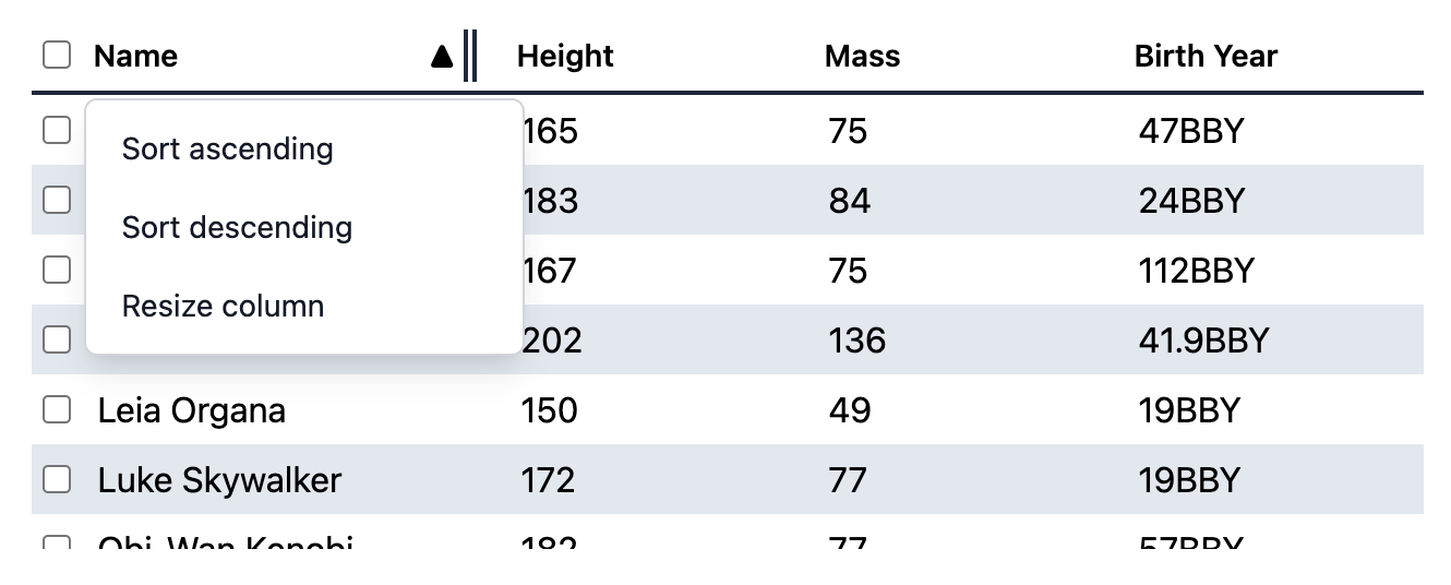
Internationalization#
useTable handles some aspects of internationalization automatically.
For example, type to select is implemented with an
Intl.Collator
for internationalized string matching, and keyboard navigation is mirrored in right-to-left languages.
You are responsible for localizing all text content within the table.
RTL#
In right-to-left languages, the table layout should be mirrored. The columns should be ordered from right to left and the individual column text alignment should be inverted. Ensure that your CSS accounts for this.