useTabList
Provides the behavior and accessibility implementation for a tab list. Tabs organize content into multiple sections and allow users to navigate between them.
| install | yarn add react-aria |
|---|---|
| version | 3.44.0 |
| usage | import {useTabList, useTab, useTabPanel} from 'react-aria' |
API#
useTabList<T>(
  props: AriaTabListOptions<T>,
  state: TabListState<T>,
  ref: RefObject<HTMLElement
    |  | null>
): TabListAria
useTab<T>(
  props: AriaTabProps,
  state: TabListState<T>,
  ref: RefObject<FocusableElement
    |  | null>
): TabAria
useTabPanel<T>(
  props: AriaTabPanelProps,
  state: TabListState<T>
    |  | null,
  ref: RefObject<Element
    |  | null>
): TabPanelAria
Features#
Tabs provide a list of tabs that a user can select from to switch between multiple tab panels. useTabList, useTab, and useTabPanel can be used to implement these in an accessible way.
- Support for mouse, touch, and keyboard interactions on tabs
- Support for LTR and RTL keyboard navigation
- Support for disabled tabs
- Follows the tabs ARIA pattern, semantically linking tabs and their associated tab panels
- Focus management for tab panels without any focusable children
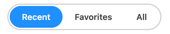
Anatomy#
Tabs consist of a tab list with one or more visually separated tabs. Each tab has associated content, and only the selected tab's content is shown.
Each tab can be clicked, tapped, or navigated to via arrow keys. Depending on the keyboardActivation prop, the tab can be selected by receiving keyboard focus, or it can be selected with the Enter key.
useTabList returns props to spread onto the tab list container:
| Name | Type | Description |
tabListProps | DOMAttributes | Props for the tablist container. |
useTab returns props to be spread onto each individual tab, along with states that can be used for styling:
| Name | Type | Description |
tabProps | DOMAttributes | Props for the tab element. |
isSelected | boolean | Whether the tab is currently selected. |
isDisabled | boolean | Whether the tab is disabled. |
isPressed | boolean | Whether the tab is currently in a pressed state. |
useTabPanel returns props to spread onto the container for the tab content:
| Name | Type | Description |
tabPanelProps | DOMAttributes | Props for the tab panel element. |
State is managed by the useTabListState
hook in @react-stately/tabs. The state object should be passed as an option to useTabList, useTab,
and useTabPanel. The Item component
is used to represent each tab, following the Collections API used by many other components.
Example#
This example displays a basic list of tabs. The currently selected tab receives a tabIndex of 0 while the rest are set to -1 ensuring that the whole tablist is a single tab stop. The selected tab has a different style so it's obvious which one is currently selected. useTab and useTabPanel handle associating the tabs and tab panels for assistive technology. The currently selected tab panel is rendered below the list of tabs. The key prop on the TabPanel element is important to ensure that DOM state (e.g. text field contents) is not shared between unrelated tabs.
import {useTab, useTabList, useTabPanel} from 'react-aria';
import {Item, useTabListState} from 'react-stately';
function Tabs(props) {
let state = useTabListState(props);
let ref = React.useRef(null);
let { tabListProps } = useTabList(props, state, ref);
return (
<div className={`tabs `}>
<div {...tabListProps} ref={ref}>
{[...state.collection].map((item) => (
<Tab key={item.key} item={item} state={state} />
))}
</div>
<TabPanel key={state.selectedItem?.key} state={state} />
</div>
);
}
function Tab({ item, state }) {
let { key, rendered } = item;
let ref = React.useRef(null);
let { tabProps } = useTab({ key }, state, ref);
return (
<div {...tabProps} ref={ref}>
{rendered}
</div>
);
}
function TabPanel({ state, ...props }) {
let ref = React.useRef(null);
let { tabPanelProps } = useTabPanel(props, state, ref);
return (
<div {...tabPanelProps} ref={ref}>
{state.selectedItem?.props.children}
</div>
);
}
<Tabs aria-label="History of Ancient Rome">
<Item key="FoR" title="Founding of Rome">
Arma virumque cano, Troiae qui primus ab oris.
</Item>
<Item key="MaR" title="Monarchy and Republic">
Senatus Populusque Romanus.
</Item>
<Item key="Emp" title="Empire">Alea jacta est.</Item>
</Tabs>import {useTab, useTabList, useTabPanel} from 'react-aria';
import {Item, useTabListState} from 'react-stately';
function Tabs(props) {
let state = useTabListState(props);
let ref = React.useRef(null);
let { tabListProps } = useTabList(props, state, ref);
return (
<div className={`tabs `}>
<div {...tabListProps} ref={ref}>
{[...state.collection].map((item) => (
<Tab key={item.key} item={item} state={state} />
))}
</div>
<TabPanel
key={state.selectedItem?.key}
state={state}
/>
</div>
);
}
function Tab({ item, state }) {
let { key, rendered } = item;
let ref = React.useRef(null);
let { tabProps } = useTab({ key }, state, ref);
return (
<div {...tabProps} ref={ref}>
{rendered}
</div>
);
}
function TabPanel({ state, ...props }) {
let ref = React.useRef(null);
let { tabPanelProps } = useTabPanel(props, state, ref);
return (
<div {...tabPanelProps} ref={ref}>
{state.selectedItem?.props.children}
</div>
);
}
<Tabs aria-label="History of Ancient Rome">
<Item key="FoR" title="Founding of Rome">
Arma virumque cano, Troiae qui primus ab oris.
</Item>
<Item key="MaR" title="Monarchy and Republic">
Senatus Populusque Romanus.
</Item>
<Item key="Emp" title="Empire">Alea jacta est.</Item>
</Tabs>import {
useTab,
useTabList,
useTabPanel
} from 'react-aria';
import {
Item,
useTabListState
} from 'react-stately';
function Tabs(props) {
let state =
useTabListState(
props
);
let ref = React.useRef(
null
);
let { tabListProps } =
useTabList(
props,
state,
ref
);
return (
<div
className={`tabs `}
>
<div
{...tabListProps}
ref={ref}
>
{[
...state
.collection
].map((item) => (
<Tab
key={item
.key}
item={item}
state={state}
/>
))}
</div>
<TabPanel
key={state
.selectedItem
?.key}
state={state}
/>
</div>
);
}
function Tab(
{ item, state }
) {
let { key, rendered } =
item;
let ref = React.useRef(
null
);
let { tabProps } =
useTab(
{ key },
state,
ref
);
return (
<div
{...tabProps}
ref={ref}
>
{rendered}
</div>
);
}
function TabPanel(
{ state, ...props }
) {
let ref = React.useRef(
null
);
let { tabPanelProps } =
useTabPanel(
props,
state,
ref
);
return (
<div
{...tabPanelProps}
ref={ref}
>
{state.selectedItem
?.props.children}
</div>
);
}
<Tabs aria-label="History of Ancient Rome">
<Item
key="FoR"
title="Founding of Rome"
>
Arma virumque cano,
Troiae qui primus
ab oris.
</Item>
<Item
key="MaR"
title="Monarchy and Republic"
>
Senatus Populusque
Romanus.
</Item>
<Item
key="Emp"
title="Empire"
>
Alea jacta est.
</Item>
</Tabs>Show CSS
.tabs {
  height: 150px;
  display: flex;
  flex-direction: column;
}

.tabs.vertical {
  flex-direction: row;
}

[role=tablist] {
  display: flex;
}

[role=tablist][aria-orientation=horizontal] {
  border-bottom: 1px solid gray;
}

[role=tablist][aria-orientation=vertical] {
  flex-direction: column;
  border-right: 1px solid gray;
}

[role=tab] {
  padding: 10px;
  cursor: default;
}

[role=tablist][aria-orientation=horizontal] [role=tab] {
  border-bottom: 3px solid transparent;
}

[role=tablist][aria-orientation=vertical] [role=tab] {
  border-right: 3px solid transparent;
}

[role=tablist] [role=tab][aria-selected=true] {
  border-color: var(--blue);
}

[role=tab][aria-disabled] {
  opacity: 0.5;
}

[role=tabpanel] {
  padding: 10px;
}.tabs {
height: 150px;
display: flex;
flex-direction: column;
}
.tabs.vertical {
flex-direction: row;
}
[role=tablist] {
display: flex;
}
[role=tablist][aria-orientation=horizontal] {
border-bottom: 1px solid gray;
}
[role=tablist][aria-orientation=vertical] {
flex-direction: column;
border-right: 1px solid gray;
}
[role=tab] {
padding: 10px;
cursor: default;
}
[role=tablist][aria-orientation=horizontal] [role=tab] {
border-bottom: 3px solid transparent;
}
[role=tablist][aria-orientation=vertical] [role=tab] {
border-right: 3px solid transparent;
}
[role=tablist] [role=tab][aria-selected=true] {
border-color: var(--blue);
}
[role=tab][aria-disabled] {
opacity: 0.5;
}
[role=tabpanel] {
padding: 10px;
}Styled examples#
Usage#
The following examples show how to use the Tabs component created in the above example.
Default selection#
A default selected tab can be provided using the defaultSelectedKey prop, which should correspond to the key prop provided to each item.
When Tabs is used with dynamic items as described below, the key of each item is derived from the data.
See the react-stately Selection docs for more details.
<Tabs aria-label="Input settings" defaultSelectedKey="keyboard">
  <Item key="mouse">Mouse Settings</Item>
  <Item key="keyboard">Keyboard Settings</Item>
  <Item key="gamepad">Gamepad Settings</Item>
</Tabs><Tabs
aria-label="Input settings"
defaultSelectedKey="keyboard"
>
<Item key="mouse">Mouse Settings</Item>
<Item key="keyboard">Keyboard Settings</Item>
<Item key="gamepad">Gamepad Settings</Item>
</Tabs><Tabs
aria-label="Input settings"
defaultSelectedKey="keyboard"
>
<Item key="mouse">
Mouse Settings
</Item>
<Item key="keyboard">
Keyboard Settings
</Item>
<Item key="gamepad">
Gamepad Settings
</Item>
</Tabs>Controlled selection#
Selection can be controlled using the selectedKey prop, paired with the onSelectionChange event. The key prop from the selected tab will be passed into the callback when the tab is selected, allowing you to update state accordingly.
function Example() {
  let [timePeriod, setTimePeriod] = React.useState('triassic');

  return (
    <>
      <p>Selected time period: {timePeriod}</p>
      <Tabs
        aria-label="Mesozoic time periods"
        selectedKey={timePeriod}
        onSelectionChange={setTimePeriod}
      >
        <Item key="triassic" title="Triassic">
          The Triassic ranges roughly from 252 million to 201 million years ago,
          preceding the Jurassic Period.
        </Item>
        <Item key="jurassic" title="Jurassic">
          The Jurassic ranges from 200 million years to 145 million years ago.
        </Item>
        <Item key="cretaceous" title="Cretaceous">
          The Cretaceous is the longest period of the Mesozoic, spanning from
          145 million to 66 million years ago.
        </Item>
      </Tabs>
    </>
  );
}
function Example() {
  let [timePeriod, setTimePeriod] = React.useState(
    'triassic'
  );

  return (
    <>
      <p>Selected time period: {timePeriod}</p>
      <Tabs
        aria-label="Mesozoic time periods"
        selectedKey={timePeriod}
        onSelectionChange={setTimePeriod}
      >
        <Item key="triassic" title="Triassic">
          The Triassic ranges roughly from 252 million to
          201 million years ago, preceding the Jurassic
          Period.
        </Item>
        <Item key="jurassic" title="Jurassic">
          The Jurassic ranges from 200 million years to 145
          million years ago.
        </Item>
        <Item key="cretaceous" title="Cretaceous">
          The Cretaceous is the longest period of the
          Mesozoic, spanning from 145 million to 66 million
          years ago.
        </Item>
      </Tabs>
    </>
  );
}
function Example() {
  let [
    timePeriod,
    setTimePeriod
  ] = React.useState(
    'triassic'
  );

  return (
    <>
      <p>
        Selected time
        period:{' '}
        {timePeriod}
      </p>
      <Tabs
        aria-label="Mesozoic time periods"
        selectedKey={timePeriod}
        onSelectionChange={setTimePeriod}
      >
        <Item
          key="triassic"
          title="Triassic"
        >
          The Triassic
          ranges roughly
          from 252
          million to 201
          million years
          ago, preceding
          the Jurassic
          Period.
        </Item>
        <Item
          key="jurassic"
          title="Jurassic"
        >
          The Jurassic
          ranges from 200
          million years
          to 145 million
          years ago.
        </Item>
        <Item
          key="cretaceous"
          title="Cretaceous"
        >
          The Cretaceous
          is the longest
          period of the
          Mesozoic,
          spanning from
          145 million to
          66 million
          years ago.
        </Item>
      </Tabs>
    </>
  );
}
Focusable content#
When the tab panel doesn't contain any focusable content, the entire panel is given a tabIndex=0 so that the content can be navigated to with the keyboard. When the tab panel contains focusable content, such as a textfield, then the tabIndex is omitted because the content itself can receive focus.
This example uses the same Tabs component from above. Try navigating from the tabs to the content for each panel using the keyboard.
<Tabs aria-label="Notes app">
  <Item key="item1" title="Jane Doe">
    <label>Leave a note for Jane: <input type="text" /></label>
  </Item>
  <Item key="item2" title="John Doe">Senatus Populusque Romanus.</Item>
  <Item key="item3" title="Joe Bloggs">Alea jacta est.</Item>
</Tabs><Tabs aria-label="Notes app">
<Item key="item1" title="Jane Doe">
<label>
Leave a note for Jane: <input type="text" />
</label>
</Item>
<Item key="item2" title="John Doe">
Senatus Populusque Romanus.
</Item>
<Item key="item3" title="Joe Bloggs">
Alea jacta est.
</Item>
</Tabs><Tabs aria-label="Notes app">
<Item
key="item1"
title="Jane Doe"
>
<label>
Leave a note for
Jane:{' '}
<input type="text" />
</label>
</Item>
<Item
key="item2"
title="John Doe"
>
Senatus Populusque
Romanus.
</Item>
<Item
key="item3"
title="Joe Bloggs"
>
Alea jacta est.
</Item>
</Tabs>Dynamic items#
The above examples have shown tabs with static items. The items prop can be used when creating tabs from a dynamic collection, for example when the user can add and remove tabs, or the tabs come from an external data source. The function passed as the children of the Tabs component is called for each item in the list, and returns an <Item> representing the tab.
Each item accepts a key prop, which is passed to the onSelectionChange handler to identify the selected item. Alternatively, if the item objects contain an id property, as shown in the example below, then this is used automatically and a key prop is not required. See Collection Components for more details.
function Example() {
let [tabs, setTabs] = React.useState([
{id: 1, title: 'Tab 1', content: 'Tab body 1'},
{id: 2, title: 'Tab 2', content: 'Tab body 2'},
{id: 3, title: 'Tab 3', content: 'Tab body 3'}
]);
let addTab = () => {
setTabs(tabs => [
...tabs,
{
id: tabs.length + 1,
title: `Tab `,
content: `Tab Body `
}
]);
};
let removeTab = () => {
if (tabs.length > 1) {
setTabs(tabs => tabs.slice(0, -1));
}
};
return (
<>
<button onClick={addTab}>Add tab</button>
<button onClick={removeTab}>Remove tab</button>
<Tabs aria-label="Dynamic tabs" items={tabs}>
{item => <Item title={item.title}>{item.content}</Item>}
</Tabs>
</>
);
}function Example() {
let [tabs, setTabs] = React.useState([
{ id: 1, title: 'Tab 1', content: 'Tab body 1' },
{ id: 2, title: 'Tab 2', content: 'Tab body 2' },
{ id: 3, title: 'Tab 3', content: 'Tab body 3' }
]);
let addTab = () => {
setTabs((tabs) => [
...tabs,
{
id: tabs.length + 1,
title: `Tab `,
content: `Tab Body `
}
]);
};
let removeTab = () => {
if (tabs.length > 1) {
setTabs((tabs) => tabs.slice(0, -1));
}
};
return (
<>
<button onClick={addTab}>Add tab</button>
<button onClick={removeTab}>Remove tab</button>
<Tabs aria-label="Dynamic tabs" items={tabs}>
{(item) => (
<Item title={item.title}>{item.content}</Item>
)}
</Tabs>
</>
);
}
function Example() {
let [tabs, setTabs] =
React.useState([
{
id: 1,
title: 'Tab 1',
content:
'Tab body 1'
},
{
id: 2,
title: 'Tab 2',
content:
'Tab body 2'
},
{
id: 3,
title: 'Tab 3',
content:
'Tab body 3'
}
]);
let addTab = () => {
setTabs((tabs) => [
...tabs,
{
id: tabs.length +
1,
title: `Tab `,
content:
`Tab Body `
}
]);
};
let removeTab = () => {
if (
tabs.length > 1
) {
setTabs((tabs) =>
tabs.slice(0, -1)
);
}
};
return (
<>
<button
onClick={addTab}
>
Add tab
</button>
<button
onClick={removeTab}
>
Remove tab
</button>
<Tabs
aria-label="Dynamic tabs"
items={tabs}
>
{(item) => (
<Item
title={item
.title}
>
{item
.content}
</Item>
)}
</Tabs>
</>
);
}
Keyboard Activation#
By default, pressing the arrow keys while focus is on a Tab will switch selection to the adjacent Tab in that direction, updating the content displayed accordingly. If you would like to prevent selection change
from happening automatically you can set the keyboardActivation prop to "manual". This will prevent tab selection from changing on arrow key press, requiring a subsequent Enter or Space key press to confirm
tab selection.
<Tabs aria-label="Input settings" keyboardActivation="manual">
  <Item key="mouse">Mouse Settings</Item>
  <Item key="keyboard">Keyboard Settings</Item>
  <Item key="gamepad">Gamepad Settings</Item>
</Tabs><Tabs
aria-label="Input settings"
keyboardActivation="manual"
>
<Item key="mouse">Mouse Settings</Item>
<Item key="keyboard">Keyboard Settings</Item>
<Item key="gamepad">Gamepad Settings</Item>
</Tabs><Tabs
aria-label="Input settings"
keyboardActivation="manual"
>
<Item key="mouse">
Mouse Settings
</Item>
<Item key="keyboard">
Keyboard Settings
</Item>
<Item key="gamepad">
Gamepad Settings
</Item>
</Tabs>Orientation#
By default, tabs are horizontally oriented. The orientation prop can be set to vertical to change this. This does not affect keyboard navigation. You are responsible for styling your tabs accordingly.
<Tabs aria-label="Chat log orientation example" orientation="vertical">
  <Item key="item1" title="John Doe">
    There is no prior chat history with John Doe.
  </Item>
  <Item key="item2" title="Jane Doe">
    There is no prior chat history with Jane Doe.
  </Item>
  <Item key="item3" title="Joe Bloggs">
    There is no prior chat history with Joe Bloggs.
  </Item>
</Tabs><Tabs
aria-label="Chat log orientation example"
orientation="vertical"
>
<Item key="item1" title="John Doe">
There is no prior chat history with John Doe.
</Item>
<Item key="item2" title="Jane Doe">
There is no prior chat history with Jane Doe.
</Item>
<Item key="item3" title="Joe Bloggs">
There is no prior chat history with Joe Bloggs.
</Item>
</Tabs><Tabs
aria-label="Chat log orientation example"
orientation="vertical"
>
<Item
key="item1"
title="John Doe"
>
There is no prior
chat history with
John Doe.
</Item>
<Item
key="item2"
title="Jane Doe"
>
There is no prior
chat history with
Jane Doe.
</Item>
<Item
key="item3"
title="Joe Bloggs"
>
There is no prior
chat history with
Joe Bloggs.
</Item>
</Tabs>Disabled#
All tabs can be disabled using the isDisabled prop.
<Tabs aria-label="Input settings" isDisabled>
  <Item key="mouse">Mouse Settings</Item>
  <Item key="keyboard">Keyboard Settings</Item>
  <Item key="gamepad">Gamepad Settings</Item>
</Tabs><Tabs aria-label="Input settings" isDisabled>
<Item key="mouse">Mouse Settings</Item>
<Item key="keyboard">Keyboard Settings</Item>
<Item key="gamepad">Gamepad Settings</Item>
</Tabs><Tabs
aria-label="Input settings"
isDisabled
>
<Item key="mouse">
Mouse Settings
</Item>
<Item key="keyboard">
Keyboard Settings
</Item>
<Item key="gamepad">
Gamepad Settings
</Item>
</Tabs>Disabled items#
Individual tabs can be disabled using the disabledKeys prop. Each key in this list
corresponds with the key prop passed to the Item component, or automatically derived from the values passed
to the items prop. See Collections for more details.
<Tabs aria-label="Input settings" disabledKeys={['gamepad']}>
  <Item key="mouse">Mouse Settings</Item>
  <Item key="keyboard">Keyboard Settings</Item>
  <Item key="gamepad">Gamepad Settings</Item>
</Tabs><Tabs
aria-label="Input settings"
disabledKeys={['gamepad']}
>
<Item key="mouse">Mouse Settings</Item>
<Item key="keyboard">Keyboard Settings</Item>
<Item key="gamepad">Gamepad Settings</Item>
</Tabs><Tabs
aria-label="Input settings"
disabledKeys={[
'gamepad'
]}
>
<Item key="mouse">
Mouse Settings
</Item>
<Item key="keyboard">
Keyboard Settings
</Item>
<Item key="gamepad">
Gamepad Settings
</Item>
</Tabs>Links#
Tabs may be rendered as links to different routes in your application. This can be achieved by passing the href prop to the <Item> component. You'll need to update the Tab component to render an <a> element when an href prop is passed to an item.
function Tab({item, state}) {
  let ref = React.useRef(null);
  let {tabProps} = useTab({key: item.key}, state, ref);
  let ElementType = item.props.href ? 'a' : 'div';  return (
    <ElementType {...tabProps} ref={ref}>
      {item.rendered}
    </ElementType>
  );
}
function Tab({item, state}) {
let ref = React.useRef(null);
let {tabProps} = useTab({key: item.key}, state, ref);
let ElementType = item.props.href ? 'a' : 'div'; return (
<ElementType {...tabProps} ref={ref}>
{item.rendered}
</ElementType>
);
}function Tab(
{ item, state }
) {
let ref = React.useRef(
null
);
let { tabProps } =
useTab(
{ key: item.key },
state,
ref
);
let ElementType =
item.props.href
? 'a'
: 'div'; return (
<ElementType
{...tabProps}
ref={ref}
>
{item.rendered}
</ElementType>
);
}
By default, links perform native browser navigation. However, you'll usually want to synchronize the selected tab with the URL from your client side router. This takes two steps:
- Set up a
RouterProviderat the root of your app. This will handle link navigation from all React Aria components using your framework or router. See the client side routing guide to learn how to set this up. - Use the
selectedKeyprop to set the selected tab based on the URL, as described above.
This example uses React Router to setup routes for each tab and synchronize the selection with the URL.
import {BrowserRouter, Route, Routes, useLocation, useNavigate} from 'react-router-dom';
import {RouterProvider} from 'react-aria';

function AppTabs() {
  let { pathname } = useLocation();

  return (
    <Tabs selectedKey={pathname}>
      <TabList aria-label="Tabs">
        <Tab id="/" href="/">Home</Tab>
        <Tab id="/shared" href="/shared">Shared</Tab>
        <Tab id="/deleted" href="/deleted">Deleted</Tab>
      </TabList>
      <TabPanel id={pathname}>
        <Routes>
          <Route path="/" element={<HomePage />} />
          <Route path="/shared" element={<SharedPage />} />
          <Route path="/deleted" element={<DeletedPage />} />
        </Routes>
      </TabPanel>
    </Tabs>
  );
}

function App() {
  let navigate = useNavigate();
  return (
    <RouterProvider navigate={navigate}>
      <Routes>
        <Route path="/*" element={<AppTabs />} />
      </Routes>
    </RouterProvider>
  );
}

<BrowserRouter>
  <App />
</BrowserRouter>
import {
BrowserRouter,
Route,
Routes,
useLocation,
useNavigate
} from 'react-router-dom';
import {RouterProvider} from 'react-aria';
function AppTabs() {
let { pathname } = useLocation();
return (
<Tabs selectedKey={pathname}>
<TabList aria-label="Tabs">
<Tab id="/" href="/">Home</Tab>
<Tab id="/shared" href="/shared">Shared</Tab>
<Tab id="/deleted" href="/deleted">Deleted</Tab>
</TabList>
<TabPanel id={pathname}>
<Routes>
<Route path="/" element={<HomePage />} />
<Route path="/shared" element={<SharedPage />} />
<Route
path="/deleted"
element={<DeletedPage />}
/>
</Routes>
</TabPanel>
</Tabs>
);
}
function App() {
let navigate = useNavigate();
return (
<RouterProvider navigate={navigate}>
<Routes>
<Route path="/*" element={<AppTabs />} />
</Routes>
</RouterProvider>
);
}
<BrowserRouter>
<App />
</BrowserRouter>import {
BrowserRouter,
Route,
Routes,
useLocation,
useNavigate
} from 'react-router-dom';
import {RouterProvider} from 'react-aria';
function AppTabs() {
let { pathname } =
useLocation();
return (
<Tabs
selectedKey={pathname}
>
<TabList aria-label="Tabs">
<Tab
id="/"
href="/"
>
Home
</Tab>
<Tab
id="/shared"
href="/shared"
>
Shared
</Tab>
<Tab
id="/deleted"
href="/deleted"
>
Deleted
</Tab>
</TabList>
<TabPanel
id={pathname}
>
<Routes>
<Route
path="/"
element={
<HomePage />
}
/>
<Route
path="/shared"
element={
<SharedPage />
}
/>
<Route
path="/deleted"
element={
<DeletedPage />
}
/>
</Routes>
</TabPanel>
</Tabs>
);
}
function App() {
let navigate =
useNavigate();
return (
<RouterProvider
navigate={navigate}
>
<Routes>
<Route
path="/*"
element={
<AppTabs />
}
/>
</Routes>
</RouterProvider>
);
}
<BrowserRouter>
<App />
</BrowserRouter>Internationalization#
useTabList handles some aspects of internationalization automatically. For example, keyboard navigation is automatically mirrored for right-to-left languages. You are responsible for localizing all tab labels and content.
RTL#
In right-to-left languages, the tablist should be mirrored. The first tab is furthest right and the last tab is furthest left. Ensure that your CSS accounts for this.