useDateRangePicker
Provides the behavior and accessibility implementation for a date picker component. A date range picker combines two DateFields and a RangeCalendar popover to allow users to enter or select a date and time range.
| install | yarn add react-aria |
|---|---|
| version | 3.44.0 |
| usage | import {useDateRangePicker} from 'react-aria' |
API#
useDateRangePicker<T extends DateValue>(
  props: AriaDateRangePickerProps<T>,
  state: DateRangePickerState,
  ref: RefObject<Element
    |  | null>
): DateRangePickerAria
Features#
A date range picker can be built using two separate <input type="date"> elements, but this is very limited in functionality, lacking in internationalization capabilities, inconsistent between browsers, and difficult to style. useDateRangePicker helps achieve accessible and international date and time range pickers that can be styled as needed.
- Dates and times – Support for dates and times with configurable granularity.
- International – Support for 13 calendar systems used around the world, including Gregorian, Buddhist, Islamic, Persian, and more. Locale-specific formatting, number systems, hour cycles, and right-to-left support are available as well.
- Time zone aware – Dates and times can optionally include a time zone. All modifications follow time zone rules such as daylight saving time.
- Accessible – Each date and time unit is displayed as an individually focusable and editable segment, which allows users an easy way to edit dates using the keyboard, in any date format and locale. Users can also open a calendar popover to select date ranges in a standard month grid. Localized screen reader messages are included to announce when the selection and visible date range change.
- Touch friendly – Date segments are editable using an easy to use numeric keypad, date ranges can be selected by dragging over dates in the calendar using a touch screen, and all interactions are accessible using touch-based screen readers.
- Customizable – As with all of React Aria, the DOM structure and styling of all elements can be fully customized.
Read our blog post for more details about the internationalization, accessibility, and user experience features implemented by useDateRangePicker.
Anatomy#
A date range picker consists of a label, and group containing two date fields and a button. Clicking the button opens a popup containing a range calendar. The date fields include segments representing each unit of a date and time (e.g. years, months, days, etc.), each of which is individually focusable and editable using the keyboard. The calendar popup offers a more visual way of choosing a date range.
useDateRangePicker also supports optional description and error message elements, which can be used
to provide more context about the field, and any validation messages. These are linked with the
input via the aria-describedby attribute.
useDateRangePicker returns props that you should spread onto the appropriate elements:
| Name | Type | Description |
labelProps | DOMAttributes | Props for the date range picker's visible label element, if any. |
groupProps | GroupDOMAttributes | Props for the grouping element containing the date fields and button. |
startFieldProps | AriaDatePickerProps<DateValue> | Props for the start date field. |
endFieldProps | AriaDatePickerProps<DateValue> | Props for the end date field. |
buttonProps | AriaButtonProps | Props for the popover trigger button. |
descriptionProps | DOMAttributes | Props for the description element, if any. |
errorMessageProps | DOMAttributes | Props for the error message element, if any. |
dialogProps | AriaDialogProps | Props for the popover dialog. |
calendarProps | RangeCalendarProps<DateValue> | Props for the range calendar within the popover dialog. |
isInvalid | boolean | Whether the input value is invalid. |
validationErrors | string[] | The current error messages for the input if it is invalid, otherwise an empty array. |
validationDetails | ValidityState | The native validation details for the input. |
State is managed by the useDateRangePickerState hook from @react-stately/datepicker. The state object should be passed as an argument to useDateRangePicker.
If the date range picker does not have a visible label, an aria-label or aria-labelledby prop must be passed instead to
identify it to assistive technology.
Date and time values#
Dates and times are represented in many different ways by cultures around the world. This includes differences in calendar systems, time zones, daylight saving time rules, date and time formatting, weekday and weekend rules, and much more. When building applications that support users around the world, it is important to handle these aspects correctly for each locale.
useDateRangePicker uses the @internationalized/date library to represent dates and times. This package provides a library of objects and functions to perform date and time related manipulation, queries, and conversions that work across locales and calendars. Date and time objects can be converted to and from native JavaScript Date objects or ISO 8601 strings. See the documentation, or the examples below for more details.
Example#
A DateRangePicker composes several other components to produce a composite element that can be used to enter date ranges with a keyboard, or select them on a calendar. The DateField, Popover, Calendar, and Button components used in this example are independent and can be used separately from the DateRangePicker. The code is available below, and documentation is available on the corresponding pages.
import {useDateRangePicker} from 'react-aria';
import {useDateRangePickerState} from 'react-stately';

// Reuse the DateField, Popover, Dialog, RangeCalendar, and Button from your component library.
import {Button, DateField, Dialog, Popover, RangeCalendar} from 'your-component-library';

function DateRangePicker(props) {
  let state = useDateRangePickerState(props);
  let ref = React.useRef(null);
  let {
    labelProps,
    groupProps,
    startFieldProps,
    endFieldProps,
    buttonProps,
    dialogProps,
    calendarProps
  } = useDateRangePicker(props, state, ref);

  return (
    <div style={{ display: 'inline-flex', flexDirection: 'column' }}>
      <span {...labelProps}>{props.label}</span>
      <div {...groupProps} ref={ref} style={{ display: 'flex' }}>
        <div className="field">
          <DateField {...startFieldProps} />
          <span style={{ padding: '0 4px' }}>–</span>
          <DateField {...endFieldProps} />
          {state.isInvalid &&
            <span aria-hidden="true">🚫</span>}
        </div>
        <Button {...buttonProps}>🗓</Button>
      </div>
      {state.isOpen &&
        (
          <Popover state={state} triggerRef={ref} placement="bottom start">
            <Dialog {...dialogProps}>
              <RangeCalendar
                {...calendarProps}
                firstDayOfWeek={props.firstDayOfWeek}
              />
            </Dialog>
          </Popover>
        )}
    </div>
  );
}

<DateRangePicker label="Event date" />
import {useDateRangePicker} from 'react-aria';
import {useDateRangePickerState} from 'react-stately';
// Reuse the DateField, Popover, Dialog, RangeCalendar, and Button from your component library.
import {
Button,
DateField,
Dialog,
Popover,
RangeCalendar
} from 'your-component-library';
function DateRangePicker(props) {
let state = useDateRangePickerState(props);
let ref = React.useRef(null);
let {
labelProps,
groupProps,
startFieldProps,
endFieldProps,
buttonProps,
dialogProps,
calendarProps
} = useDateRangePicker(props, state, ref);
return (
<div
style={{
display: 'inline-flex',
flexDirection: 'column'
}}
>
<span {...labelProps}>{props.label}</span>
<div
{...groupProps}
ref={ref}
style={{ display: 'flex' }}
>
<div className="field">
<DateField {...startFieldProps} />
<span style={{ padding: '0 4px' }}>–</span>
<DateField {...endFieldProps} />
{state.isInvalid &&
<span aria-hidden="true">🚫</span>}
</div>
<Button {...buttonProps}>🗓</Button>
</div>
{state.isOpen &&
(
<Popover
state={state}
triggerRef={ref}
placement="bottom start"
>
<Dialog {...dialogProps}>
<RangeCalendar
{...calendarProps}
firstDayOfWeek={props.firstDayOfWeek}
/>
</Dialog>
</Popover>
)}
</div>
);
}
<DateRangePicker label="Event date" />import {useDateRangePicker} from 'react-aria';
import {useDateRangePickerState} from 'react-stately';
// Reuse the DateField, Popover, Dialog, RangeCalendar, and Button from your component library.
import {
Button,
DateField,
Dialog,
Popover,
RangeCalendar
} from 'your-component-library';
function DateRangePicker(
props
) {
let state =
useDateRangePickerState(
props
);
let ref = React.useRef(
null
);
let {
labelProps,
groupProps,
startFieldProps,
endFieldProps,
buttonProps,
dialogProps,
calendarProps
} = useDateRangePicker(
props,
state,
ref
);
return (
<div
style={{
display:
'inline-flex',
flexDirection:
'column'
}}
>
<span
{...labelProps}
>
{props.label}
</span>
<div
{...groupProps}
ref={ref}
style={{
display: 'flex'
}}
>
<div className="field">
<DateField
{...startFieldProps}
/>
<span
style={{
padding:
'0 4px'
}}
>
–
</span>
<DateField
{...endFieldProps}
/>
{state
.isInvalid &&
(
<span aria-hidden="true">
🚫
</span>
)}
</div>
<Button
{...buttonProps}
>
🗓
</Button>
</div>
{state.isOpen &&
(
<Popover
state={state}
triggerRef={ref}
placement="bottom start"
>
<Dialog
{...dialogProps}
>
<RangeCalendar
{...calendarProps}
firstDayOfWeek={props
.firstDayOfWeek}
/>
</Dialog>
</Popover>
)}
</div>
);
}
<DateRangePicker label="Event date" />Button#
The Button component is used in the above example to trigger the calendar popover. It is built using the useButton hook, and can be shared with many other components.
Show code
import {useButton} from 'react-aria';

function Button(props) {
  let ref = React.useRef(null);
  let { buttonProps } = useButton(props, ref);
  return <button {...buttonProps} ref={ref}>{props.children}</button>;
}
import {useButton} from 'react-aria';

function Button(props) {
  let ref = React.useRef(null);
  let { buttonProps } = useButton(props, ref);
  return (
    <button {...buttonProps} ref={ref}>
      {props.children}
    </button>
  );
}
import {useButton} from 'react-aria';

function Button(props) {
  let ref = React.useRef(
    null
  );
  let { buttonProps } =
    useButton(
      props,
      ref
    );
  return (
    <button
      {...buttonProps}
      ref={ref}
    >
      {props.children}
    </button>
  );
}
DateField#
The DateField component implements the keyboard editable inputs used in a DateRangePicker. It can also be used standalone, or within a single date picker. See useDateField for more examples and documentation.
Show code
import {useDateFieldState} from 'react-stately';
import {useDateField, useDateSegment, useLocale} from 'react-aria';
function DateField(props) {
let { locale } = useLocale();
let state = useDateFieldState({
...props,
locale,
createCalendar
});
let ref = React.useRef(null);
let { labelProps, fieldProps } = useDateField(props, state, ref);
return (
<div className="wrapper">
<span {...labelProps}>{props.label}</span>
<div {...fieldProps} ref={ref} className="field">
{state.segments.map((segment, i) => (
<DateSegment key={i} segment={segment} state={state} />
))}
</div>
</div>
);
}
function DateSegment({ segment, state }) {
let ref = React.useRef(null);
let { segmentProps } = useDateSegment(segment, state, ref);
return (
<div
{...segmentProps}
ref={ref}
className={`segment `}
>
{segment.text}
</div>
);
}
import {useDateFieldState} from 'react-stately';
import {
useDateField,
useDateSegment,
useLocale
} from 'react-aria';
function DateField(props) {
let { locale } = useLocale();
let state = useDateFieldState({
...props,
locale,
createCalendar
});
let ref = React.useRef(null);
let { labelProps, fieldProps } = useDateField(
props,
state,
ref
);
return (
<div className="wrapper">
<span {...labelProps}>{props.label}</span>
<div {...fieldProps} ref={ref} className="field">
{state.segments.map((segment, i) => (
<DateSegment
key={i}
segment={segment}
state={state}
/>
))}
</div>
</div>
);
}
function DateSegment({ segment, state }) {
let ref = React.useRef(null);
let { segmentProps } = useDateSegment(
segment,
state,
ref
);
return (
<div
{...segmentProps}
ref={ref}
className={`segment `}
>
{segment.text}
</div>
);
}
import {useDateFieldState} from 'react-stately';
import {
useDateField,
useDateSegment,
useLocale
} from 'react-aria';
function DateField(
props
) {
let { locale } =
useLocale();
let state =
useDateFieldState({
...props,
locale,
createCalendar
});
let ref = React.useRef(
null
);
let {
labelProps,
fieldProps
} = useDateField(
props,
state,
ref
);
return (
<div className="wrapper">
<span
{...labelProps}
>
{props.label}
</span>
<div
{...fieldProps}
ref={ref}
className="field"
>
{state.segments
.map((
segment,
i
) => (
<DateSegment
key={i}
segment={segment}
state={state}
/>
))}
</div>
</div>
);
}
function DateSegment(
{ segment, state }
) {
let ref = React.useRef(
null
);
let { segmentProps } =
useDateSegment(
segment,
state,
ref
);
return (
<div
{...segmentProps}
ref={ref}
className={`segment `}
>
{segment.text}
</div>
);
}
Show CSS
.wrapper {
  display: flex;
  flex-direction: column;
  align-items: flex-start;
}

.field {
  display: inline-flex;
  padding: 2px 4px;
  border-radius: 2px;
  border: 1px solid var(--gray);
  background: var(--spectrum-global-color-gray-50);
  max-width: 100%;
  overflow: auto;
}

.field:focus-within {
  border-color: var(--blue);
}

.field .field {
  all: initial;
  display: inline-flex;
  color: inherit;
}

.segment {
  padding: 0 2px;
  font-variant-numeric: tabular-nums;
  text-align: end;
}

.segment.placeholder {
  color: var(--spectrum-gray-600);
}

.segment:focus {
  color: white;
  background: var(--blue);
  outline: none;
  border-radius: 2px;
}.wrapper {
display: flex;
flex-direction: column;
align-items: flex-start;
}
.field {
display: inline-flex;
padding: 2px 4px;
border-radius: 2px;
border: 1px solid var(--gray);
background: var(--spectrum-global-color-gray-50);
max-width: 100%;
overflow: auto;
}
.field:focus-within {
border-color: var(--blue);
}
.field .field {
all: initial;
display: inline-flex;
color: inherit;
}
.segment {
padding: 0 2px;
font-variant-numeric: tabular-nums;
text-align: end;
}
.segment.placeholder {
color: var(--spectrum-gray-600);
}
.segment:focus {
color: white;
background: var(--blue);
outline: none;
border-radius: 2px;
}Popover#
The Popover component is used to contain the popup calendar for the DateRangePicker.
It can be shared between many other components, including Select,
Menu, and others.
See usePopover for more examples of popovers.
Show code
import {DismissButton, Overlay, usePopover} from 'react-aria';
import type {AriaPopoverProps} from 'react-aria';
import type {OverlayTriggerState} from 'react-stately';

interface PopoverProps extends Omit<AriaPopoverProps, 'popoverRef'> {
  children: React.ReactNode;
  state: OverlayTriggerState;
}

function Popover({ children, state, ...props }: PopoverProps) {
  let popoverRef = React.useRef(null);
  let { popoverProps, underlayProps } = usePopover({
    ...props,
    popoverRef
  }, state);

  return (
    <Overlay>
      <div {...underlayProps} style={{ position: 'fixed', inset: 0 }} />
      <div
        {...popoverProps}
        ref={popoverRef}
        style={{
          ...popoverProps.style,
          background: 'var(--page-background)',
          border: '1px solid gray'
        }}
      >
        <DismissButton onDismiss={state.close} />
        {children}
        <DismissButton onDismiss={state.close} />
      </div>
    </Overlay>
  );
}
import {
  DismissButton,
  Overlay,
  usePopover
} from 'react-aria';
import type {AriaPopoverProps} from 'react-aria';
import type {OverlayTriggerState} from 'react-stately';

interface PopoverProps
  extends Omit<AriaPopoverProps, 'popoverRef'> {
  children: React.ReactNode;
  state: OverlayTriggerState;
}

function Popover(
  { children, state, ...props }: PopoverProps
) {
  let popoverRef = React.useRef(null);
  let { popoverProps, underlayProps } = usePopover({
    ...props,
    popoverRef
  }, state);

  return (
    <Overlay>
      <div
        {...underlayProps}
        style={{ position: 'fixed', inset: 0 }}
      />
      <div
        {...popoverProps}
        ref={popoverRef}
        style={{
          ...popoverProps.style,
          background: 'var(--page-background)',
          border: '1px solid gray'
        }}
      >
        <DismissButton onDismiss={state.close} />
        {children}
        <DismissButton onDismiss={state.close} />
      </div>
    </Overlay>
  );
}
import {
  DismissButton,
  Overlay,
  usePopover
} from 'react-aria';
import type {AriaPopoverProps} from 'react-aria';
import type {OverlayTriggerState} from 'react-stately';

interface PopoverProps
  extends
    Omit<
      AriaPopoverProps,
      'popoverRef'
    > {
  children:
    React.ReactNode;
  state:
    OverlayTriggerState;
}

function Popover(
  {
    children,
    state,
    ...props
  }: PopoverProps
) {
  let popoverRef = React
    .useRef(null);
  let {
    popoverProps,
    underlayProps
  } = usePopover({
    ...props,
    popoverRef
  }, state);

  return (
    <Overlay>
      <div
        {...underlayProps}
        style={{
          position:
            'fixed',
          inset: 0
        }}
      />
      <div
        {...popoverProps}
        ref={popoverRef}
        style={{
          ...popoverProps
            .style,
          background:
            'var(--page-background)',
          border:
            '1px solid gray'
        }}
      >
        <DismissButton
          onDismiss={state
            .close}
        />
        {children}
        <DismissButton
          onDismiss={state
            .close}
        />
      </div>
    </Overlay>
  );
}
Dialog#
The Dialog component is rendered within the Popover component. It is built using the useDialog hook, and can be shared with many other components.
Show code
import type {AriaDialogProps} from 'react-aria';
import {useDialog} from 'react-aria';

interface DialogProps extends AriaDialogProps {
  title?: React.ReactNode;
  children: React.ReactNode;
}

function Dialog({ title, children, ...props }: DialogProps) {
  let ref = React.useRef(null);
  let { dialogProps, titleProps } = useDialog(props, ref);

  return (
    <div {...dialogProps} ref={ref} style={{ padding: 30 }}>
      {title &&
        (
          <h3 {...titleProps} style={{ marginTop: 0 }}>
            {title}
          </h3>
        )}
      {children}
    </div>
  );
}
import type {AriaDialogProps} from 'react-aria';
import {useDialog} from 'react-aria';

interface DialogProps extends AriaDialogProps {
  title?: React.ReactNode;
  children: React.ReactNode;
}

function Dialog(
  { title, children, ...props }: DialogProps
) {
  let ref = React.useRef(null);
  let { dialogProps, titleProps } = useDialog(props, ref);

  return (
    <div {...dialogProps} ref={ref} style={{ padding: 30 }}>
      {title &&
        (
          <h3 {...titleProps} style={{ marginTop: 0 }}>
            {title}
          </h3>
        )}
      {children}
    </div>
  );
}
import type {AriaDialogProps} from 'react-aria';
import {useDialog} from 'react-aria';

interface DialogProps
  extends
    AriaDialogProps {
  title?:
    React.ReactNode;
  children:
    React.ReactNode;
}

function Dialog(
  {
    title,
    children,
    ...props
  }: DialogProps
) {
  let ref = React.useRef(
    null
  );
  let {
    dialogProps,
    titleProps
  } = useDialog(
    props,
    ref
  );

  return (
    <div
      {...dialogProps}
      ref={ref}
      style={{
        padding: 30
      }}
    >
      {title &&
        (
          <h3
            {...titleProps}
            style={{
              marginTop:
                0
            }}
          >
            {title}
          </h3>
        )}
      {children}
    </div>
  );
}
RangeCalendar#
The RangeCalendar component implements the month grid shown within the DateRangePicker popover. It can also be used standalone, or within other components. See useRangeCalendar for more examples and documentation.
Show code
import {useCalendarCell, useCalendarGrid, useRangeCalendar} from 'react-aria';
import {useRangeCalendarState} from 'react-stately';
import {createCalendar, getWeeksInMonth} from '@internationalized/date';
function RangeCalendar(props) {
let { locale } = useLocale();
let state = useRangeCalendarState({
...props,
locale,
createCalendar
});
let ref = React.useRef(null);
let { calendarProps, prevButtonProps, nextButtonProps, title } =
useRangeCalendar(props, state, ref);
return (
<div {...calendarProps} ref={ref} className="calendar">
<div className="header">
<h2>{title}</h2>
<Button {...prevButtonProps}><</Button>
<Button {...nextButtonProps}>></Button>
</div>
<CalendarGrid state={state} firstDayOfWeek={props.firstDayOfWeek} />
</div>
);
}
function CalendarGrid({ state, ...props }) {
let { locale } = useLocale();
let { gridProps, headerProps, weekDays } = useCalendarGrid(props, state);
// Get the number of weeks in the month so we can render the proper number of rows.
let weeksInMonth = getWeeksInMonth(
state.visibleRange.start,
locale,
props.firstDayOfWeek
);
return (
<table {...gridProps}>
<thead {...headerProps}>
<tr>
{weekDays.map((day, index) => <th key={index}>{day}</th>)}
</tr>
</thead>
<tbody>
{[...new Array(weeksInMonth).keys()].map((weekIndex) => (
<tr key={weekIndex}>
{state.getDatesInWeek(weekIndex).map((date, i) => (
date
? (
<CalendarCell
key={i}
state={state}
date={date}
/>
)
: <td key={i} />
))}
</tr>
))}
</tbody>
</table>
);
}
function CalendarCell({ state, date }) {
let ref = React.useRef(null);
let {
cellProps,
buttonProps,
isSelected,
isOutsideVisibleRange,
isDisabled,
isUnavailable,
formattedDate
} = useCalendarCell({ date }, state, ref);
return (
<td {...cellProps}>
<div
{...buttonProps}
ref={ref}
hidden={isOutsideVisibleRange}
className={`cell `}
>
{formattedDate}
</div>
</td>
);
}
import {
useCalendarCell,
useCalendarGrid,
useRangeCalendar
} from 'react-aria';
import {useRangeCalendarState} from 'react-stately';
import {
createCalendar,
getWeeksInMonth
} from '@internationalized/date';
function RangeCalendar(props) {
let { locale } = useLocale();
let state = useRangeCalendarState({
...props,
locale,
createCalendar
});
let ref = React.useRef(null);
let {
calendarProps,
prevButtonProps,
nextButtonProps,
title
} = useRangeCalendar(props, state, ref);
return (
<div {...calendarProps} ref={ref} className="calendar">
<div className="header">
<h2>{title}</h2>
<Button {...prevButtonProps}><</Button>
<Button {...nextButtonProps}>></Button>
</div>
<CalendarGrid
state={state}
firstDayOfWeek={props.firstDayOfWeek}
/>
</div>
);
}
function CalendarGrid({ state, ...props }) {
let { locale } = useLocale();
let { gridProps, headerProps, weekDays } =
useCalendarGrid(props, state);
// Get the number of weeks in the month so we can render the proper number of rows.
let weeksInMonth = getWeeksInMonth(
state.visibleRange.start,
locale,
props.firstDayOfWeek
);
return (
<table {...gridProps}>
<thead {...headerProps}>
<tr>
{weekDays.map((day, index) => (
<th key={index}>{day}</th>
))}
</tr>
</thead>
<tbody>
{[...new Array(weeksInMonth).keys()].map(
(weekIndex) => (
<tr key={weekIndex}>
{state.getDatesInWeek(weekIndex).map((
date,
i
) => (
date
? (
<CalendarCell
key={i}
state={state}
date={date}
/>
)
: <td key={i} />
))}
</tr>
)
)}
</tbody>
</table>
);
}
function CalendarCell({ state, date }) {
let ref = React.useRef(null);
let {
cellProps,
buttonProps,
isSelected,
isOutsideVisibleRange,
isDisabled,
isUnavailable,
formattedDate
} = useCalendarCell({ date }, state, ref);
return (
<td {...cellProps}>
<div
{...buttonProps}
ref={ref}
hidden={isOutsideVisibleRange}
className={`cell `}
>
{formattedDate}
</div>
</td>
);
}
import {
useCalendarCell,
useCalendarGrid,
useRangeCalendar
} from 'react-aria';
import {useRangeCalendarState} from 'react-stately';
import {
createCalendar,
getWeeksInMonth
} from '@internationalized/date';
function RangeCalendar(
props
) {
let { locale } =
useLocale();
let state =
useRangeCalendarState(
{
...props,
locale,
createCalendar
}
);
let ref = React.useRef(
null
);
let {
calendarProps,
prevButtonProps,
nextButtonProps,
title
} = useRangeCalendar(
props,
state,
ref
);
return (
<div
{...calendarProps}
ref={ref}
className="calendar"
>
<div className="header">
<h2>{title}</h2>
<Button
{...prevButtonProps}
>
<
</Button>
<Button
{...nextButtonProps}
>
>
</Button>
</div>
<CalendarGrid
state={state}
firstDayOfWeek={props
.firstDayOfWeek}
/>
</div>
);
}
function CalendarGrid(
{ state, ...props }
) {
let { locale } =
useLocale();
let {
gridProps,
headerProps,
weekDays
} = useCalendarGrid(
props,
state
);
// Get the number of weeks in the month so we can render the proper number of rows.
let weeksInMonth =
getWeeksInMonth(
state.visibleRange
.start,
locale,
props
.firstDayOfWeek
);
return (
<table
{...gridProps}
>
<thead
{...headerProps}
>
<tr>
{weekDays.map((
day,
index
) => (
<th
key={index}
>
{day}
</th>
))}
</tr>
</thead>
<tbody>
{[...new Array(
weeksInMonth
).keys()].map(
(weekIndex) => (
<tr
key={weekIndex}
>
{state
.getDatesInWeek(
weekIndex
).map((
date,
i
) => (
date
? (
<CalendarCell
key={i}
state={state}
date={date}
/>
)
: (
<td
key={i}
/>
)
))}
</tr>
)
)}
</tbody>
</table>
);
}
function CalendarCell(
{ state, date }
) {
let ref = React.useRef(
null
);
let {
cellProps,
buttonProps,
isSelected,
isOutsideVisibleRange,
isDisabled,
isUnavailable,
formattedDate
} = useCalendarCell(
{ date },
state,
ref
);
return (
<td {...cellProps}>
<div
{...buttonProps}
ref={ref}
hidden={isOutsideVisibleRange}
className={`cell `}
>
{formattedDate}
</div>
</td>
);
}
Show CSS
.calendar {
  width: 220px;
}

.header {
  display: flex;
  align-items: center;
  gap: 4px;
  margin: 0 8px;
}

.header h2 {
  flex: 1;
  margin: 0;
}

.calendar table {
  width: 100%;
}

.cell {
  cursor: default;
  text-align: center;
}

.selected {
  background: var(--blue);
  color: white;
}

.unavailable {
  color: var(--spectrum-global-color-red-600);
}

.disabled {
  color: gray;
}.calendar {
width: 220px;
}
.header {
display: flex;
align-items: center;
gap: 4px;
margin: 0 8px;
}
.header h2 {
flex: 1;
margin: 0;
}
.calendar table {
width: 100%;
}
.cell {
cursor: default;
text-align: center;
}
.selected {
background: var(--blue);
color: white;
}
.unavailable {
color: var(--spectrum-global-color-red-600);
}
.disabled {
color: gray;
}Styled examples#
Usage#
The following examples show how to use the DateRangePicker component created in the above example.
Value#
A DateRangePicker displays a placeholder by default. An initial, uncontrolled value can be provided to the DateRangePicker using the defaultValue prop. Alternatively, a controlled value can be provided using the value prop.
Date ranges are objects with start and end properties containing date values, which are provided using objects in the @internationalized/date package. This library handles correct international date manipulation across calendars, time zones, and other localization concerns. useDateRangePicker supports values of the following types:
CalendarDate– a date without any time components. May be parsed from a string representation using theparseDatefunction. Use this type to represent dates where the time is not important, such as a birthday or an all day calendar event.CalendarDateTime– a date with a time, but not in any specific time zone. May be parsed from a string representation using theparseDateTimefunction. Use this type to represent times that occur at the same local time regardless of the time zone, such as the time of New Years Eve fireworks which always occur at midnight. Most times are better stored as aZonedDateTime.ZonedDateTime– a date with a time in a specific time zone. May be parsed from a string representation using theparseZonedDateTime,parseAbsolute, orparseAbsoluteToLocalfunctions. Use this type to represent an exact moment in time at a particular location on Earth.
import {parseDate} from '@internationalized/date';

function Example() {
  let [value, setValue] = React.useState({
    start: parseDate('2020-02-03'),
    end: parseDate('2020-02-08')
  });

  return (
    <>
      <DateRangePicker
        label="Date range (uncontrolled)"
        defaultValue={{
          start: parseDate('2020-02-03'),
          end: parseDate('2020-02-08')
        }} />
      <DateRangePicker
        label="Date range (controlled)"
        value={value}
        onChange={setValue} />
    </>
  );
}
import {parseDate} from '@internationalized/date';
function Example() {
let [value, setValue] = React.useState({
start: parseDate('2020-02-03'),
end: parseDate('2020-02-08')
});
return (
<>
<DateRangePicker
label="Date range (uncontrolled)"
defaultValue={{
start: parseDate('2020-02-03'),
end: parseDate('2020-02-08')
}} />
<DateRangePicker
label="Date range (controlled)"
value={value}
onChange={setValue} />
</>
);
}import {parseDate} from '@internationalized/date';
function Example() {
let [value, setValue] =
React.useState({
start: parseDate(
'2020-02-03'
),
end: parseDate(
'2020-02-08'
)
});
return (
<>
<DateRangePicker
label="Date range (uncontrolled)"
defaultValue={{
start:
parseDate(
'2020-02-03'
),
end: parseDate(
'2020-02-08'
)
}}
/>
<DateRangePicker
label="Date range (controlled)"
value={value}
onChange={setValue}
/>
</>
);
}
Events#
useDateRangePicker accepts an onChange prop which is triggered whenever the start or end date is edited by the user. The example below uses onChange to update a separate element with a formatted version of the date range in the user's locale and local time zone. This is done by converting the dates to native JavaScript Date objects to pass to the formatter.
import {useDateFormatter} from 'react-aria';
import {getLocalTimeZone} from '@internationalized/date';

function Example() {
  let [range, setRange] = React.useState({
    start: parseDate('2020-07-03'),
    end: parseDate('2020-07-10')
  });
  let formatter = useDateFormatter({ dateStyle: 'long' });

  return (
    <>
      <DateRangePicker label="Date range" value={range} onChange={setRange} />
      <p>
        Selected date: {range
          ? formatter.formatRange(
            range.start.toDate(getLocalTimeZone()),
            range.end.toDate(getLocalTimeZone())
          )
          : '--'}
      </p>
    </>
  );
}
import {useDateFormatter} from 'react-aria';
import {getLocalTimeZone} from '@internationalized/date';

function Example() {
  let [range, setRange] = React.useState({
    start: parseDate('2020-07-03'),
    end: parseDate('2020-07-10')
  });
  let formatter = useDateFormatter({ dateStyle: 'long' });

  return (
    <>
      <DateRangePicker
        label="Date range"
        value={range}
        onChange={setRange}
      />
      <p>
        Selected date: {range
          ? formatter.formatRange(
            range.start.toDate(getLocalTimeZone()),
            range.end.toDate(getLocalTimeZone())
          )
          : '--'}
      </p>
    </>
  );
}
import {useDateFormatter} from 'react-aria';
import {getLocalTimeZone} from '@internationalized/date';

function Example() {
  let [range, setRange] =
    React.useState({
      start: parseDate(
        '2020-07-03'
      ),
      end: parseDate(
        '2020-07-10'
      )
    });
  let formatter =
    useDateFormatter({
      dateStyle: 'long'
    });

  return (
    <>
      <DateRangePicker
        label="Date range"
        value={range}
        onChange={setRange}
      />
      <p>
        Selected date:
        {' '}
        {range
          ? formatter
            .formatRange(
              range.start
                .toDate(
                  getLocalTimeZone()
                ),
              range.end
                .toDate(
                  getLocalTimeZone()
                )
            )
          : '--'}
      </p>
    </>
  );
}
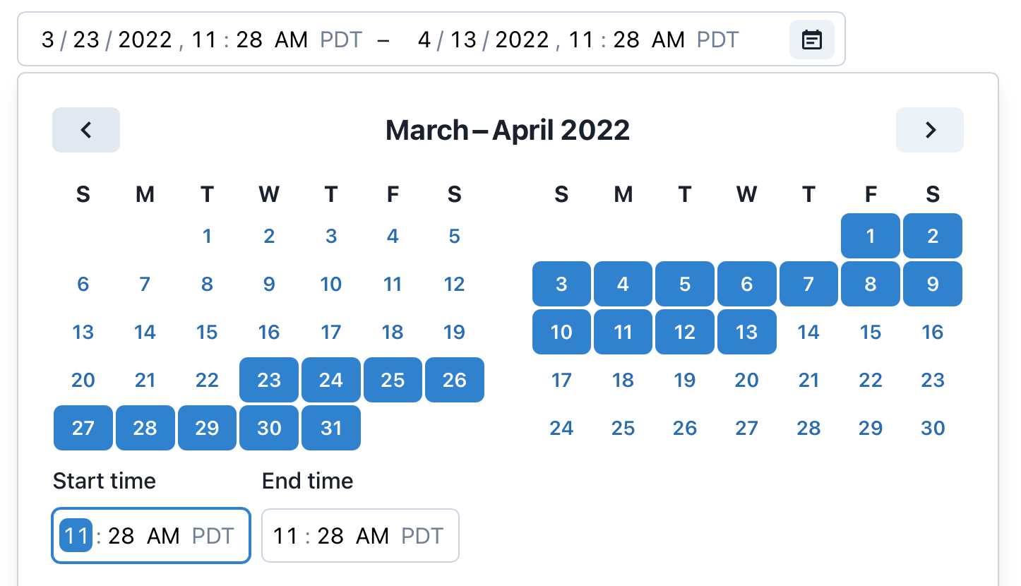
Time zones#
useDateRangePicker is time zone aware when ZonedDateTime objects are provided as the value. In this case, the time zone abbreviation is displayed, and time zone concerns such as daylight saving time are taken into account when the value is manipulated.
In most cases, your data will come from and be sent to a server as an ISO 8601 formatted string. @internationalized/date includes functions for parsing strings in multiple formats into ZonedDateTime objects. Which format you use will depend on what information you need to store.
parseZonedDateTime– This function parses a date with an explicit time zone and optional UTC offset attached (e.g."2021-11-07T00:45[America/Los_Angeles]"or"2021-11-07T00:45-07:00[America/Los_Angeles]"). This format preserves the maximum amount of information. If the exact local time and time zone that a user selected is important, use this format. Storing the time zone and offset that was selected rather than converting to UTC ensures that the local time is correct regardless of daylight saving rule changes (e.g. if a locale abolishes DST). Examples where this applies include calendar events, reminders, and other times that occur in a particular location.parseAbsolute– This function parses an absolute date and time that occurs at the same instant at all locations on Earth. It can be represented in UTC (e.g."2021-11-07T07:45:00Z"), or stored with a particular offset (e.g."2021-11-07T07:45:00-07:00"). A time zone identifier, e.g.America/Los_Angeles, must be passed, and the result will be converted into that time zone. Absolute times are the best way to represent events that occurred in the past, or future events where an exact time is needed, regardless of time zone.parseAbsoluteToLocal– This function parses an absolute date and time into the current user's local time zone. It is a shortcut forparseAbsolute, and accepts the same formats.
import {parseZonedDateTime} from '@internationalized/date';

<DateRangePicker
  label="Date range"
  defaultValue={{
    start: parseZonedDateTime('2022-11-07T00:45[America/Los_Angeles]'),
    end: parseZonedDateTime('2022-11-08T11:15[America/Los_Angeles]')
  }} />
import {parseZonedDateTime} from '@internationalized/date';
<DateRangePicker
label="Date range"
defaultValue={{
start: parseZonedDateTime(
'2022-11-07T00:45[America/Los_Angeles]'
),
end: parseZonedDateTime(
'2022-11-08T11:15[America/Los_Angeles]'
)
}}
/>import {parseZonedDateTime} from '@internationalized/date';
<DateRangePicker
label="Date range"
defaultValue={{
start:
parseZonedDateTime(
'2022-11-07T00:45[America/Los_Angeles]'
),
end:
parseZonedDateTime(
'2022-11-08T11:15[America/Los_Angeles]'
)
}}
/>useDateRangePicker displays times in the time zone included in the ZonedDateTime object. The above example is always displayed in Pacific Standard Time because the America/Los_Angeles time zone identifier is provided. @internationalized/date includes functions for converting dates between time zones, or parsing a date directly into a specific time zone or the user's local time zone, as shown below.
import {parseAbsoluteToLocal} from '@internationalized/date';

<DateRangePicker
  label="Date range"
  defaultValue={{
    start: parseAbsoluteToLocal('2021-11-07T07:45:00Z'),
    end: parseAbsoluteToLocal('2021-11-08T14:25:00Z')
  }}
/>
import {parseAbsoluteToLocal} from '@internationalized/date';
<DateRangePicker
label="Date range"
defaultValue={{
start: parseAbsoluteToLocal('2021-11-07T07:45:00Z'),
end: parseAbsoluteToLocal('2021-11-08T14:25:00Z')
}}
/>import {parseAbsoluteToLocal} from '@internationalized/date';
<DateRangePicker
label="Date range"
defaultValue={{
start:
parseAbsoluteToLocal(
'2021-11-07T07:45:00Z'
),
end:
parseAbsoluteToLocal(
'2021-11-08T14:25:00Z'
)
}}
/>Granularity#
The granularity prop allows you to control the smallest unit that is displayed by useDateRangePicker. By default, CalendarDate values are displayed with "day" granularity (year, month, and day), and CalendarDateTime and ZonedDateTime values are displayed with "minute" granularity. More granular time values can be displayed by setting the granularity prop to "second".
In addition, when a value with a time is provided but you wish to only display the date, you can set the granularity to "day". This has no effect on the actual value (it still has a time component), only on what fields are displayed. In the following example, two DateRangePickers are synchronized with the same value, but display different granularities.
function Example() {
  let [date, setDate] = React.useState({
    start: parseAbsoluteToLocal('2021-04-07T18:45:22Z'),
    end: parseAbsoluteToLocal('2021-04-08T20:00:00Z')
  });

  return (
    <>
      <DateRangePicker
        label="Date and time range"
        granularity="second"
        value={date}
        onChange={setDate} />
      <DateRangePicker
        label="Date range"
        granularity="day"
        value={date}
        onChange={setDate} />
    </>
  );
}
function Example() {
let [date, setDate] = React.useState({
start: parseAbsoluteToLocal('2021-04-07T18:45:22Z'),
end: parseAbsoluteToLocal('2021-04-08T20:00:00Z')
});
return (
<>
<DateRangePicker
label="Date and time range"
granularity="second"
value={date}
onChange={setDate} />
<DateRangePicker
label="Date range"
granularity="day"
value={date}
onChange={setDate} />
</>
);
}function Example() {
let [date, setDate] =
React.useState({
start:
parseAbsoluteToLocal(
'2021-04-07T18:45:22Z'
),
end:
parseAbsoluteToLocal(
'2021-04-08T20:00:00Z'
)
});
return (
<>
<DateRangePicker
label="Date and time range"
granularity="second"
value={date}
onChange={setDate}
/>
<DateRangePicker
label="Date range"
granularity="day"
value={date}
onChange={setDate}
/>
</>
);
}
If no value or defaultValue prop is passed, then the granularity prop also affects which type of value is emitted from the onChange event. Note that by default, time values will not have a time zone because none was supplied. You can override this by setting the placeholderValue prop explicitly. Values emitted from onChange will use the time zone of the placeholder value.
import {now} from '@internationalized/date';

<DateRangePicker
  label="Date range"
  granularity="second" />
<DateRangePicker
  label="Date range"
  placeholderValue={now('America/New_York')}
  granularity="second" />
import {now} from '@internationalized/date';
<DateRangePicker
label="Date range"
granularity="second" />
<DateRangePicker
label="Date range"
placeholderValue={now('America/New_York')}
granularity="second" />import {now} from '@internationalized/date';
<DateRangePicker
label="Date range"
granularity="second"
/>
<DateRangePicker
label="Date range"
placeholderValue={now(
'America/New_York'
)}
granularity="second"
/>International calendars#
useDateRangePicker supports selecting dates in many calendar systems used around the world, including Gregorian, Hebrew, Indian, Islamic, Buddhist, and more. Dates are automatically displayed in the appropriate calendar system for the user's locale. The calendar system can be overridden using the Unicode calendar locale extension, passed to the I18nProvider component.
Selected dates passed to onChange always use the same calendar system as the value or defaultValue prop. If no value or defaultValue is provided, then dates passed to onChange are always in the Gregorian calendar since this is the most commonly used. This means that even though the user selects dates in their local calendar system, applications are able to deal with dates from all users consistently.
The below example displays a DateRangePicker in the Hindi language, using the Indian calendar. Dates emitted from onChange are in the Gregorian calendar.
import {I18nProvider} from 'react-aria';

function Example() {
  let [range, setRange] = React.useState(null);
  return (
    <I18nProvider locale="hi-IN-u-ca-indian">
      <DateRangePicker label="Date range" value={range} onChange={setRange} />
      <p>Start date: {range?.start.toString()}</p>
      <p>End date: {range?.end.toString()}</p>
    </I18nProvider>
  );
}
import {I18nProvider} from 'react-aria';

function Example() {
  let [range, setRange] = React.useState(null);
  return (
    <I18nProvider locale="hi-IN-u-ca-indian">
      <DateRangePicker
        label="Date range"
        value={range}
        onChange={setRange}
      />
      <p>Start date: {range?.start.toString()}</p>
      <p>End date: {range?.end.toString()}</p>
    </I18nProvider>
  );
}
import {I18nProvider} from 'react-aria';

function Example() {
  let [range, setRange] =
    React.useState(null);
  return (
    <I18nProvider locale="hi-IN-u-ca-indian">
      <DateRangePicker
        label="Date range"
        value={range}
        onChange={setRange}
      />
      <p>
        Start date:{' '}
        {range?.start
          .toString()}
      </p>
      <p>
        End date:{' '}
        {range?.end
          .toString()}
      </p>
    </I18nProvider>
  );
}
Minimum and maximum values#
The minValue and maxValue props can also be used to perform builtin validation. This prevents the user from selecting dates outside the valid range in the calendar, and marks the date fields as invalid using ARIA. useDateRangePicker also validates that the end date is after the start date. You should implement a visual indication that the date range picker is invalid as well.
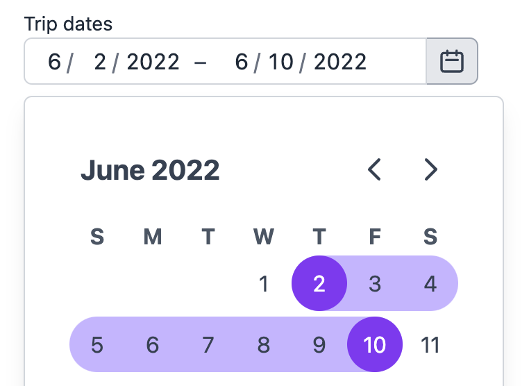
This example only accepts dates after today.
import {today} from '@internationalized/date';

<DateRangePicker
  label="Trip dates"
  minValue={today(getLocalTimeZone())}
  defaultValue={{
    start: parseDate('2022-02-03'),
    end: parseDate('2022-05-03')
  }} />
import {today} from '@internationalized/date';
<DateRangePicker
label="Trip dates"
minValue={today(getLocalTimeZone())}
defaultValue={{
start: parseDate('2022-02-03'),
end: parseDate('2022-05-03')
}} />import {today} from '@internationalized/date';
<DateRangePicker
label="Trip dates"
minValue={today(
getLocalTimeZone()
)}
defaultValue={{
start: parseDate(
'2022-02-03'
),
end: parseDate(
'2022-05-03'
)
}}
/>Unavailable dates#
useDateRangePicker supports marking certain dates as unavailable. These dates remain focusable with the keyboard in the calendar so that navigation is consistent, but cannot be selected by the user. The isDateUnavailable prop accepts a callback that is called to evaluate whether each visible date is unavailable.
Note that by default, users may not select non-contiguous ranges, i.e. ranges that contain unavailable dates within them. Once a start date is selected in the calendar, enabled dates will be restricted to subsequent dates until an unavailable date is hit. While this is handled automatically in the calendar, additional validation logic must be provided to ensure an invalid state is displayed in the date field. This can be achieved using the isInvalid prop. See below for an example of how to allow non-contiguous ranges.
This example includes multiple unavailable date ranges, e.g. dates when a rental house is not available. The minValue prop is also used to prevent selecting dates before today. The isInvalid prop is used to mark selected date ranges with unavailable dates in the middle as invalid.
import {today} from '@internationalized/date';

function Example() {
  let now = today(getLocalTimeZone());
  let disabledRanges = [
    [now, now.add({ days: 5 })],
    [now.add({ days: 14 }), now.add({ days: 16 })],
    [now.add({ days: 23 }), now.add({ days: 24 })]
  ];

  let isDateUnavailable = (date) =>
    disabledRanges.some((interval) =>
      date.compare(interval[0]) >= 0 && date.compare(interval[1]) <= 0
    );
  let [value, setValue] = React.useState(null);
  let isInvalid = value &&
    disabledRanges.some((interval) =>
      value.end.compare(interval[0]) >= 0 &&
      value.start.compare(interval[1]) <= 0
    );

  return (
    <DateRangePicker
      label="Trip dates"
      minValue={today(getLocalTimeZone())}
      isDateUnavailable={isDateUnavailable}
      value={value}
      onChange={setValue}
      isInvalid={isInvalid}
    />
  );
}
import {today} from '@internationalized/date';

function Example() {
  let now = today(getLocalTimeZone());
  let disabledRanges = [
    [now, now.add({ days: 5 })],
    [now.add({ days: 14 }), now.add({ days: 16 })],
    [now.add({ days: 23 }), now.add({ days: 24 })]
  ];

  let isDateUnavailable = (date) =>
    disabledRanges.some((interval) =>
      date.compare(interval[0]) >= 0 &&
      date.compare(interval[1]) <= 0
    );
  let [value, setValue] = React.useState(null);
  let isInvalid = value &&
    disabledRanges.some((interval) =>
      value.end.compare(interval[0]) >= 0 &&
      value.start.compare(interval[1]) <= 0
    );

  return (
    <DateRangePicker
      label="Trip dates"
      minValue={today(getLocalTimeZone())}
      isDateUnavailable={isDateUnavailable}
      value={value}
      onChange={setValue}
      isInvalid={isInvalid}
    />
  );
}
import {today} from '@internationalized/date';

function Example() {
  let now = today(
    getLocalTimeZone()
  );
  let disabledRanges = [
    [
      now,
      now.add({
        days: 5
      })
    ],
    [
      now.add({
        days: 14
      }),
      now.add({
        days: 16
      })
    ],
    [
      now.add({
        days: 23
      }),
      now.add({
        days: 24
      })
    ]
  ];

  let isDateUnavailable =
    (date) =>
      disabledRanges
        .some((
          interval
        ) =>
          date.compare(
              interval[0]
            ) >= 0 &&
          date.compare(
              interval[1]
            ) <= 0
        );
  let [value, setValue] =
    React.useState(null);
  let isInvalid =
    value &&
    disabledRanges.some(
      (interval) =>
        value.end
            .compare(
              interval[0]
            ) >= 0 &&
        value.start
            .compare(
              interval[1]
            ) <= 0
    );

  return (
    <DateRangePicker
      label="Trip dates"
      minValue={today(
        getLocalTimeZone()
      )}
      isDateUnavailable={isDateUnavailable}
      value={value}
      onChange={setValue}
      isInvalid={isInvalid}
    />
  );
}
Non-contiguous ranges#
The allowsNonContiguousRanges prop enables a range to be selected even if there are unavailable dates in the middle. The value emitted in the onChange event will still be a single range with a start and end property, but unavailable dates will not be displayed as selected. It is up to applications to split the full selected range into multiple as needed for business logic.
This example prevents selecting weekends, but allows selecting ranges that span multiple weeks.
import {isWeekend} from '@internationalized/date';

function Example() {
  let { locale } = useLocale();

  return (
    <DateRangePicker
      label="Time off request"
      isDateUnavailable={(date) => isWeekend(date, locale)}
      allowsNonContiguousRanges
    />
  );
}
import {isWeekend} from '@internationalized/date';

function Example() {
  let { locale } = useLocale();

  return (
    <DateRangePicker
      label="Time off request"
      isDateUnavailable={(date) => isWeekend(date, locale)}
      allowsNonContiguousRanges
    />
  );
}
import {isWeekend} from '@internationalized/date';

function Example() {
  let { locale } =
    useLocale();

  return (
    <DateRangePicker
      label="Time off request"
      isDateUnavailable={(date) =>
        isWeekend(
          date,
          locale
        )}
      allowsNonContiguousRanges
    />
  );
}
Placeholder value#
When no value is set, a placeholder is shown. The format of the placeholder is influenced by the granularity and placeholderValue props. placeholderValue also controls the default values of each segment when the user first interacts with them, e.g. using the up and down arrow keys, as well as the default month shown in the calendar popover. By default, the placeholderValue is the current date at midnight, but you can set it to a more appropriate value if needed.
import {CalendarDate} from '@internationalized/date';

<DateRangePicker
  label="Date range"
  placeholderValue={new CalendarDate(1980, 1, 1)}
/>
import {CalendarDate} from '@internationalized/date';
<DateRangePicker
label="Date range"
placeholderValue={new CalendarDate(1980, 1, 1)}
/>import {CalendarDate} from '@internationalized/date';
<DateRangePicker
label="Date range"
placeholderValue={new CalendarDate(
1980,
1,
1
)}
/>Hide time zone#
When ZonedDateTime objects are provided as the value of to useDateRangePicker, the time zone abbreviation is displayed by default. However, if this is displayed elsewhere or implicit based on the usecase, it can be hidden using the hideTimeZone option.
<DateRangePicker
  label="Date range"
  defaultValue={{
    start: parseZonedDateTime('2022-11-07T10:45[America/Los_Angeles]'),
    end: parseZonedDateTime('2022-11-08T19:45[America/Los_Angeles]')
  }}
hideTimeZone /><DateRangePicker
label="Date range"
defaultValue={{
start: parseZonedDateTime(
'2022-11-07T10:45[America/Los_Angeles]'
),
end: parseZonedDateTime(
'2022-11-08T19:45[America/Los_Angeles]'
)
}}
hideTimeZone
/><DateRangePicker
label="Date range"
defaultValue={{
start:
parseZonedDateTime(
'2022-11-07T10:45[America/Los_Angeles]'
),
end:
parseZonedDateTime(
'2022-11-08T19:45[America/Los_Angeles]'
)
}}
hideTimeZone
/>Hour cycle#
By default, useDateRangePicker displays times in either 12 or 24 hour hour format depending on the user's locale. However, this can be overridden using the hourCycle prop if needed for a specific usecase. This example forces the DateRangePicker to use 24-hour time, regardless of the locale.
<DateRangePicker
  label="Date range"
  granularity="minute"
hourCycle={24} /><DateRangePicker
label="Date range"
granularity="minute"
hourCycle={24} /><DateRangePicker
label="Date range"
granularity="minute"
hourCycle={24} />Custom first day of week#
By default, the first day of the week is automatically set based on the current locale. This can be changed by setting the firstDayOfWeek prop to 'sun', 'mon', 'tue', 'wed', 'thu', 'fri', or 'sat'.
<DateRangePicker label="Date range" firstDayOfWeek="mon" /><DateRangePicker label="Date range" firstDayOfWeek="mon" /><DateRangePicker
label="Date range"
firstDayOfWeek="mon"
/>