useTagGroup
Provides the behavior and accessibility implementation for a tag group component. A tag group is a focusable list of labels, categories, keywords, filters, or other items, with support for keyboard navigation, selection, and removal.
| install | yarn add react-aria |
|---|---|
| version | 3.44.0 |
| usage | import {useTagGroup} from 'react-aria' |
API#
useTagGroup<T>(
  props: AriaTagGroupOptions<T>,
  state: ListState<T>,
  ref: RefObject<HTMLElement
    |  | null>
): TagGroupAria
useTag<T>(
  props: AriaTagProps<T>,
  state: ListState<T>,
  ref: RefObject<FocusableElement
    |  | null>
): TagAria
Features#
- Exposed to assistive technology as a grid using ARIA
- Keyboard navigation support including arrow keys, home/end, page up/down, and delete
- Keyboard focus management and cross browser normalization
- Labeling support for accessibility
- Support for mouse, touch, and keyboard interactions
Anatomy#
A tag group consists of a list of tags.
If a visual label is not provided, then an aria-label or
aria-labelledby prop must be passed to identify the tag group to assistive technology.
Individual tags should include a visual label, and may optionally include icons or a remove button.
useTagGroup returns props for the group and its label, which you should spread
onto the appropriate element:
| Name | Type | Description |
gridProps | DOMAttributes | Props for the tag grouping element. |
labelProps | DOMAttributes | Props for the tag group's visible label (if any). |
descriptionProps | DOMAttributes | Props for the tag group description element, if any. |
errorMessageProps | DOMAttributes | Props for the tag group error message element, if any. |
useTag returns props for an individual tag, along with states that you can use for styling:
| Name | Type | Description |
rowProps | DOMAttributes | Props for the tag row element. |
gridCellProps | DOMAttributes | Props for the tag cell element. |
removeButtonProps | AriaButtonProps | Props for the tag remove button. |
allowsRemoving | boolean | Whether the tag can be removed. |
isPressed | boolean | Whether the item is currently in a pressed state. |
isSelected | boolean | Whether the item is currently selected. |
isFocused | boolean | Whether the item is currently focused. |
isDisabled | boolean | Whether the item is non-interactive, i.e. both selection and actions are disabled and the item may
not be focused. Dependent on |
allowsSelection | boolean | Whether the item may be selected, dependent on selectionMode, disabledKeys, and disabledBehavior. |
In order to be correctly identified to assistive technologies and enable proper keyboard navigation, the tag group should use gridProps on its outer container.
Each individual tag should use rowProps on its outer container, and use gridCellProps on an inner container.
Example#
import type {ListState} from 'react-stately';
import type {AriaTagGroupProps, AriaTagProps} from 'react-aria';
import {Item, useListState} from 'react-stately';
import {useFocusRing, useTag, useTagGroup} from 'react-aria';
// Reuse the Button from your component library. See below for details.
import {Button} from 'your-component-library';
function TagGroup<T extends object>(props: AriaTagGroupProps<T>) {
let { label, description, errorMessage } = props;
let ref = React.useRef(null);
let state = useListState(props);
let {
gridProps,
labelProps,
descriptionProps,
errorMessageProps
} = useTagGroup(props, state, ref);
return (
<div className="tag-group">
<div {...labelProps}>{label}</div>
<div {...gridProps} ref={ref}>
{[...state.collection].map((item) => (
<Tag
key={item.key}
item={item}
state={state}
/>
))}
</div>
{description && (
<div {...descriptionProps} className="description">
{description}
</div>
)}
{errorMessage && (
<div {...errorMessageProps} className="error-message">
{errorMessage}
</div>
)}
</div>
);
}
interface TagProps<T> extends AriaTagProps<T> {
state: ListState<T>;
}
function Tag<T>(props: TagProps<T>) {
let { item, state } = props;
let ref = React.useRef(null);
let { focusProps, isFocusVisible } = useFocusRing({ within: false });
let { rowProps, gridCellProps, removeButtonProps, allowsRemoving } = useTag(
props,
state,
ref
);
return (
<div
ref={ref}
{...rowProps}
{...focusProps}
data-focus-visible={isFocusVisible}
>
<div {...gridCellProps}>
{item.rendered}
{allowsRemoving && <Button {...removeButtonProps}>ⓧ</Button>}
</div>
</div>
);
}
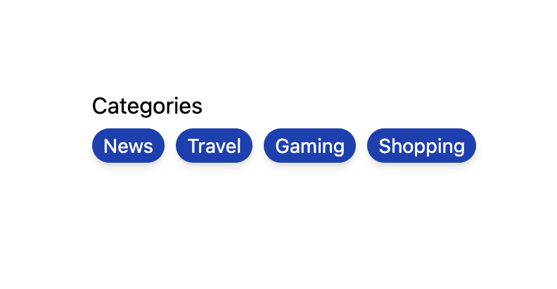
<TagGroup label="Categories">
<Item key="news">News</Item>
<Item key="travel">Travel</Item>
<Item key="gaming">Gaming</Item>
<Item key="shopping">Shopping</Item>
</TagGroup>import type {ListState} from 'react-stately';
import type {
AriaTagGroupProps,
AriaTagProps
} from 'react-aria';
import {Item, useListState} from 'react-stately';
import {
useFocusRing,
useTag,
useTagGroup
} from 'react-aria';
// Reuse the Button from your component library. See below for details.
import {Button} from 'your-component-library';
function TagGroup<T extends object>(
props: AriaTagGroupProps<T>
) {
let { label, description, errorMessage } = props;
let ref = React.useRef(null);
let state = useListState(props);
let {
gridProps,
labelProps,
descriptionProps,
errorMessageProps
} = useTagGroup(props, state, ref);
return (
<div className="tag-group">
<div {...labelProps}>{label}</div>
<div {...gridProps} ref={ref}>
{[...state.collection].map((item) => (
<Tag
key={item.key}
item={item}
state={state}
/>
))}
</div>
{description && (
<div {...descriptionProps} className="description">
{description}
</div>
)}
{errorMessage && (
<div
{...errorMessageProps}
className="error-message"
>
{errorMessage}
</div>
)}
</div>
);
}
interface TagProps<T> extends AriaTagProps<T> {
state: ListState<T>;
}
function Tag<T>(props: TagProps<T>) {
let { item, state } = props;
let ref = React.useRef(null);
let { focusProps, isFocusVisible } = useFocusRing({
within: false
});
let {
rowProps,
gridCellProps,
removeButtonProps,
allowsRemoving
} = useTag(props, state, ref);
return (
<div
ref={ref}
{...rowProps}
{...focusProps}
data-focus-visible={isFocusVisible}
>
<div {...gridCellProps}>
{item.rendered}
{allowsRemoving && (
<Button {...removeButtonProps}>ⓧ</Button>
)}
</div>
</div>
);
}
<TagGroup label="Categories">
<Item key="news">News</Item>
<Item key="travel">Travel</Item>
<Item key="gaming">Gaming</Item>
<Item key="shopping">Shopping</Item>
</TagGroup>import type {ListState} from 'react-stately';
import type {
AriaTagGroupProps,
AriaTagProps
} from 'react-aria';
import {
Item,
useListState
} from 'react-stately';
import {
useFocusRing,
useTag,
useTagGroup
} from 'react-aria';
// Reuse the Button from your component library. See below for details.
import {Button} from 'your-component-library';
function TagGroup<
T extends object
>(
props:
AriaTagGroupProps<T>
) {
let {
label,
description,
errorMessage
} = props;
let ref = React.useRef(
null
);
let state =
useListState(props);
let {
gridProps,
labelProps,
descriptionProps,
errorMessageProps
} = useTagGroup(
props,
state,
ref
);
return (
<div className="tag-group">
<div
{...labelProps}
>
{label}
</div>
<div
{...gridProps}
ref={ref}
>
{[
...state
.collection
].map((item) => (
<Tag
key={item
.key}
item={item}
state={state}
/>
))}
</div>
{description && (
<div
{...descriptionProps}
className="description"
>
{description}
</div>
)}
{errorMessage && (
<div
{...errorMessageProps}
className="error-message"
>
{errorMessage}
</div>
)}
</div>
);
}
interface TagProps<T>
extends
AriaTagProps<T> {
state: ListState<T>;
}
function Tag<T>(
props: TagProps<T>
) {
let { item, state } =
props;
let ref = React.useRef(
null
);
let {
focusProps,
isFocusVisible
} = useFocusRing({
within: false
});
let {
rowProps,
gridCellProps,
removeButtonProps,
allowsRemoving
} = useTag(
props,
state,
ref
);
return (
<div
ref={ref}
{...rowProps}
{...focusProps}
data-focus-visible={isFocusVisible}
>
<div
{...gridCellProps}
>
{item.rendered}
{allowsRemoving &&
(
<Button
{...removeButtonProps}
>
ⓧ
</Button>
)}
</div>
</div>
);
}
<TagGroup label="Categories">
<Item key="news">
News
</Item>
<Item key="travel">
Travel
</Item>
<Item key="gaming">
Gaming
</Item>
<Item key="shopping">
Shopping
</Item>
</TagGroup>Show CSS
.tag-group {
  display: flex;
  flex-direction: column;
  gap: 4px;
}

.tag-group [role="grid"] {
  display: flex;
  flex-wrap: wrap;
  gap: 4px;
}

.tag-group [role="row"] {
  border: 1px solid gray;
  forced-color-adjust: none;
  border-radius: 4px;
  padding: 2px 8px;
  font-size: 0.929rem;
  outline: none;
  cursor: default;
  display: flex;
  align-items: center;
  transition: border-color 200ms;

  &[data-focus-visible=true] {
    outline: 2px solid slateblue;
    outline-offset: 2px;
  }

  &[aria-selected=true] {
    background: var(--spectrum-gray-900);
    border-color: var(--spectrum-gray-900);
    color: var(--spectrum-gray-50);
  }

  &[aria-disabled] {
    opacity: 0.4;
  }
}

.tag-group [role="gridcell"] {
  display: contents;
}

.tag-group [role="row"] button {
  background: none;
  border: none;
  padding: 0;
  margin-left: 4px;
  outline: none;
  font-size: 0.95em;
  border-radius: 100%;
  aspect-ratio: 1/1;
  height: 100%;

  &[data-focus-visible=true] {
    outline: 2px solid slateblue;
    outline-offset: -1px;
  }
}

.tag-group .description {
  font-size: 12px;
}

.tag-group .error-message {
  color: red;
  font-size: 12px;
}.tag-group {
display: flex;
flex-direction: column;
gap: 4px;
}
.tag-group [role="grid"] {
display: flex;
flex-wrap: wrap;
gap: 4px;
}
.tag-group [role="row"] {
border: 1px solid gray;
forced-color-adjust: none;
border-radius: 4px;
padding: 2px 8px;
font-size: 0.929rem;
outline: none;
cursor: default;
display: flex;
align-items: center;
transition: border-color 200ms;
&[data-focus-visible=true] {
outline: 2px solid slateblue;
outline-offset: 2px;
}
&[aria-selected=true] {
background: var(--spectrum-gray-900);
border-color: var(--spectrum-gray-900);
color: var(--spectrum-gray-50);
}
&[aria-disabled] {
opacity: 0.4;
}
}
.tag-group [role="gridcell"] {
display: contents;
}
.tag-group [role="row"] button {
background: none;
border: none;
padding: 0;
margin-left: 4px;
outline: none;
font-size: 0.95em;
border-radius: 100%;
aspect-ratio: 1/1;
height: 100%;
&[data-focus-visible=true] {
outline: 2px solid slateblue;
outline-offset: -1px;
}
}
.tag-group .description {
font-size: 12px;
}
.tag-group .error-message {
color: red;
font-size: 12px;
}Button#
The Button component is used in the above example to remove a tag. It is built using the useButton hook, and can be shared with many other components.
Show code
import {mergeProps, useButton} from 'react-aria';

function Button(props) {
  let ref = React.useRef(null);
  let { buttonProps } = useButton(props, ref);
  let { focusProps, isFocusVisible } = useFocusRing({ within: false });
  return (
    <button
      {...mergeProps(buttonProps, focusProps)}
      ref={ref}
      data-focus-visible={isFocusVisible}
    >
      {props.children}
    </button>
  );
}
import {mergeProps, useButton} from 'react-aria';

function Button(props) {
  let ref = React.useRef(null);
  let { buttonProps } = useButton(props, ref);
  let { focusProps, isFocusVisible } = useFocusRing({
    within: false
  });
  return (
    <button
      {...mergeProps(buttonProps, focusProps)}
      ref={ref}
      data-focus-visible={isFocusVisible}
    >
      {props.children}
    </button>
  );
}
import {
  mergeProps,
  useButton
} from 'react-aria';

function Button(props) {
  let ref = React.useRef(
    null
  );
  let { buttonProps } =
    useButton(
      props,
      ref
    );
  let {
    focusProps,
    isFocusVisible
  } = useFocusRing({
    within: false
  });
  return (
    <button
      {...mergeProps(
        buttonProps,
        focusProps
      )}
      ref={ref}
      data-focus-visible={isFocusVisible}
    >
      {props.children}
    </button>
  );
}
Styled examples#
Usage#
Remove tags#
The onRemove prop can be used to include a remove button which can be used to remove a tag. This allows the user to press the remove button, or press the backspace key while the tag is focused to remove the tag from the group. Additionally, when selection is enabled, all selected items will be deleted when pressing the backspace key on a selected tag.
import {useListData} from 'react-stately';

function Example() {
  let list = useListData({
    initialItems: [
      { id: 1, name: 'News' },
      { id: 2, name: 'Travel' },
      { id: 3, name: 'Gaming' },
      { id: 4, name: 'Shopping' }
    ]
  });

  return (
    <TagGroup
      label="Categories"
      items={list.items}
      onRemove={(keys) => list.remove(...keys)}
    >
      {(item) => <Item>{item.name}</Item>}
    </TagGroup>
  );
}
import {useListData} from 'react-stately';

function Example() {
  let list = useListData(
    {
      initialItems: [
        {
          id: 1,
          name: 'News'
        },
        {
          id: 2,
          name: 'Travel'
        },
        {
          id: 3,
          name: 'Gaming'
        },
        {
          id: 4,
          name:
            'Shopping'
        }
      ]
    }
  );

  return (
    <TagGroup
      label="Categories"
      items={list.items}
      onRemove={(keys) =>
        list.remove(
          ...keys
        )}
    >
      {(item) => (
        <Item>
          {item.name}
        </Item>
      )}
    </TagGroup>
  );
}
Selection#
TagGroup supports multiple selection modes. By default, selection is disabled, however this can be changed using the selectionMode prop.
Use defaultSelectedKeys to provide a default set of selected items (uncontrolled) and selectedKeys to set the selected items (controlled). The value of the selected keys must match the key prop of the items.
See the react-stately Selection docs for more details.
import type {Selection} from 'react-stately';

function Example() {
  let [selected, setSelected] = React.useState<Selection>(new Set(['parking']));

  return (
    <>
      <TagGroup
        label="Amenities"
        selectionMode="multiple"
        selectedKeys={selected}
        onSelectionChange={setSelected}
      >
        <Item key="laundry">Laundry</Item>
        <Item key="fitness">Fitness center</Item>
        <Item key="parking">Parking</Item>
        <Item key="pool">Swimming pool</Item>
        <Item key="breakfast">Breakfast</Item>
      </TagGroup>
      <p>
        Current selection (controlled):{' '}
        {selected === 'all' ? 'all' : [...selected].join(', ')}
      </p>
    </>
  );
}
import type {Selection} from 'react-stately';

function Example() {
  let [selected, setSelected] = React.useState<Selection>(
    new Set(['parking'])
  );

  return (
    <>
      <TagGroup
        label="Amenities"
        selectionMode="multiple"
        selectedKeys={selected}
        onSelectionChange={setSelected}
      >
        <Item key="laundry">Laundry</Item>
        <Item key="fitness">Fitness center</Item>
        <Item key="parking">Parking</Item>
        <Item key="pool">Swimming pool</Item>
        <Item key="breakfast">Breakfast</Item>
      </TagGroup>
      <p>
        Current selection (controlled): {selected === 'all'
          ? 'all'
          : [...selected].join(', ')}
      </p>
    </>
  );
}
import type {Selection} from 'react-stately';

function Example() {
  let [
    selected,
    setSelected
  ] = React.useState<
    Selection
  >(
    new Set(['parking'])
  );

  return (
    <>
      <TagGroup
        label="Amenities"
        selectionMode="multiple"
        selectedKeys={selected}
        onSelectionChange={setSelected}
      >
        <Item key="laundry">
          Laundry
        </Item>
        <Item key="fitness">
          Fitness center
        </Item>
        <Item key="parking">
          Parking
        </Item>
        <Item key="pool">
          Swimming pool
        </Item>
        <Item key="breakfast">
          Breakfast
        </Item>
      </TagGroup>
      <p>
        Current selection
        (controlled):
        {' '}
        {selected ===
            'all'
          ? 'all'
          : [...selected]
            .join(', ')}
      </p>
    </>
  );
}
Links#
Tags may be links to another page or website. This can be achieved by passing the href prop to the <Item> component. Tags with an href are not selectable.
<TagGroup label="Links">
  <Item href="https://adobe.com/" target="_blank">Adobe</Item>
  <Item href="https://apple.com/" target="_blank">Apple</Item>
  <Item href="https://google.com/" target="_blank">Google</Item>
  <Item href="https://microsoft.com/" target="_blank">Microsoft</Item>
</TagGroup><TagGroup label="Links">
<Item href="https://adobe.com/" target="_blank">
Adobe
</Item>
<Item href="https://apple.com/" target="_blank">
Apple
</Item>
<Item href="https://google.com/" target="_blank">
Google
</Item>
<Item href="https://microsoft.com/" target="_blank">
Microsoft
</Item>
</TagGroup><TagGroup label="Links">
<Item
href="https://adobe.com/"
target="_blank"
>
Adobe
</Item>
<Item
href="https://apple.com/"
target="_blank"
>
Apple
</Item>
<Item
href="https://google.com/"
target="_blank"
>
Google
</Item>
<Item
href="https://microsoft.com/"
target="_blank"
>
Microsoft
</Item>
</TagGroup>Client side routing#
The <Item> component works with frameworks and client side routers like Next.js and React Router. As with other React Aria components that support links, this works via the RouterProvider component at the root of your app. See the client side routing guide to learn how to set this up.
Disabled tags#
TagGroup supports marking items as disabled using the disabledKeys prop. Each key in this list
corresponds with the key prop passed to the Item component, or automatically derived from the values passed
to the items prop. Disabled items are not focusable, selectable, or keyboard navigable.
See Collections for more details.
<TagGroup
  label="Sandwich contents"
  selectionMode="multiple"
  disabledKeys={['tuna']}
>
  <Item key="lettuce">Lettuce</Item>
  <Item key="tomato">Tomato</Item>
  <Item key="cheese">Cheese</Item>
  <Item key="tuna">Tuna Salad</Item>
  <Item key="egg">Egg Salad</Item>
  <Item key="ham">Ham</Item>
</TagGroup><TagGroup
label="Sandwich contents"
selectionMode="multiple"
disabledKeys={['tuna']}
>
<Item key="lettuce">Lettuce</Item>
<Item key="tomato">Tomato</Item>
<Item key="cheese">Cheese</Item>
<Item key="tuna">Tuna Salad</Item>
<Item key="egg">Egg Salad</Item>
<Item key="ham">Ham</Item>
</TagGroup><TagGroup
label="Sandwich contents"
selectionMode="multiple"
disabledKeys={[
'tuna'
]}
>
<Item key="lettuce">
Lettuce
</Item>
<Item key="tomato">
Tomato
</Item>
<Item key="cheese">
Cheese
</Item>
<Item key="tuna">
Tuna Salad
</Item>
<Item key="egg">
Egg Salad
</Item>
<Item key="ham">
Ham
</Item>
</TagGroup>Description#
The description prop can be used to associate additional help text with a tag group.
<TagGroup label="Categories" description="Your selected categories.">
  <Item key="news">News</Item>
  <Item key="travel">Travel</Item>
  <Item key="gaming">Gaming</Item>
  <Item key="shopping">Shopping</Item>
</TagGroup><TagGroup
label="Categories"
description="Your selected categories."
>
<Item key="news">News</Item>
<Item key="travel">Travel</Item>
<Item key="gaming">Gaming</Item>
<Item key="shopping">Shopping</Item>
</TagGroup><TagGroup
label="Categories"
description="Your selected categories."
>
<Item key="news">
News
</Item>
<Item key="travel">
Travel
</Item>
<Item key="gaming">
Gaming
</Item>
<Item key="shopping">
Shopping
</Item>
</TagGroup>Error message#
The errorMessage prop can be used to help the user fix a validation error.
<TagGroup label="Categories" errorMessage="Invalid set of categories.">
  <Item key="news">News</Item>
  <Item key="travel">Travel</Item>
  <Item key="gaming">Gaming</Item>
  <Item key="shopping">Shopping</Item>
</TagGroup><TagGroup
label="Categories"
errorMessage="Invalid set of categories."
>
<Item key="news">News</Item>
<Item key="travel">Travel</Item>
<Item key="gaming">Gaming</Item>
<Item key="shopping">Shopping</Item>
</TagGroup><TagGroup
label="Categories"
errorMessage="Invalid set of categories."
>
<Item key="news">
News
</Item>
<Item key="travel">
Travel
</Item>
<Item key="gaming">
Gaming
</Item>
<Item key="shopping">
Shopping
</Item>
</TagGroup>